There’s Nothing Childlike About Our Experts’ 12 Favorite Pink Paint Colors
Words by Olivia Lidbury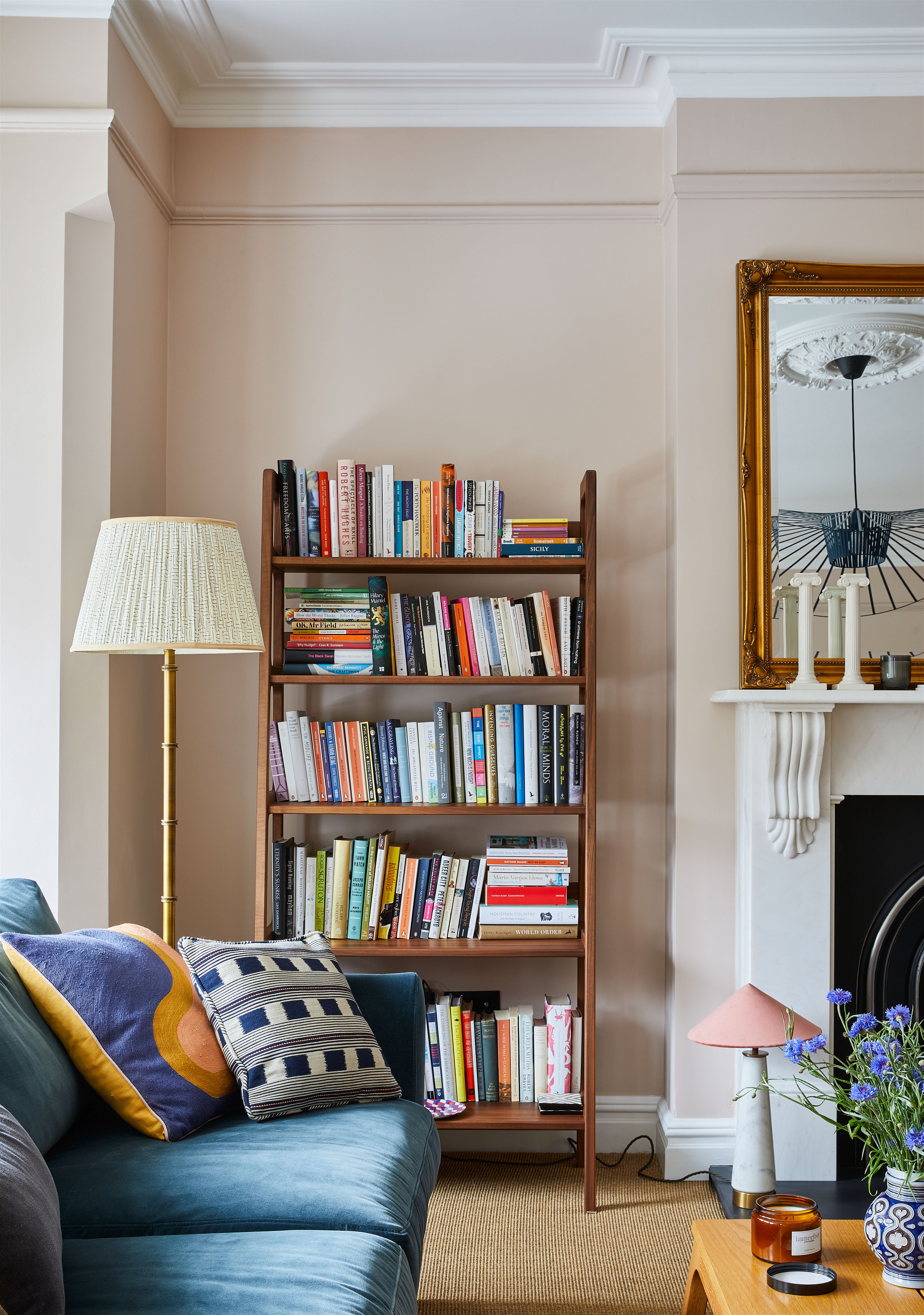
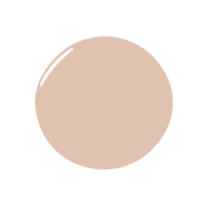
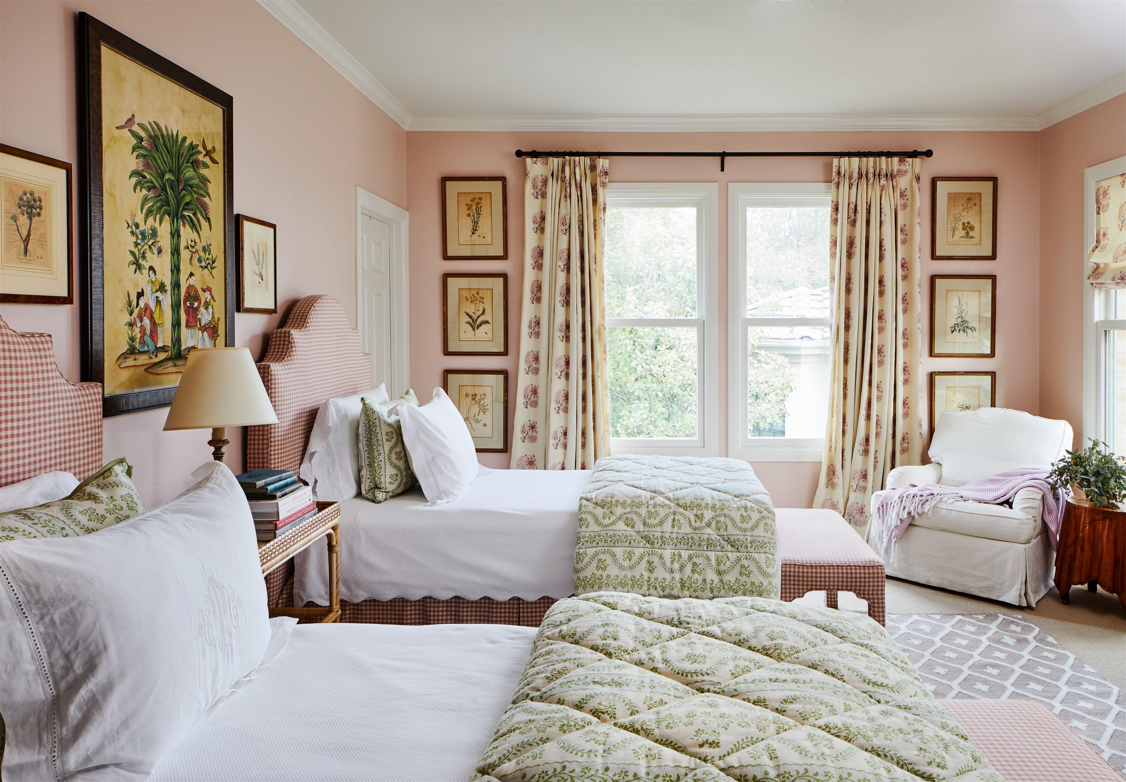
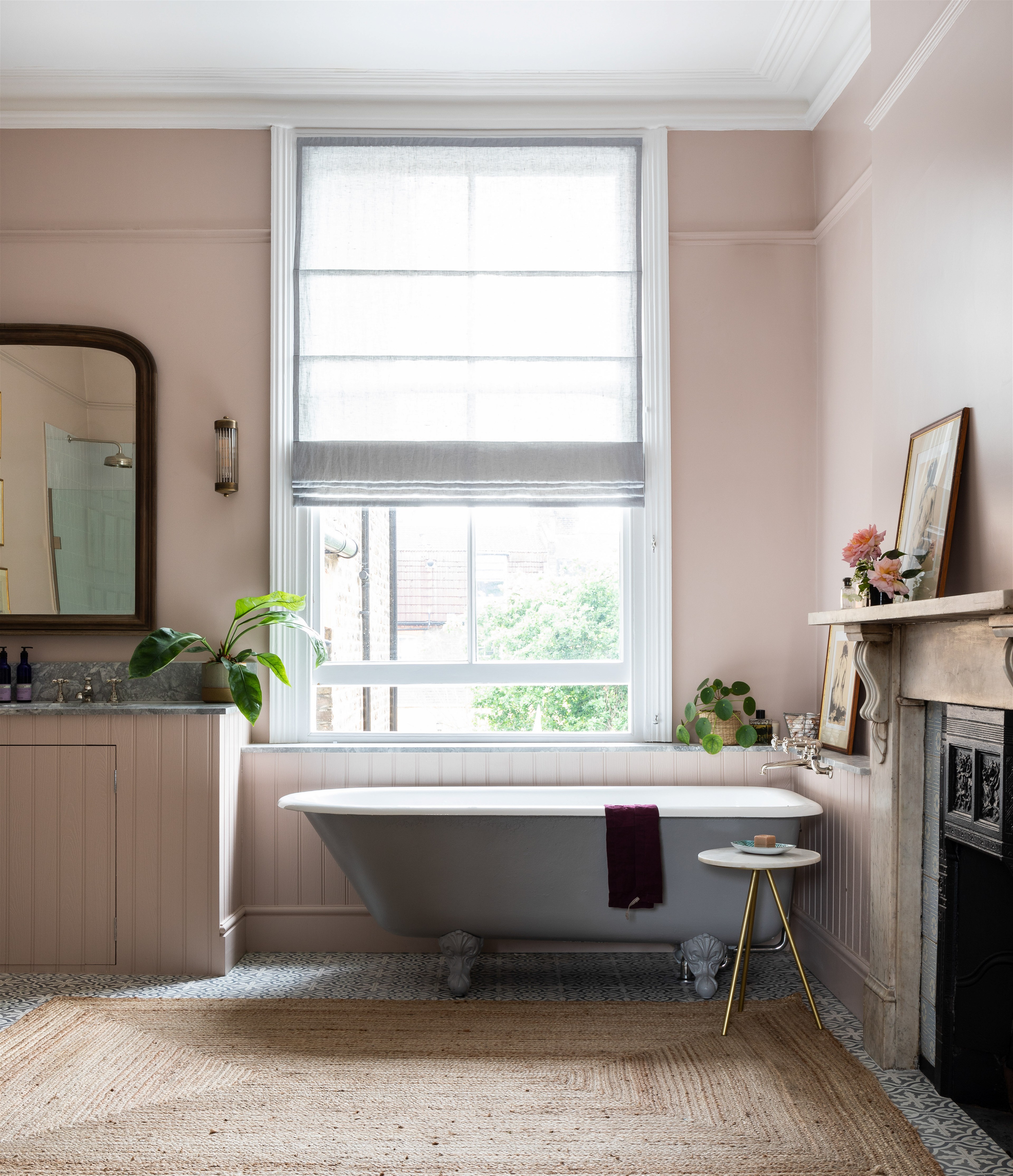
Design by Imperfect Interiors; Photo by Chris Snook
Pink has had a makeover.
It shed its princessy persona, ditched its saccharine inclinations and re-invented itself as one of the most cocooning and desirable colors to use everywhere and anywhere in the home.
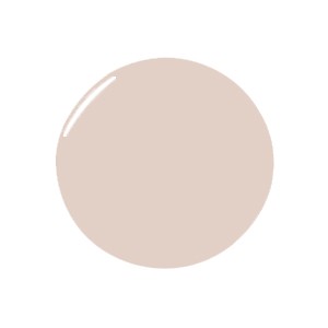
Once a go-to for the under-12 group, a new tribe of sophisticated hues have made their mark. Two colors which came up repeatedly when we canvassed our Experts for their favorites was Farrow & Ball’s Setting Plaster—“a warm pink that works well as a contrast to pale walls,” says Beth Dadswell, of Imperfect Interiors, who uses it liberally as a neutral-with-a-twist across bathrooms, studies, and mudrooms.
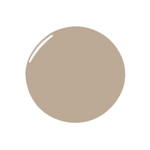
And on the opposite end of the scale from this gently blushing tone, the brand’s Sulking Room Pink scores highly because “it feels saturated without being too bold,” explains Zoe Feldman. “I’ve used it in kitchens because it looks so great on cabinetry but it would also look fantastic somewhere that has a jewel box quality or lots of millwork.”
Whether you’re blush-curious or prepared to go all in with a bold statement, keep reading for the best pink paint colors to know now.
The Best Colors for a Subtle Hint
Design by Whitney Parkinson; Photo by Sarah Shields
For a Dose of Zen
“Farrow & Ball’s Dead Salmon is the perfect color if you’re not able to fully commit yourself to pink. It has beautiful beige undertones and is still very much a calm neutral. It feels sophisticated, yet still playful and unique. This color is a favorite of mine to use in mudrooms.” —Whittney Parkinson
Design by Meredith Ellis; Photo by Read MckKendree
For Versatile Elegance
“Benjamin Moore’s Fondant is a subtle pink. It’s perfect when you want just a touch of softness, but create a fresh and bright feel. I have used it in bedrooms, entry halls, and stairwells.” —Meredith Ellis

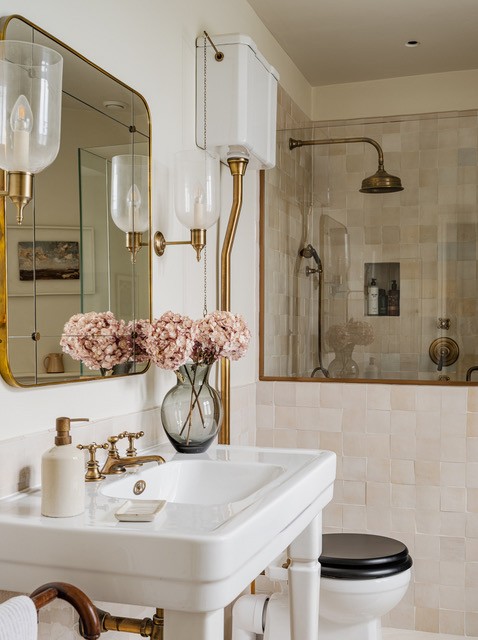
Photo courtesy of Anna Haines
For a Traditional Feel
“We have earmarked Atelier Ellis’ Waving & Smiling for a drawing room. There is a timeless quality to the color that might have felt equally happy in a Georgian living room or hallway.” —Anna Haines
The Proudest Pink Shades
Photo courtesy of Meredith Ellis
For Little Kids Who Dream Big
“I love Pink Shadow from Sherwin Williams because it has a touch of gray in it which makes it soft and subtle. I’ve used this a couple of times in girl’s bedrooms; it’s a more sophisticated hue, so nothing that the young client will outgrow.” – Meredith Ellis

For the Sweetest of Dreams
“Benjamin Moore’s rich and warming Rose Accent pairs beautifully with reds and oranges. I have used it in a guest bedroom where I paired it with a beautiful Lisa Fine fabric on the
drapery and a pretty bamboo bed. So many people request the color of this room—it’s just so inviting.” —Meredith Ellis
For Good Vibes
“Smoked Trout by Farrow & Ball is an incredibly saturated and rich pink neutral tone. It feels vibrant but not overpowering. This color beautifully contrasts against white or off-white trims. I would absolutely use this in an office or bedroom.” —Whittney Parkinson
The Best Pink Paint Colors for Bathrooms
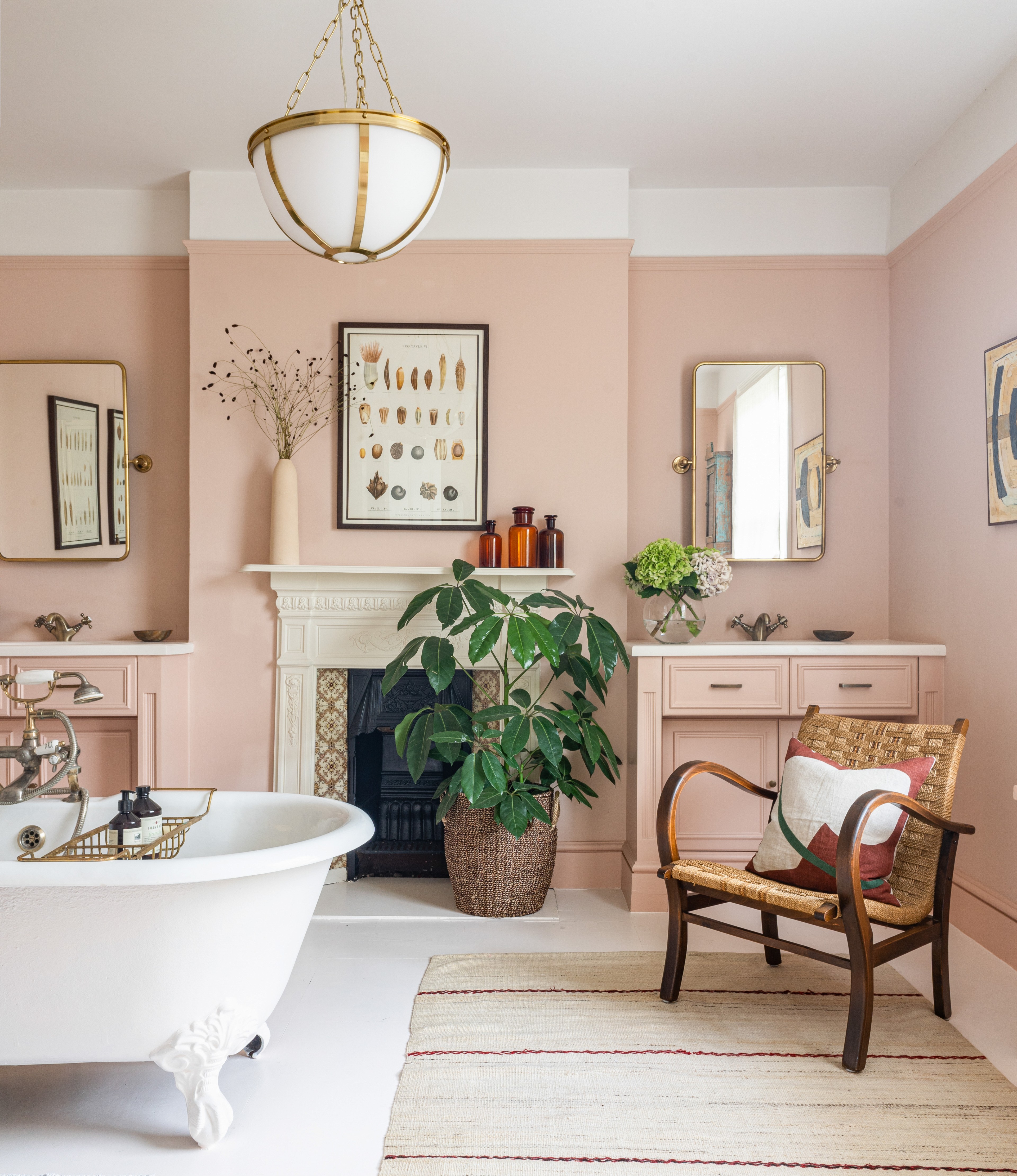
Photo courtesy of Anna Haines
For the Guest Vanity
“Edward Bulmer’s Cuisse De Nymphe Emue is a dusty pink with enough umber to avoid it being too sugary. The warmth of the color amplifies the radiance of your skin, so it is a wonderfully flattering color to use in a bathroom.” —Anna Haines

For a Luxuriant En-Suite
“Dimity from Farrow & Ball is described as a red-based neutral, but when combined with pink Zellige tiles and aged brass shower fixtures, it reads pinker. To me it looks slightly aged with a whisper of blush—it’s elegant, friendly, and gentle.” —Anna Haines
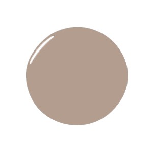
Design by Imperfect Interiors; Photo by Chris Snook
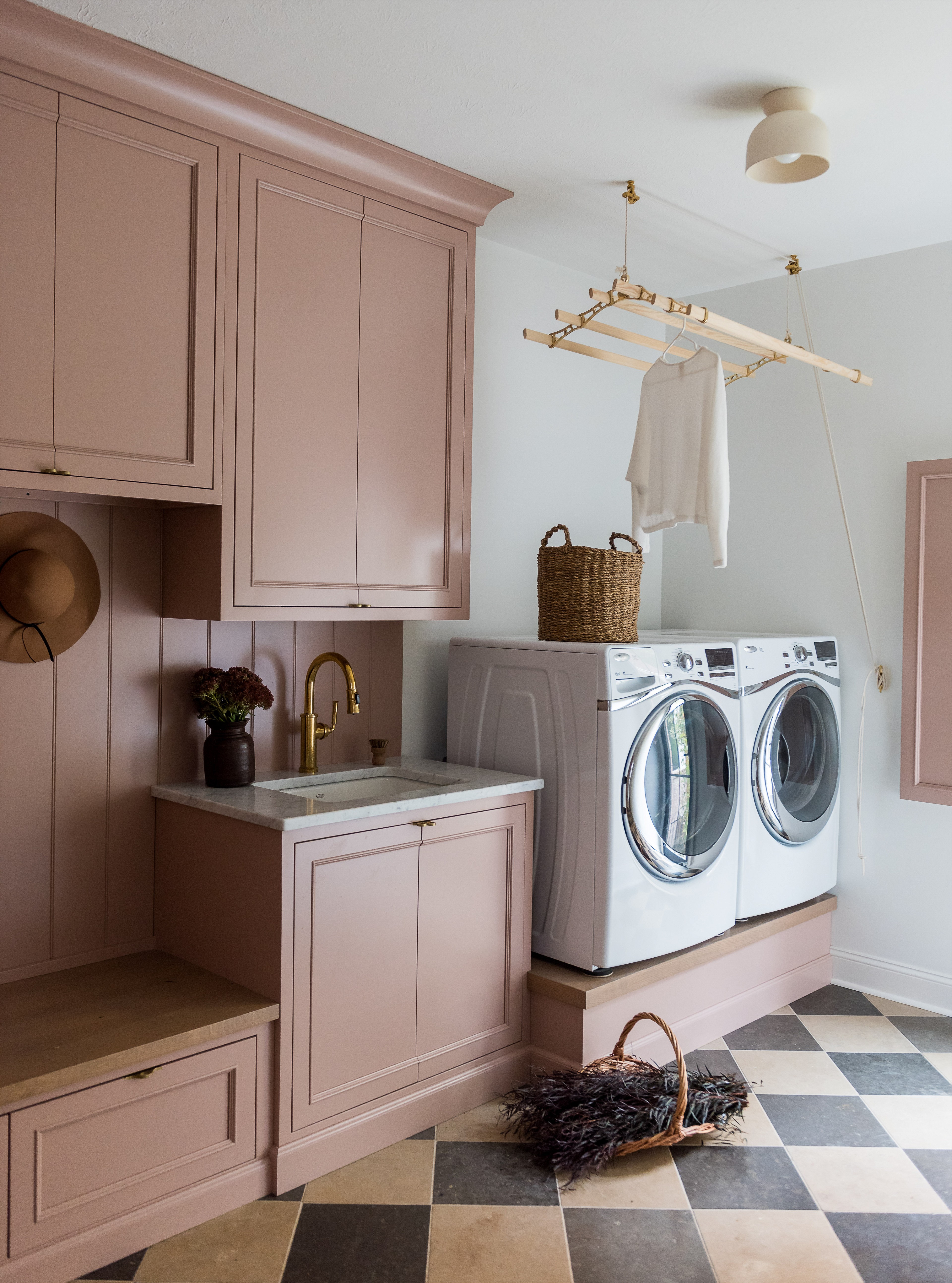
For a Family Washroom
“Dulux’s Soft Stone is a very flattering tone that works really well in a bathroom as it has warming yellow undertones. We’ve used it on the walls and paneling in a large bathroom to make it feel cozier.” —Beth Dadswell, Imperfect Interiors
For Joyfully Unpredictable Hues
Photo courtesy of Zoë Feldman
For Grown-up Settings
“Farrow & Ball’s Peignoir has a very ethereal quality. You don’t know if it’s blush, lilac, white, or gray. It changes a lot with the light and feels very different in different spaces. We usually use it for walls and millwork in different sheens in bedrooms and dressing rooms. My office is also painted in it, and we’ve been playing with it on kitchen cabinetry, as well. It reads like a neutral and is a very mature pink.” —Zoe Feldman
For the Kids’ Wing
“Sulking Room Pink by Farrow & Ball tends to sway to the mauve side. It’s a risk worth taking if you’re committed to this side of the color wheel. It’s the perfect hue for a kids’ room or play space to ignite creativity.” —Whittney Parkinson

…and Finally, for the Perfect Plaster Shade
“While Farrow & Ball’s Setting Plaster is a pink hue, it feels very organic and has a historic quality to it. It doesn’t read as a baby hue, so it can be used in more mature applications. It looks beautiful in bathrooms, bedrooms, and light-filled living rooms.” —Zoe Feldman