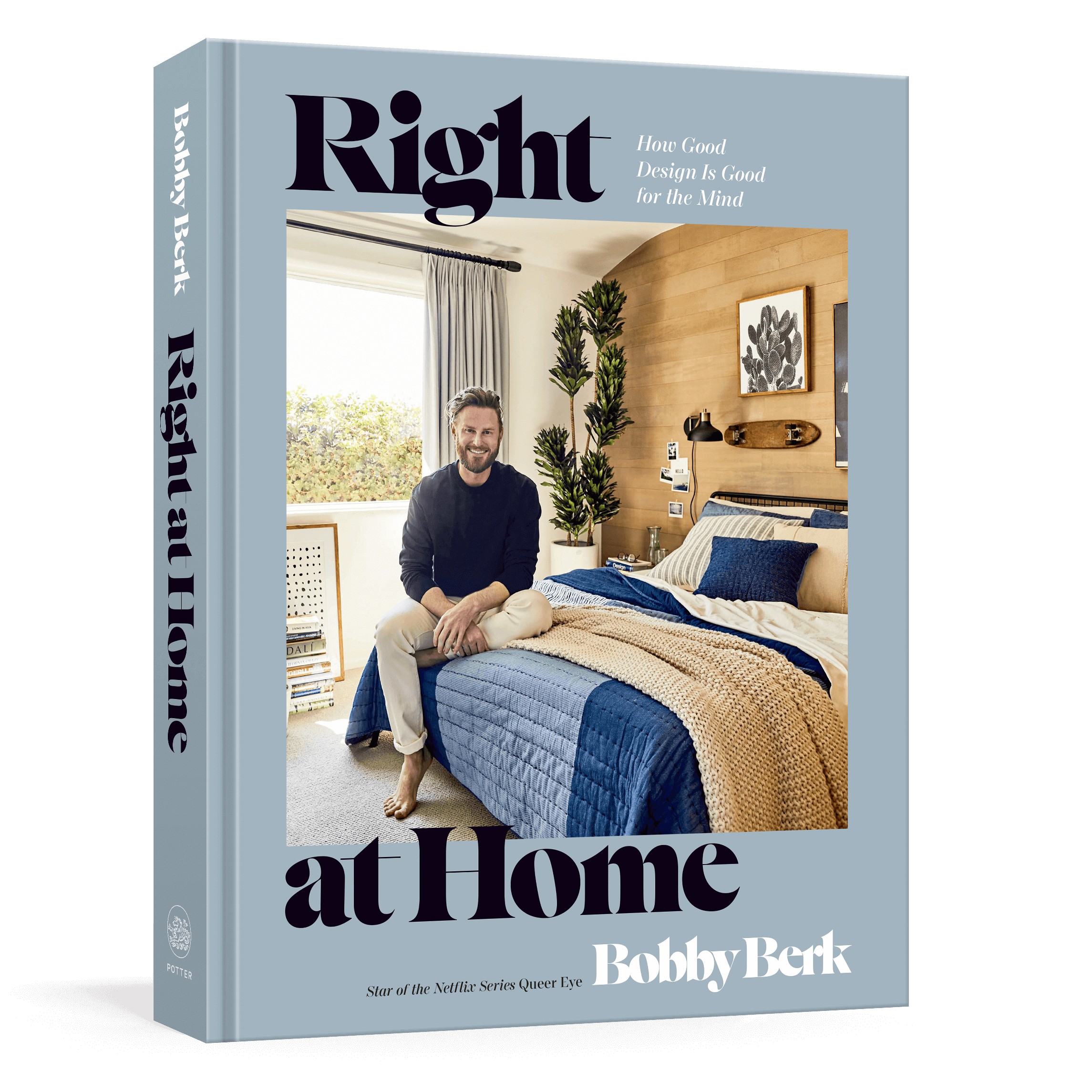
Bobby Berk’s 16 Go-To Paint Colors Are “Mood Whisperers”
Words by Bobby BerkWith our Book Club series, we hand over the proverbial mic to our Experts—letting them share their work, their thought process, and their best tips, all in their own words. The following is an excerpt from Bobby Berk’s new book, Right at Home, published this month with Clarkson Potter.
Photography by Sara Ligorria Tramp. Reprinted from © RIGHT AT HOME, by Bobby Berk, Clarkson Potter New York, 2023.
Being fluent in color is an incredibly powerful tool for mental wellness.
When I first started out as a designer, I approached color purely on instinct. To me, colors always felt kind of like mood whisperers—subtle messengers that inexplicably, strangely, but undeniably told me to feel one way or another.
After working with countless clients over the years, I found out that this is actually a pretty common experience. Often, we’re not consciously clocking what the colors of a space are telling us because the messages are being registered at the subconscious level—in our nervous system, in our brain, in our feelings. I learned later that chromotherapy is an actual thing (I knew I wasn’t crazy!)—a whole field with tons of research and studies dedicated to testing the effects of color on behavior, mood, and wellness IRL.
Now I’ve got lots of advice about how to pick the right color palettes based on this stuff, but keep in mind that my foolproof recipe for how to pick the right colors gives equal weight to one key ingredient that everyone always has at their disposal: Whatever Makes You Happy!
Photography by Sara Ligorria Tramp. Reprinted from © RIGHT AT HOME, by Bobby Berk, Clarkson Potter New York, 2023.
Here’s the thing: If your personal preferences are at odds with some of the science behind a color, not only is that totally valid but it’s also a designer-approved position, through and through. (So if studies show that blue is calming, but you’ve just never been a fan of blue, you have my full blessing and official stamp of approval to avoid blue at all costs.)
Because that’s kind of how colors work: Each one is an infinitely expandable container of meaning. White can stand for purity at an American wedding, but in other cultures, it’s the color of death and mourning. And based on your personal experience with the color, white may be positive, neutral, or negative.
At the end of the day, picking the “right” colors for a space is kind of a mixed bag. But the important thing is that you take a minute to figure out how you personally feel and respond to colors before forging ahead—especially if the color updates you’re looking into aren’t easily reversible.
Bottom line: Color’s palpable effects on mood are just too good to pass up, and when it comes to your mental wellness, every little bit helps. Take your time figuring out how you feel about a color.
Photography by Sara Ligorria Tramp. Reprinted from © RIGHT AT HOME, by Bobby Berk, Clarkson Potter New York, 2023.
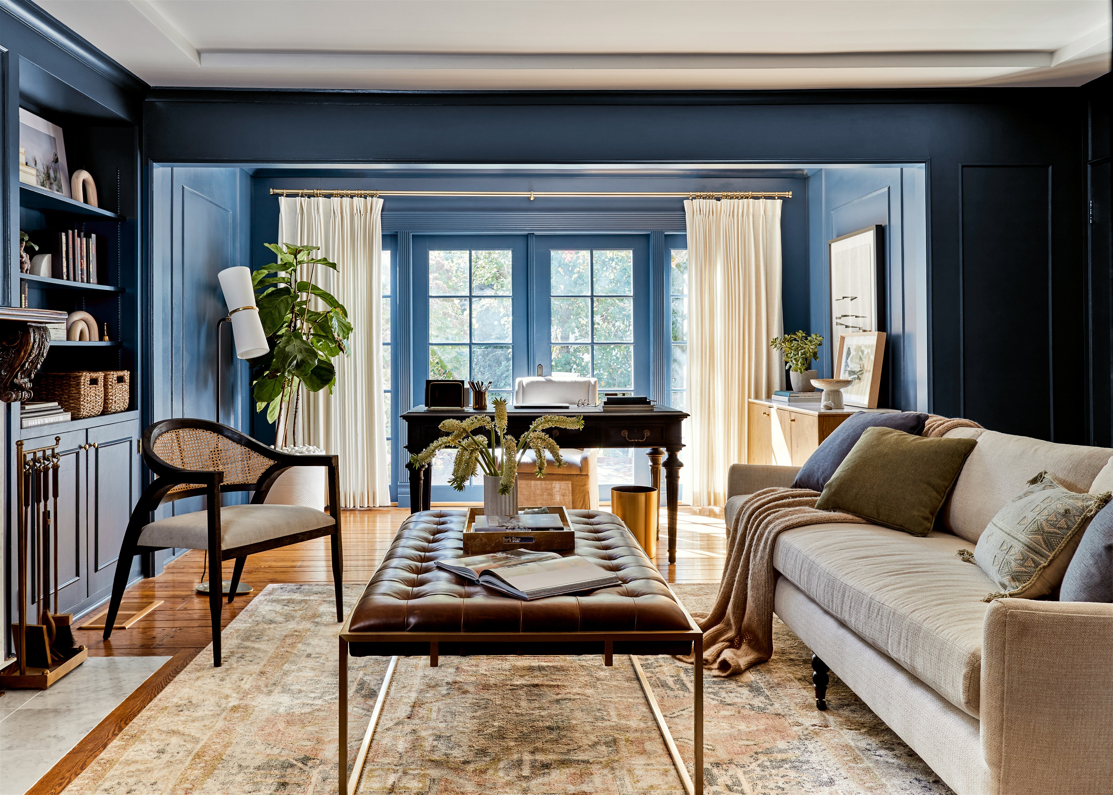
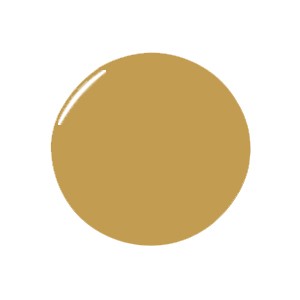
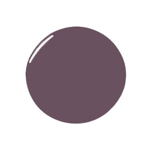
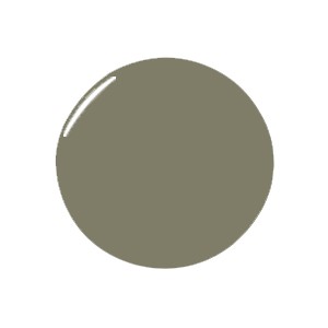
Gray Areas
Neutrals will always be in the mix, whether you’re opting for a solid, goes-with-everything base color or using them as accents for a bolder, color-driven room. Be careful, though: Too much neutral might feel sterile or institutional, so if you do want to go for a tone-on- tone look, make sure you layer in textures, shapes, and patterns to keep things dimensional, engaging, and interesting.


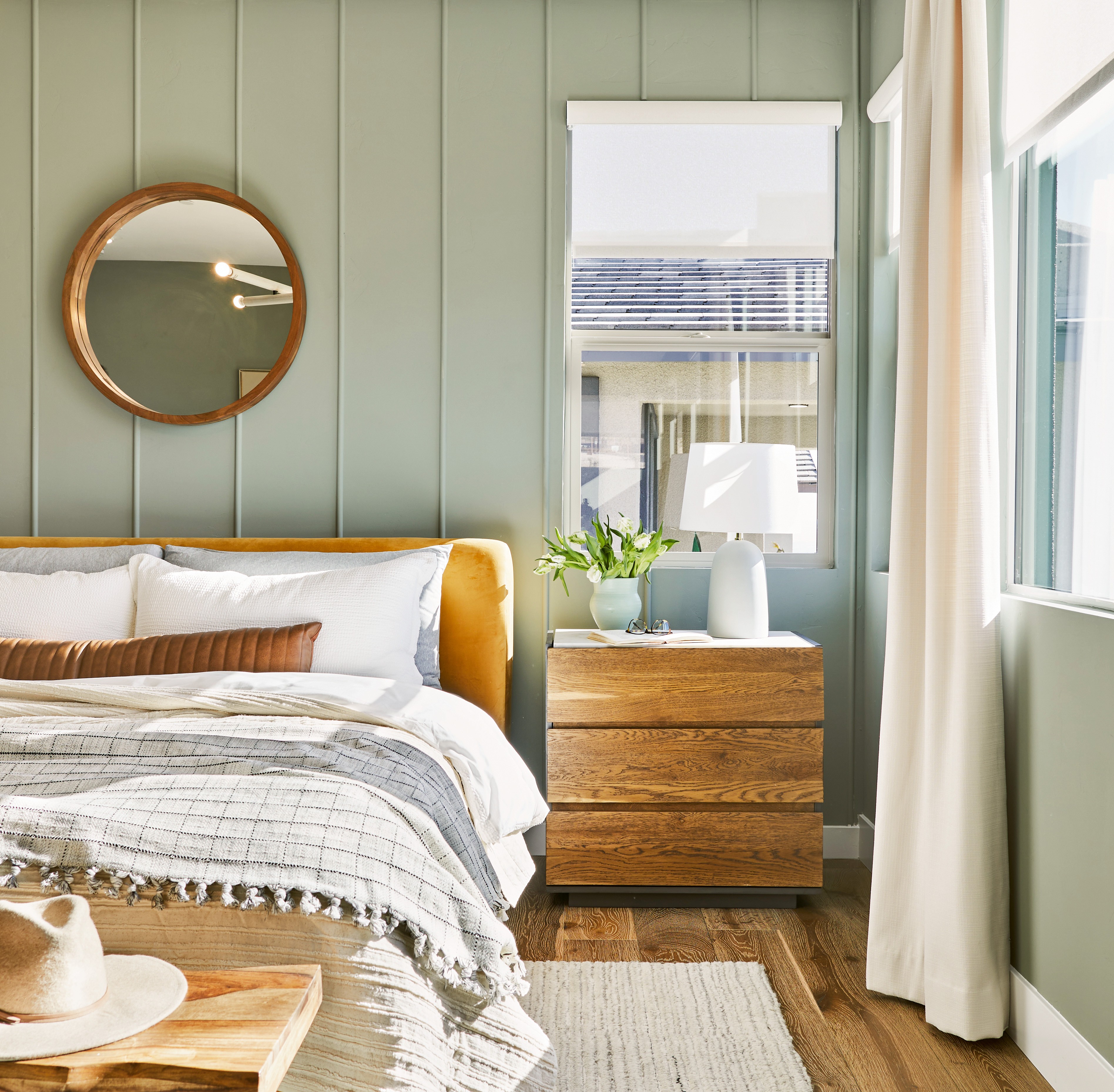
(Color) Palette Cleanser
Remember: You register color in your subconscious, your nervous system. Cool colors have been proven to lower heart rate and blood pressure, so try some of these soothing color combos to help bring things down a notch (great for anyone who struggles with anxiety and feelings of being overwhelmed).


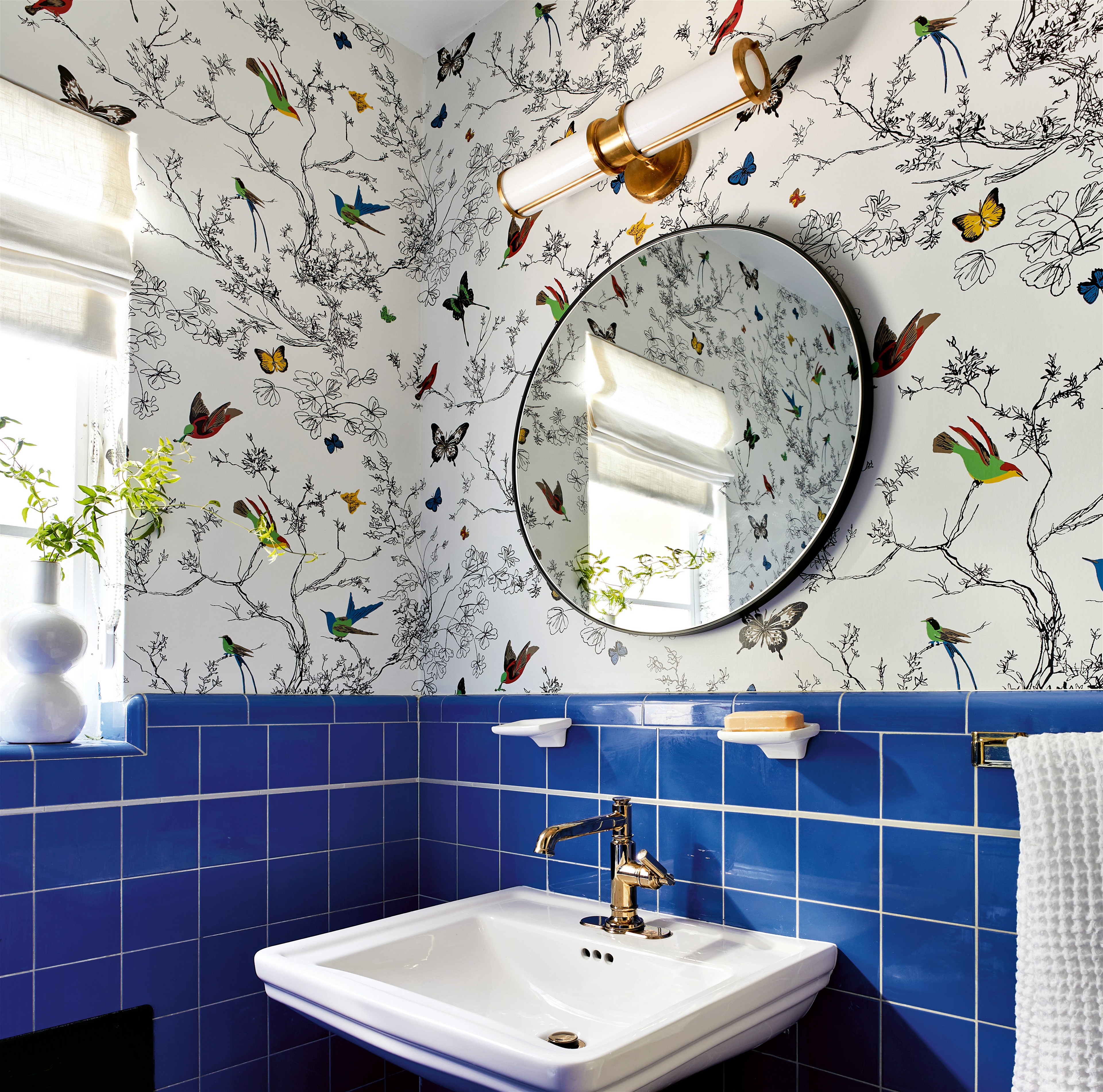
Photography by Sara Ligorria Tramp. Reprinted from © RIGHT AT HOME, by Bobby Berk, Clarkson Potter New York, 2023.
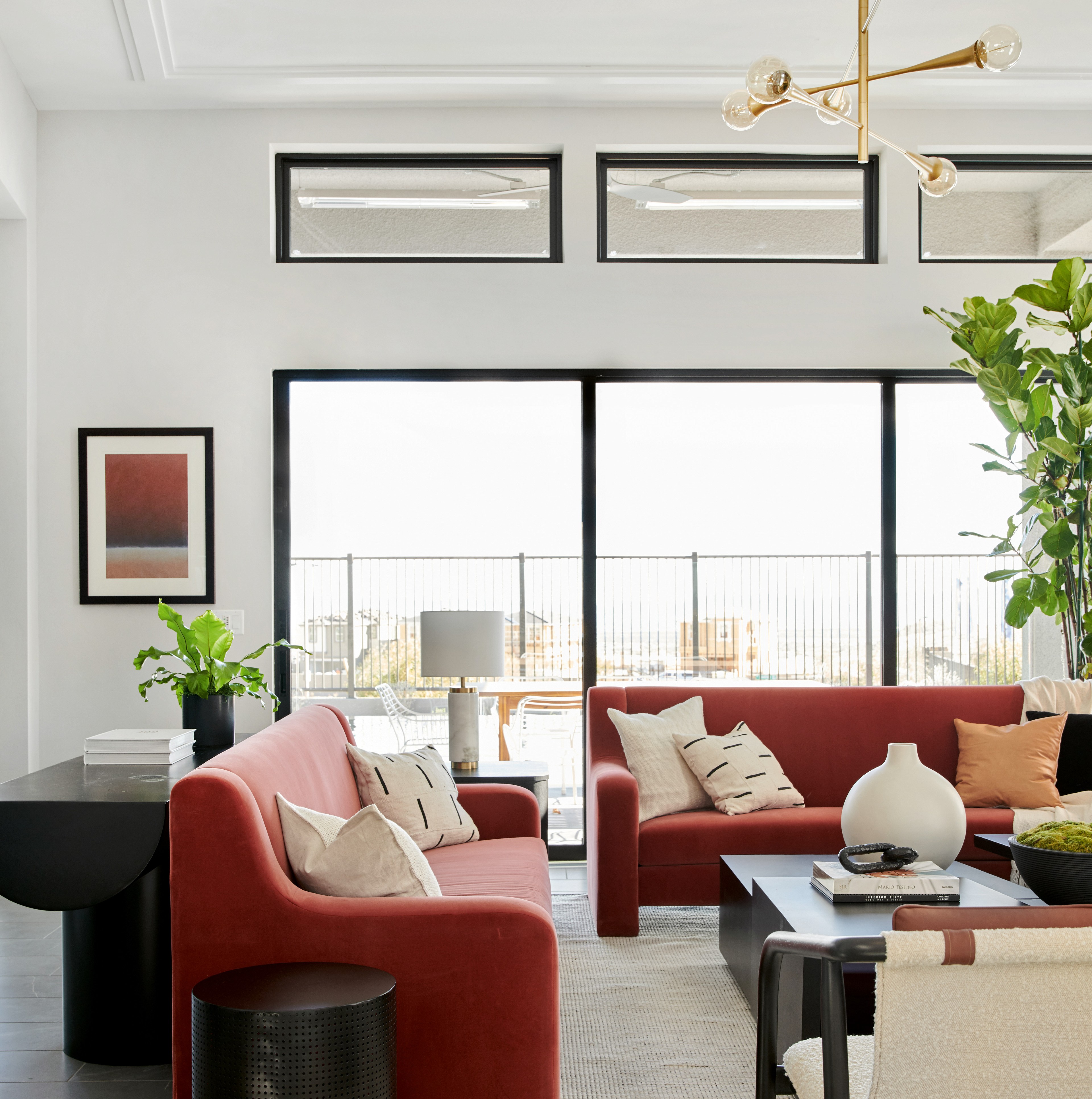
Energizing Hues
Liven up more “public” rooms (living rooms, dining rooms, family rooms)—or any room than could use an extra pick me-up (a bleh guest bathroom, a kid’s space, a bonus room). I also go for these palettes when designing for anyone who struggles with low mood and energy levels.

Visual Caffeine
Hit that creative sweet spot with a mix that’s not overstimulating but also not too chill (you need some juice to get those ideas going!). Try these palettes in a home office, a kid’s playroom, or any public/group space.


Photography by Sara Ligorria Tramp. Reprinted from © RIGHT AT HOME, by Bobby Berk, Clarkson Potter New York, 2023.