From Lavender to Brown, Discover the Paint Trends Our Experts are Excited About for 2023
Words by Olivia Lidbury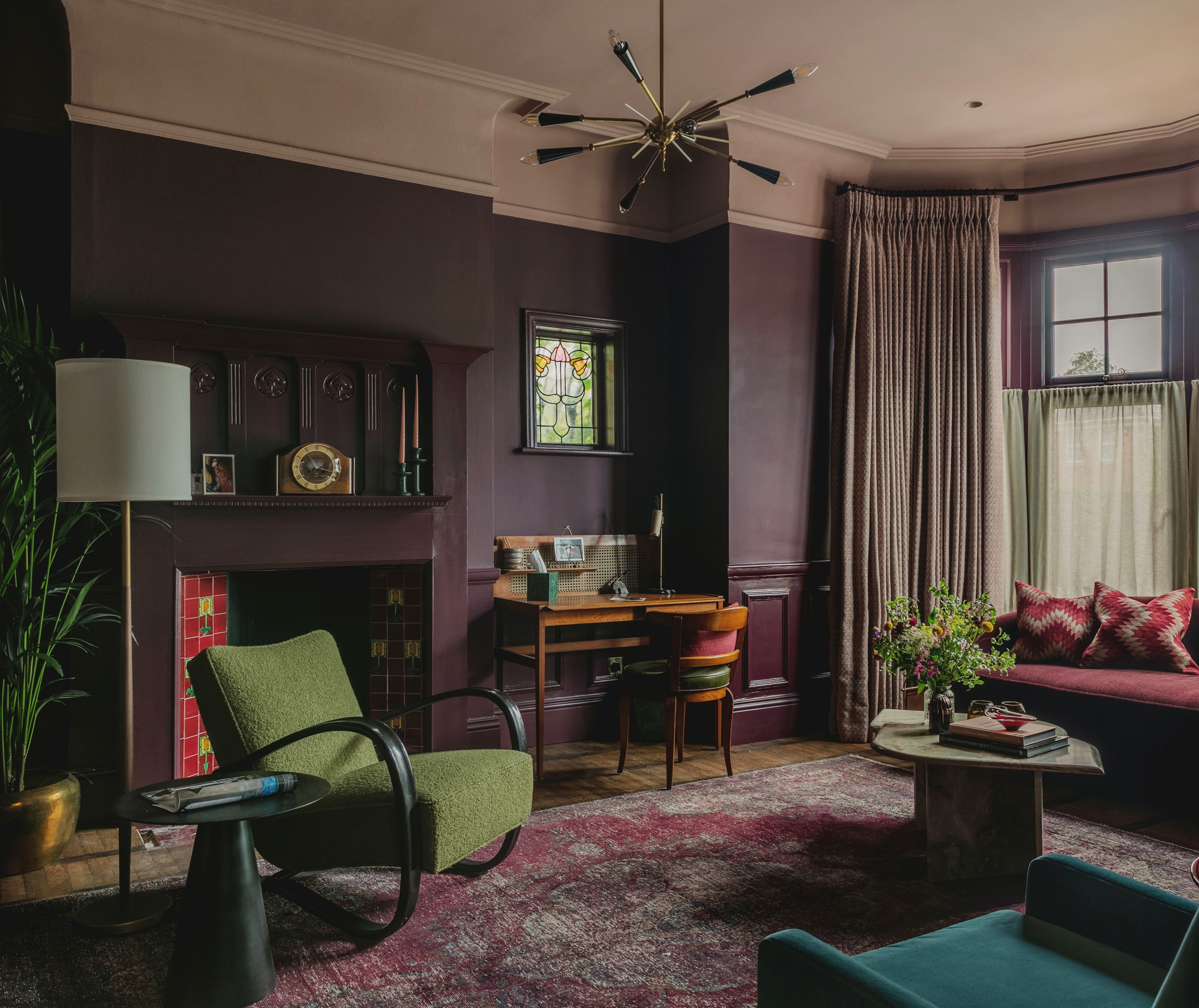
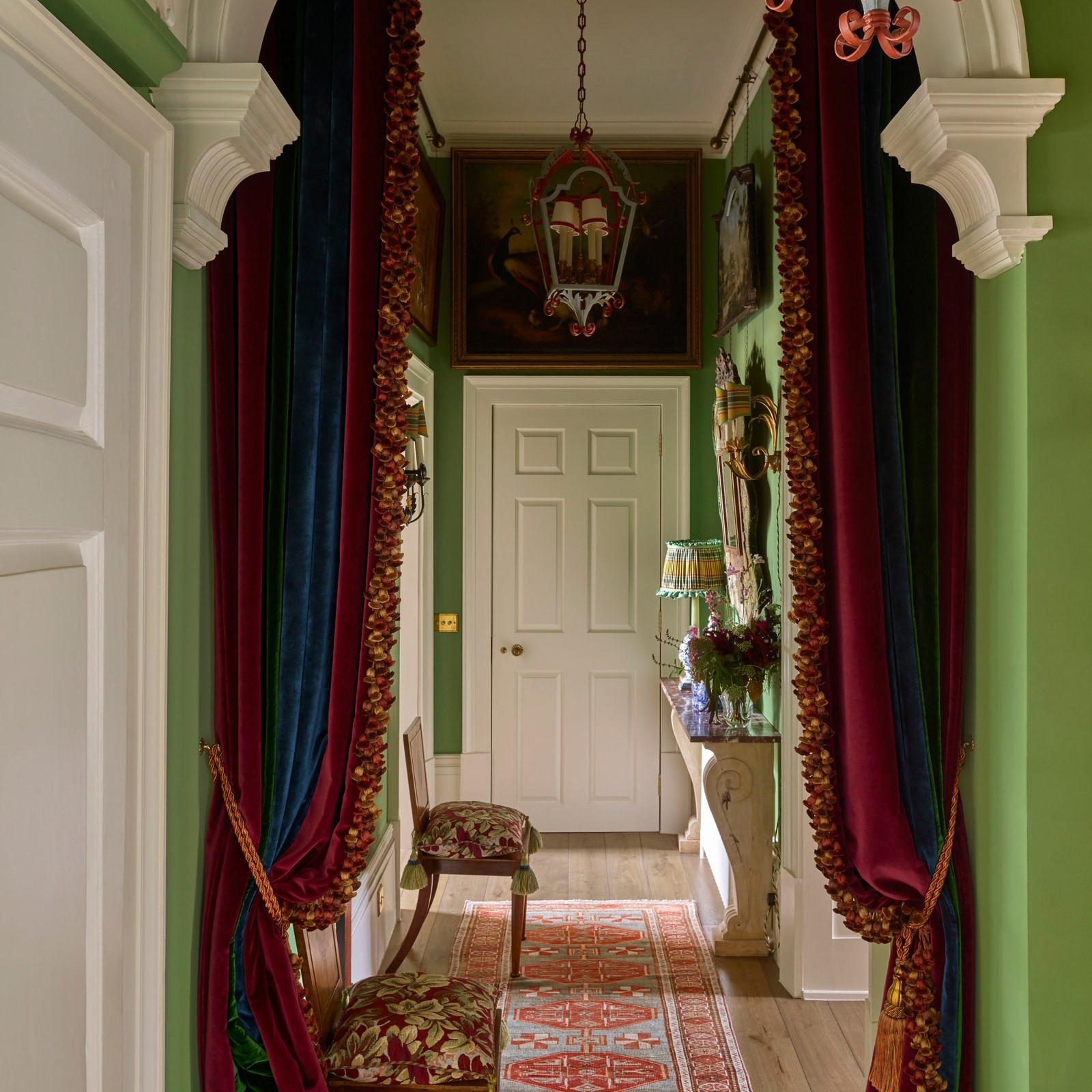
Photo courtesy of Studio Duggan
Much like in fashion, paint color trends come and go. So whose turn is it to step into the spotlight now?
Martin Brudnizki—designer behind some of the world’s best restaurants, private clubs, and hotels—and London-based Tiffany Duggan of Studio Duggan are backing brown: “it’s so much warmer and more flattering than the ubiquitous grays of days gone by, and much easier to use with greens and nudes,” says Tiffany. “Along with creams, these feel like reassuringly traditional and grounding colors for less than certain times.”
Elsewhere, LA-based Mark Sikes predicts the return of clean, white paints: “It feels like we're in need of an inspirational palette cleanser and a fresh start.” Looking into her crystal ball, former fashion executive Jenna Lyons thinks soft pinks will dominate over the next year. “A lot of my clients are into this—which totally works for me!” We canvassed these four Experts to discover which other shades they’re most excited about right now.
Unapologetically Pink
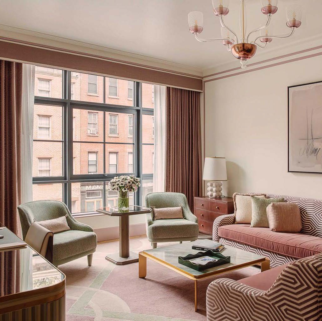
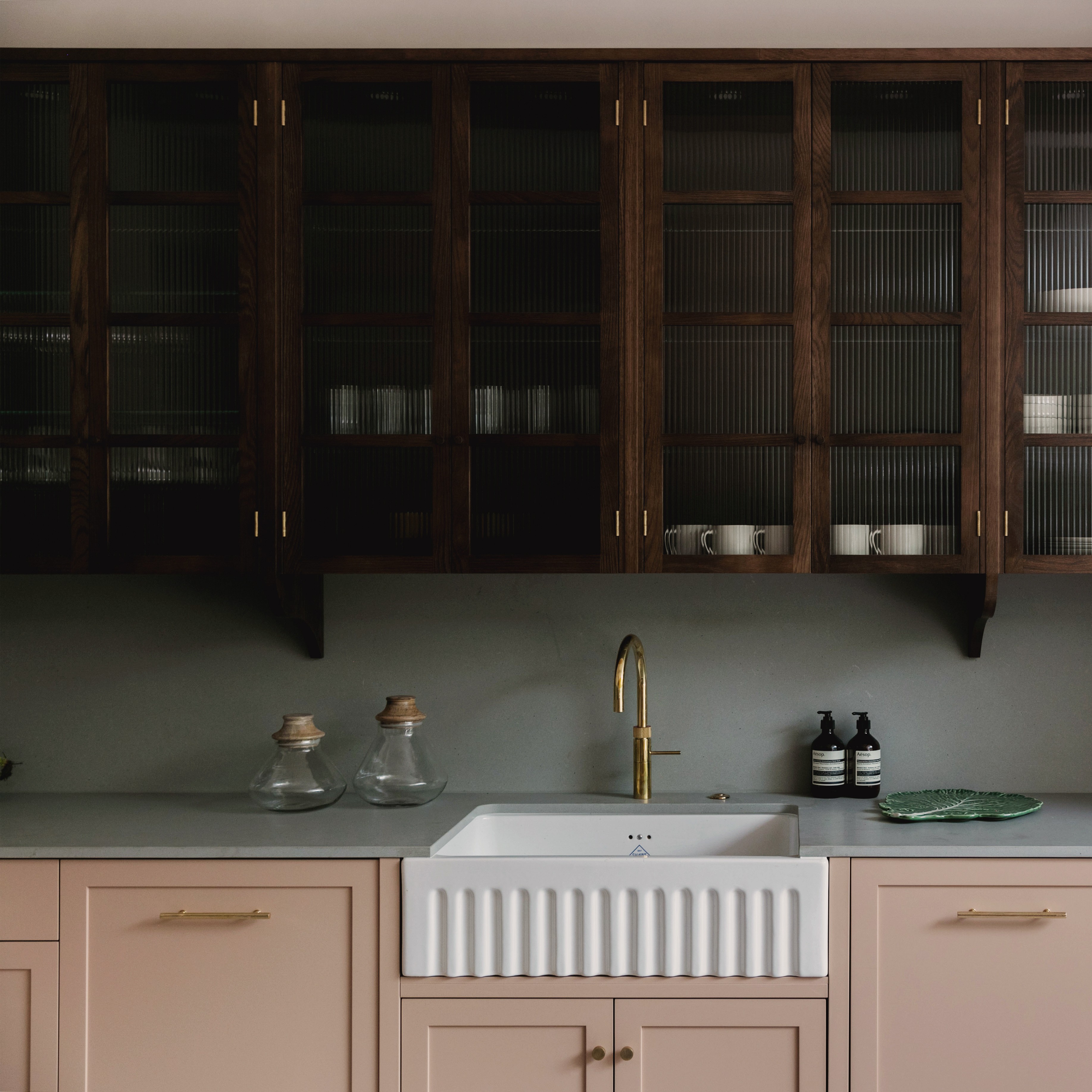
Photo courtesy of Martin Brudnizki
Photo courtesy of Studio Duggan
“Portola’s Roman Clay in Full Circle possesses the softest blush undertone which makes everything glow without being saccharine.” —Jenna Lyons

“Edward Bulmer’s Jonquil is a lovely yellow-based pink with a bit of a cult following (and for good reason). It works equally well in both traditional and contemporary interiors and has the appearance of somewhat moody raw plaster. We have used Jonquil on walls, woodwork, ceilings and kitchen cabinets—it is unbelievably versatile.” —Tiffany Duggan
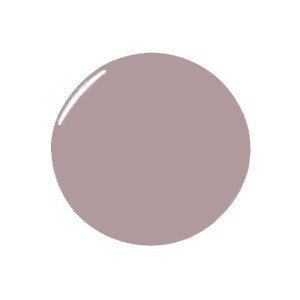
“For an alternative to pink, lavender is wonderful and enjoying a comeback with the return to the 1980s Laura Ashley-type aesthetic we are experiencing. It’s a wonderfully light and natural color. We used Edward Bulmer’s Lavender in a recent project in New York for Hotel Barrière Fouquet where it provides a lovely nod to France.” —Martin Brudnizki
A Vote for Brown
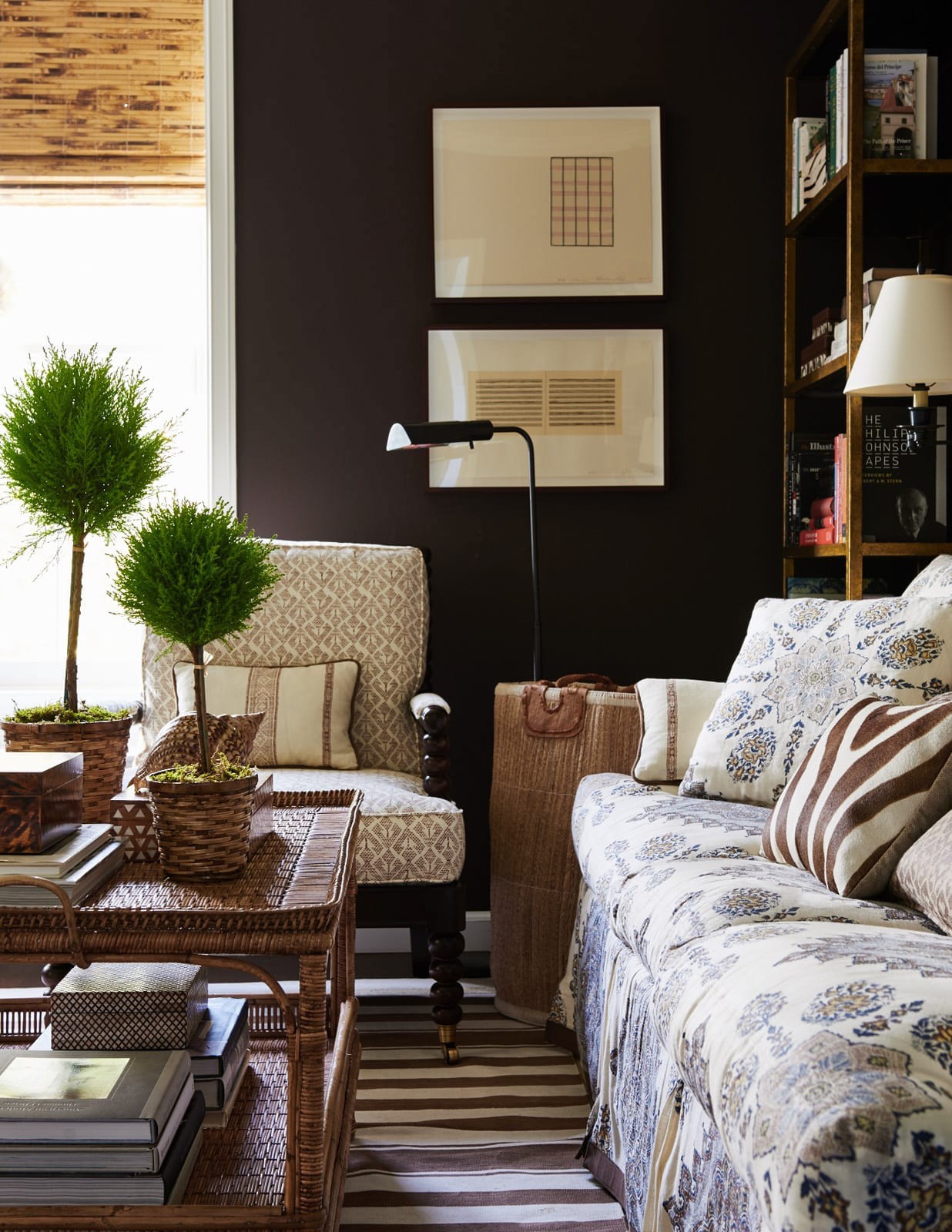
Photo courtesy of Mark D. Sikes
“London Brown by Edward Bulmer is a favorite. We often look to brighten up rooms with lighter or more neutral shades but brown is a neglected color. Sometimes it works best in a small room to make it feel cozier; other times it can feel quite grand in a room with high proportions.” —Martin Brudnizki
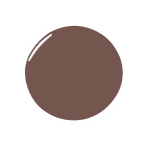
“Tanner's Brown from Farrow & Ball is perfect in an urban environment, especially with a lacquered finish on the walls. I'd pair it with ivory upholstered furniture, gilt finishes, and French antiques.” —Mark Sikes

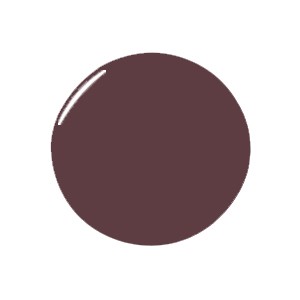
“Brinjal by Farrow & Ball is an excellent choice for injecting a little sophisticated drama to a space. It looks wonderful paired with lilac pinks, greens, and creams. If you don’t want to go full cover, using it on woodwork against a more muted wall is super smart too.” —Tiffany Duggan
Inspired by Nature
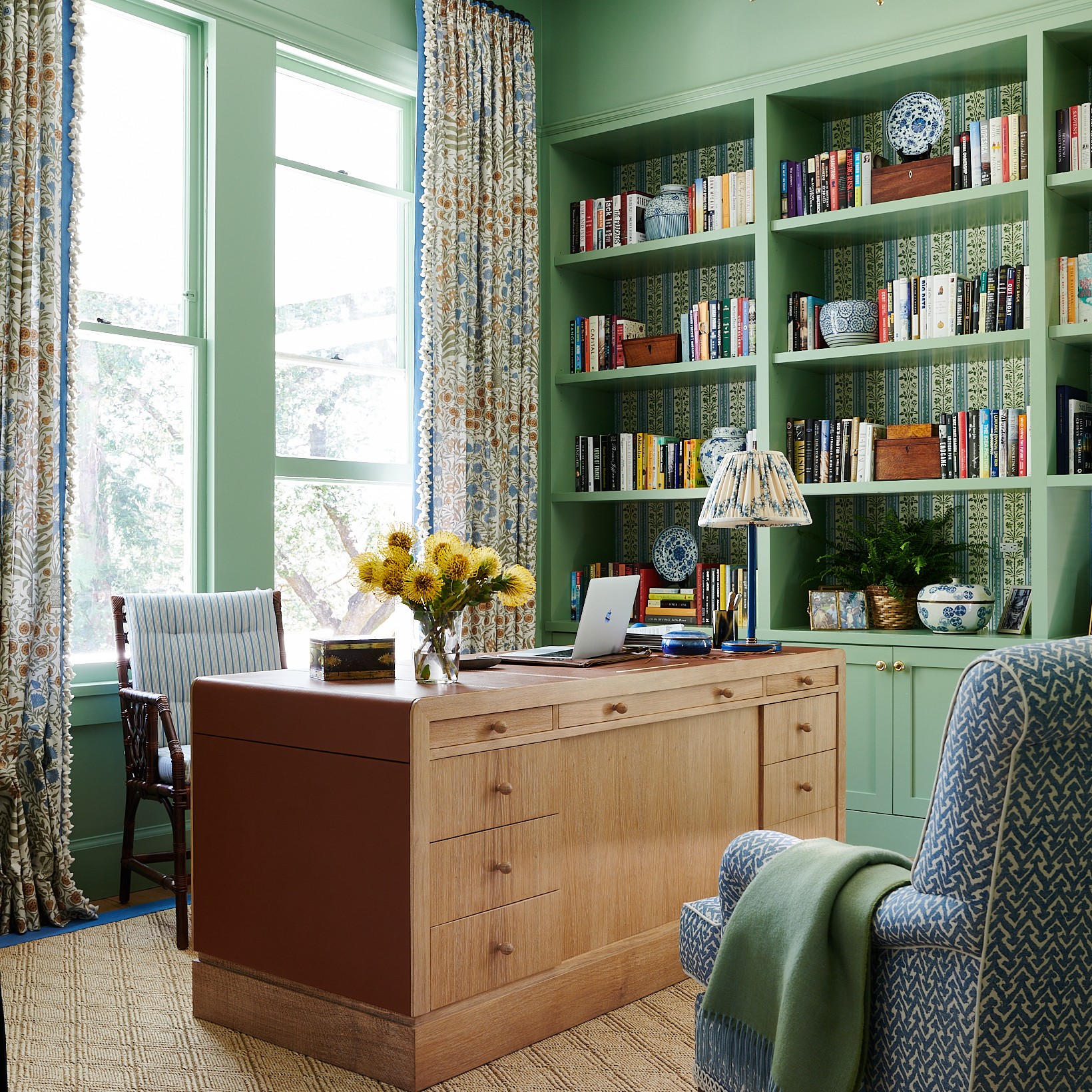
Design by Martin Brudnizki; Photo by Henry Bourne
Photo courtesy of Mark D. Sikes
“Green is always in fashion as it is a color that goes with every other color and is essentially grounded in nature. Invisible Green by Edward Bulmer manages to shapeshift throughout the day from a deep soft tone in low light to a vibrant shade in direct sun.” —Martin Brudnizki
“Skylight by Farrow & Ball is one of my favorites for primary bedrooms and sitting rooms. It's such a soft and calming color that looks amazing with patterned upholstery.” —Mark Sikes

“For a muted blue-green that manages to appear both fresh and earthy, Sobek by Paint and Paper Library looks more paired back when layered with other greens and blues. A contrast color such as terracotta can be used to make it sing.” —Tiffany Duggan
Neutrals for Now
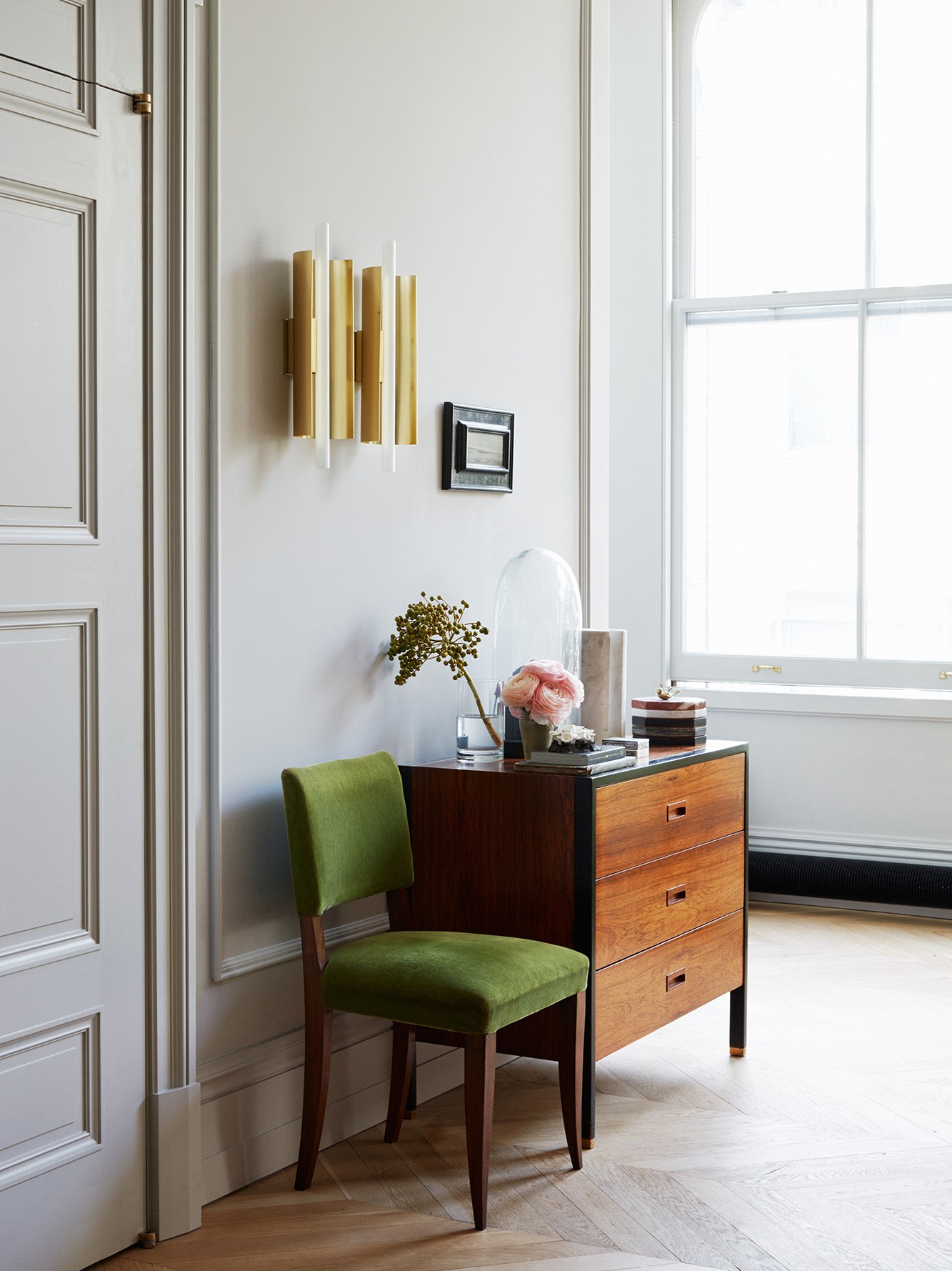
Photo courtesy of Jenna Lyons
“Portola’s lime washes in Spectre and Wings are the perfect foolproof grays. The finish gives them depth and a gentle texture.” —Jenna Lyons


“Pointing by Farrow & Ball is a great, fresh white. For creative spaces, like our own offices, it provides the perfect blank slate for inspiration and ideas. I love an all-white room with Noguchi lanterns, lacquered Parsons tables, and Bielecky Brothers wicker.” —Mark Sikes
“Benjamin Moore’s White Dove is literally perfect—not too bright white, not too gray and not yellow at all. It just works and It's always my go-to.” —Jenna Lyons
