Dutch Blue Cabinets Connect This 1930s Colonial Revival to Its Roots
Words by Morgan Goldberg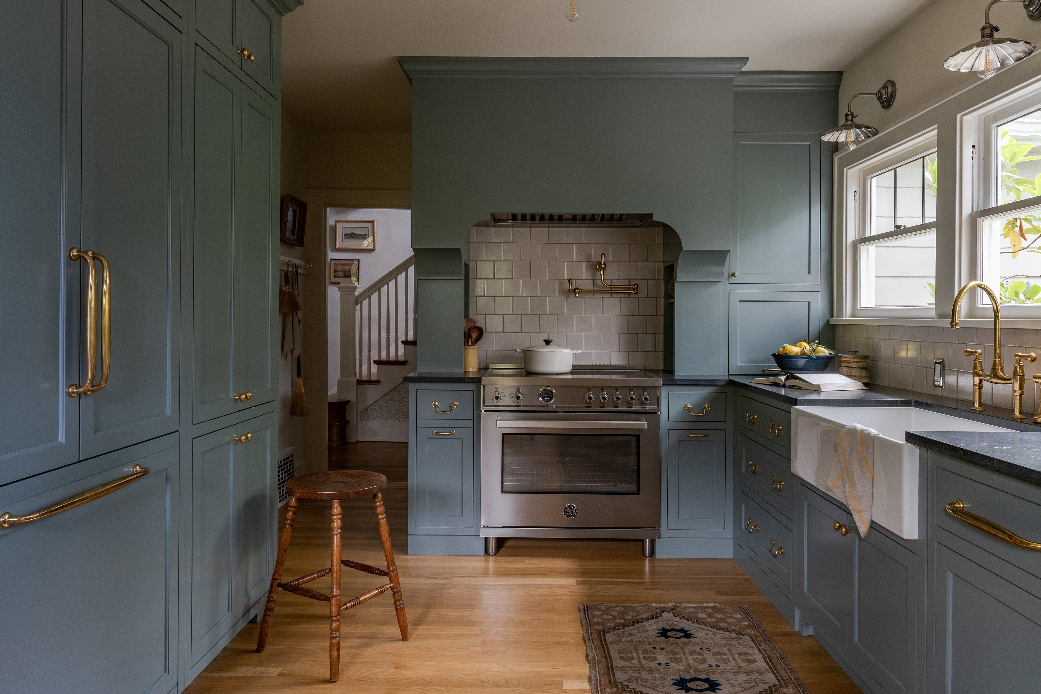
Photography by Lauren Caron; Design by Studio Laloc
For one Seattle couple, honoring the roots of their 1930s Dutch Colonial revival house was the primary goal of their kitchen renovation.
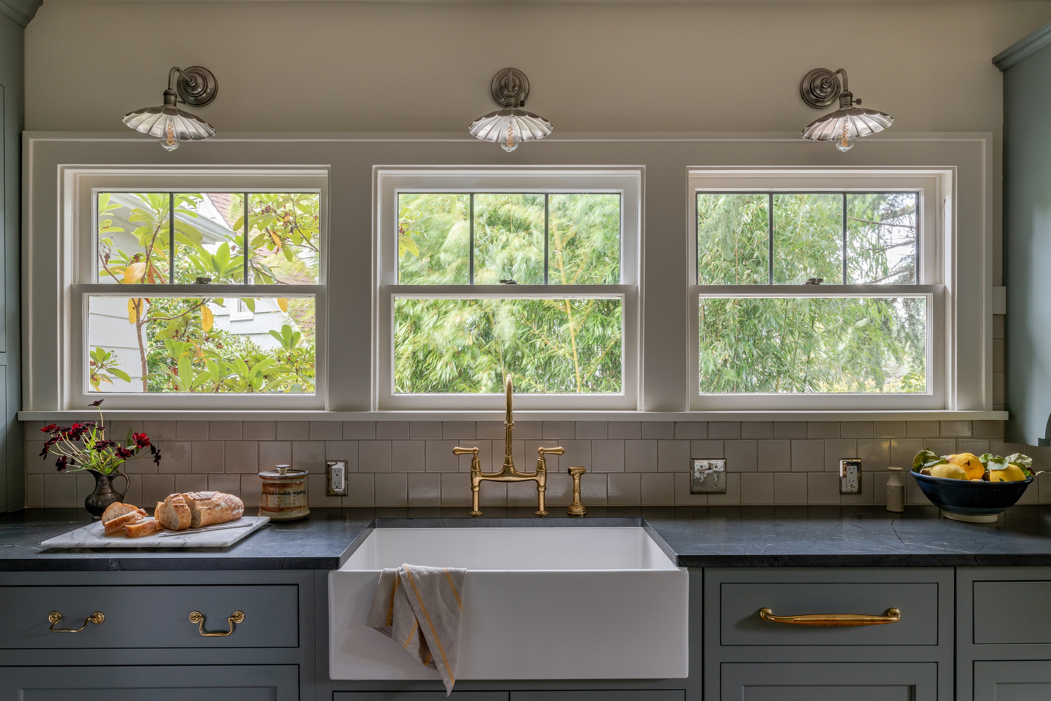
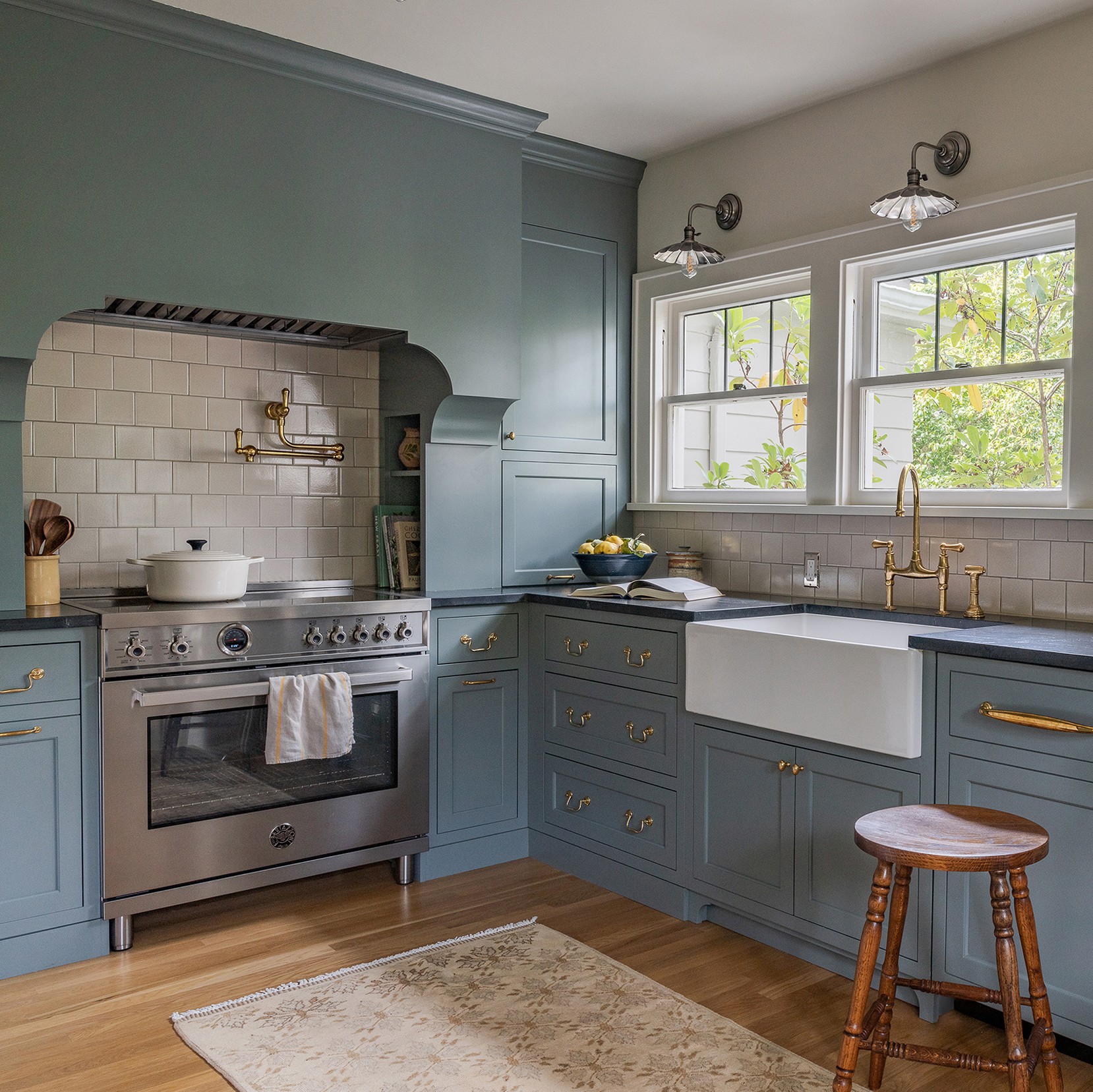
That’s why Studio Laloc founder Lauren Caron designed a statement hood with traditional detailing and painted the custom cabinets in De Nimes by Farrow & Ball, a Dutch blue tone. “The brief was to create something that was really inspired by Dutch architecture and kitchens that you would see in Amsterdam,” she explains.
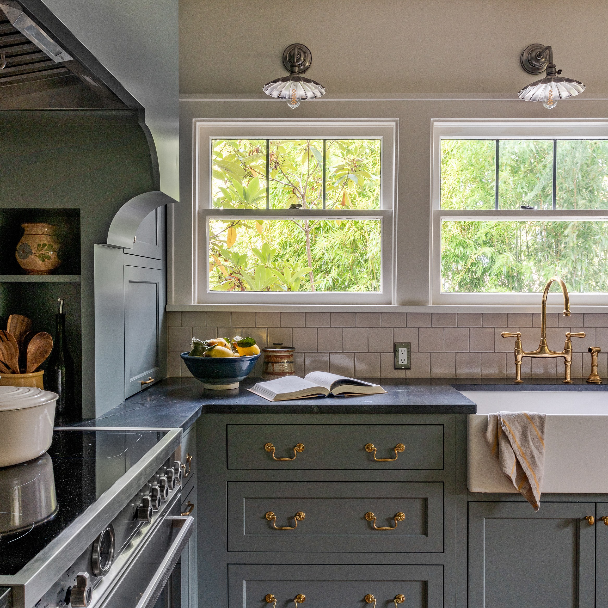
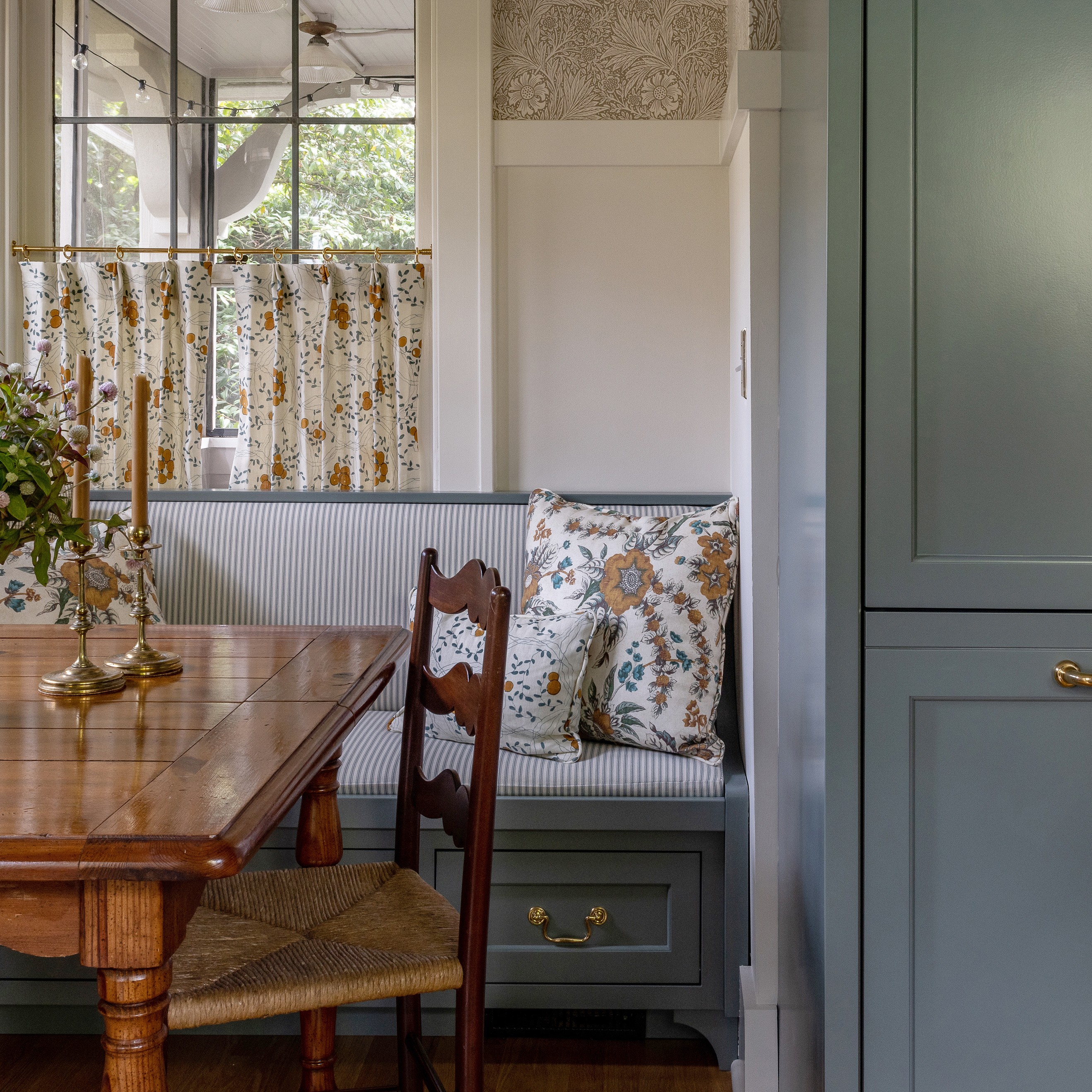
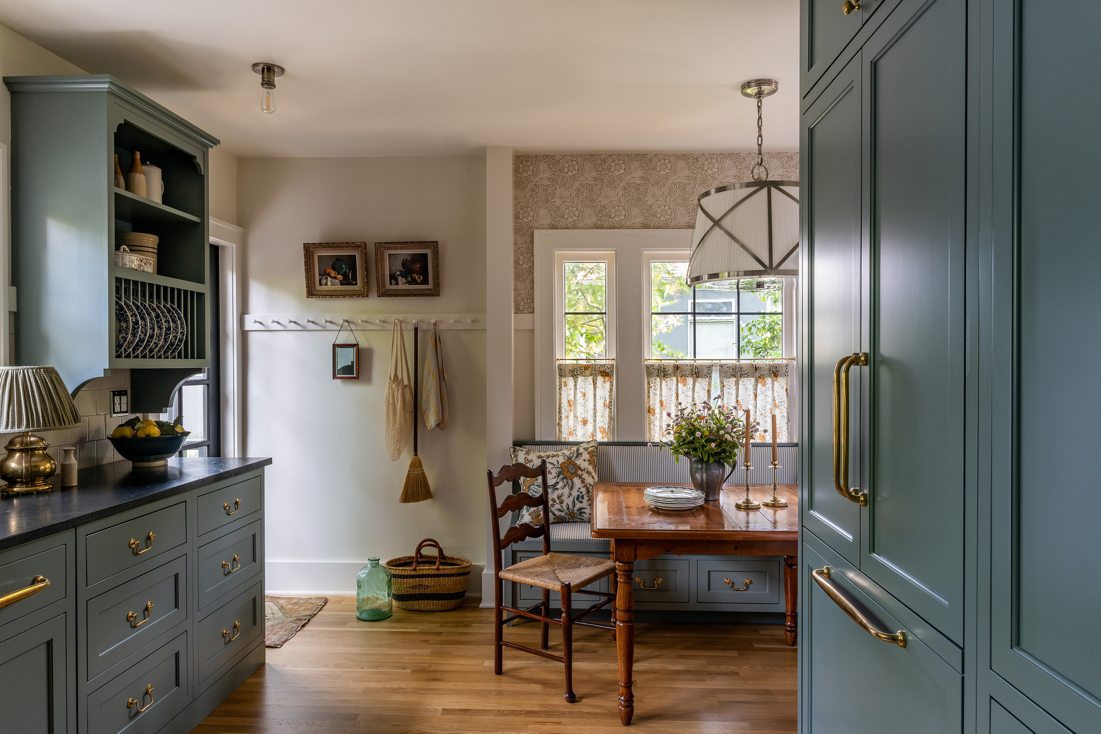
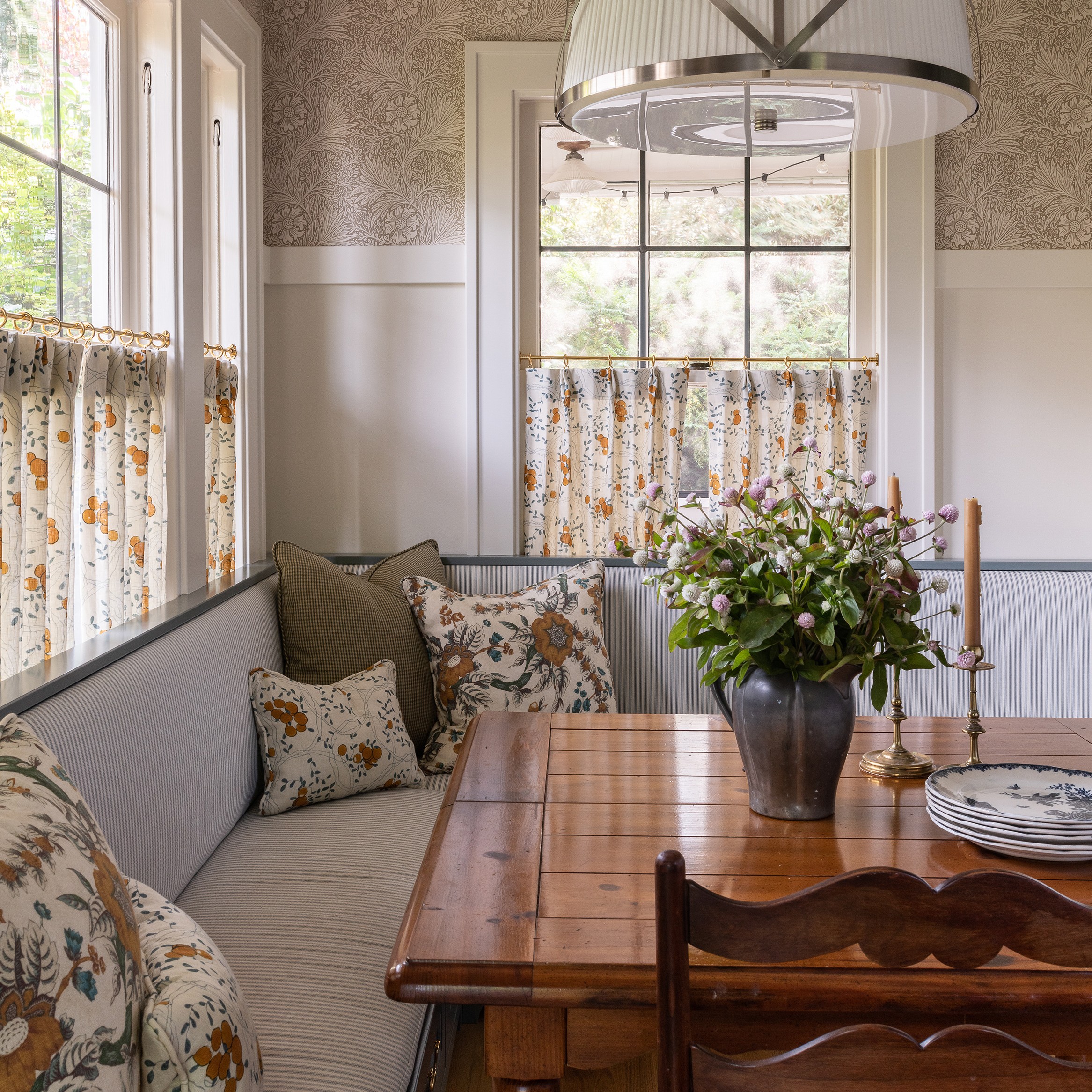
Naturally, the clients, who have a young daughter, also wanted something more functional than what you’d find in authentic cook spaces from a century ago—a functional layout for cooking, sustainable appliances, and a comfortable dining zone—so Lauren delivered on all fronts by maximizing storage and surfaces and building an L-shaped banquette with custom cushions and pillows. “Adding textiles to kitchens really makes them feel like livable living spaces rather than just functional utility rooms,” she opines.
The Expert completed the charming Northern European look with vintage decor, a mix of metal finishes, and cafe curtains in a fruit motif from Claremont fabric. It’s a timeless combination that feels as if it could have been there all along.
The project: A Dutch Colonial revival home
The location: A quiet, verdant neighborhood near Seattle’s Interlaken Park
The room: A kitchen
The client: A couple and their daughter
Photography by Lauren Caron; Design by Studio Laloc
Photography by Lauren Caron; Design by Studio Laloc
The biggest problem to solve
We were working within a footprint that we couldn't change too much. The house originally had an enclosed back porch, which became part of the kitchen, so we had to fix the flooring and re-level it. And we had a lot of issues with walls that aren’t very plumb because it's an older house.
The item that started it all
The clients really liked my own kitchen, so that was the jumping off point. I actually pulled the hood design from initial concept sketches that I had done for my own home. The rest of the kitchen design was inspired by the built-in hood surround with its curves that are meant to feel like corbels.
The splurge and steal in the room
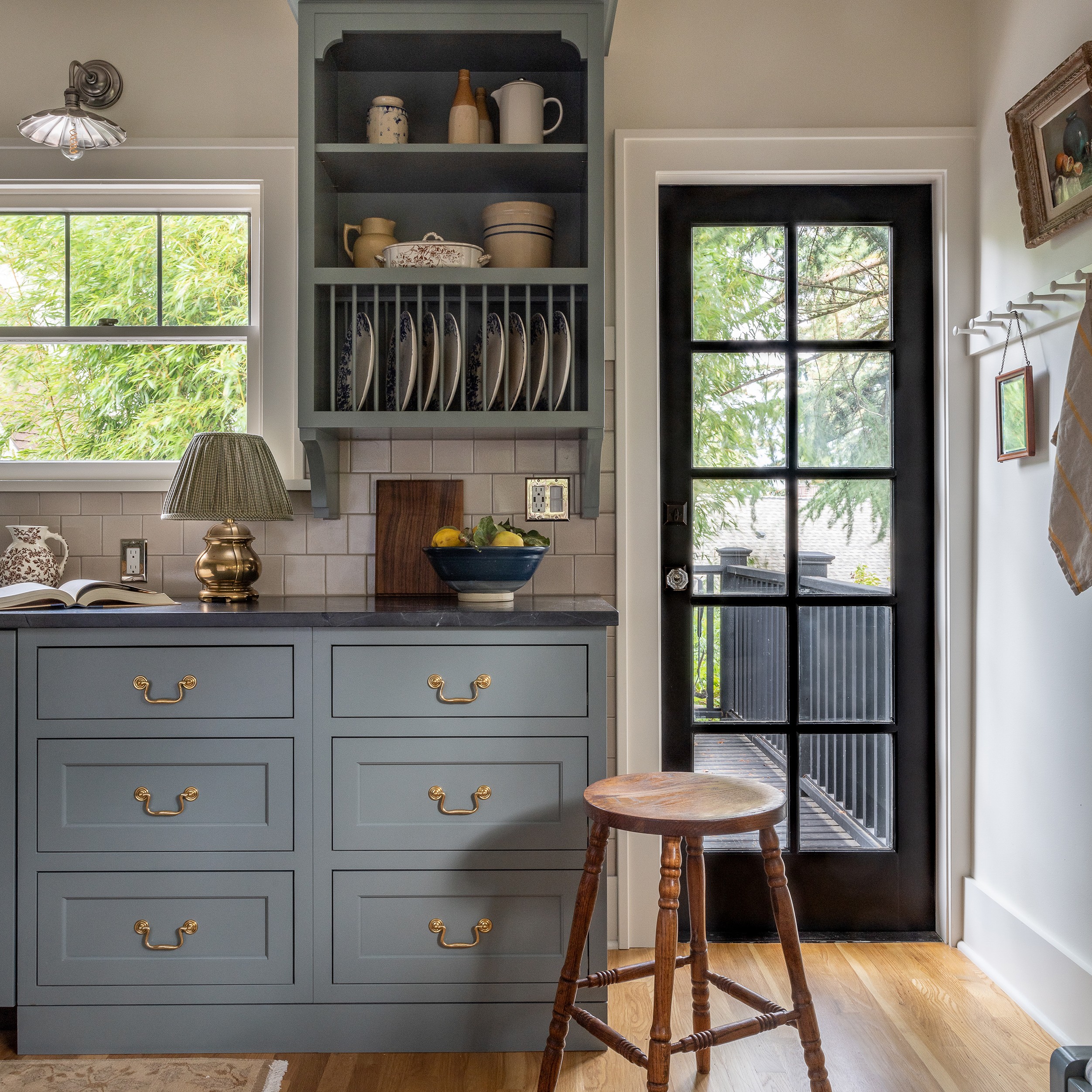
The cabinets. We discussed going semi-custom, but they really wanted to have the built-in, panel-ready appliances, and wanted everything to feel seamless and not super kitcheny. In order to get that look, we had to do the custom cabinets.
The most affordable item in the whole project was the little vintage country dining table. I found it online and it's great because it can be beat up. They can scratch it and not really worry about it getting damaged.
Photography by Lauren Caron; Design by Studio Laloc
The design risk with the biggest payoff
Initially we talked about doing soapstone for the countertops, but the clients were worried about the price point and how it can chip. They asked about Caesarstone, but I'm not a huge fan of manmade stone. I ended up finding a quartzite that was more affordable than soapstone, is going to age well, and won’t chip. It's honed, but it has that leathered finish and it’s the style they were going for. It'll work really well for the family in terms of maintenance and longevity.
Something vintage
In addition to the dining table, I added a lot of vintage accessories. It makes it feel like it’s not a brand new kitchen. It fits the house and it's a little more timeless than big box accessories. It adds a little bit more soul to the kitchen.
The biggest learning
I've learned that you should never put a cabinet at the end of a wall. You should give it at least one or two inches. And I also learned to really push the clients to spend the money on having all their walls, floors, and ceilings plumbed, leveled, and squared, if possible.
Photography by Lauren Caron; Design by Studio Laloc
Photography by Lauren Caron; Design by Studio Laloc
The little detail with a big impact
We definitely wanted inset cabinets. That was the biggest thing to keep the kitchen feeling grounded in that traditional aesthetic. Adding that quarter round detail was really a nice way to soften a standard Shaker front and make it feel a little bit more refined.
I really had to sell my clients on
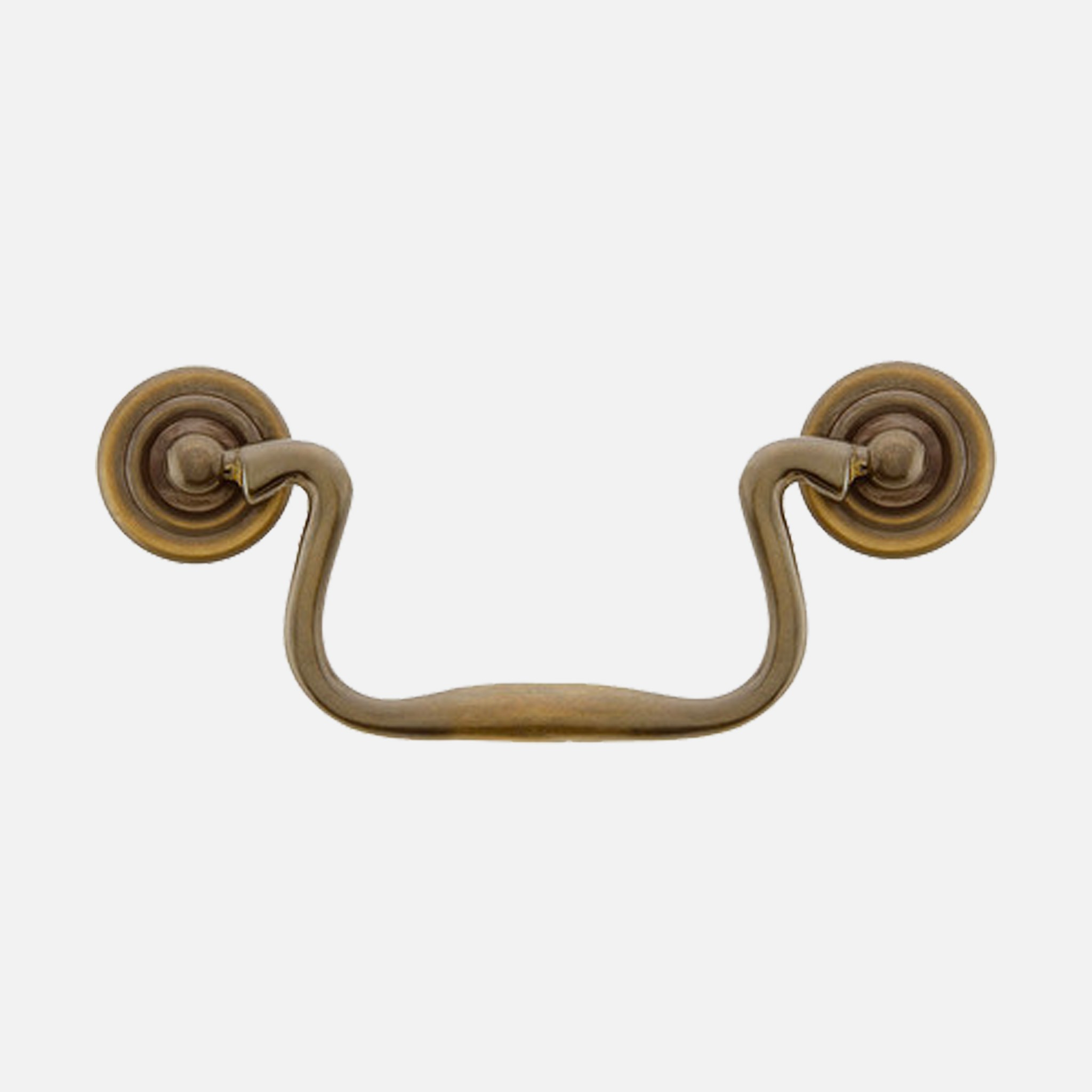
The clients were expecting all brass finishes, but I decided to mix in antique nickel. The light fixtures are antique nickel and we paired them with the unlacquered brass hardware just so the space doesn't feel like it's specific to a certain time and trend. I didn't know if the clients were going to go for it, but they really loved it.
The happy accident
When we were designing the cabinets, I drew up flush toe kicks. But the cabinet maker didn't read my drawings very specifically and he created inset toe kicks. I was really bummed, so we had to add them back with a little bit of a line underneath and it creates a subtle shadow. We also created feet for the refrigerator and the sink area. Those were little design things that came afterwards and that weren't exactly planned, but it's actually a nice extra detail to have that little shadow line under the cabinet.
Photography by Lauren Caron; Design by Studio Laloc
Why this space works so well
It's all very cohesive in color. We made the most of the layout. We didn't bring in a lot of uppers, so the space feels a little larger than it actually is. We maximized the amount of counter space that they could use so it’s really functional.
The final vibe
It's comfortable, it's lived-in, and it's unpretentious.
Want personalized design advice from Studio Laloc? Book a consultation.