Feeling the Blues: Experts Share Their 9 Go-To Paint Colors
Words by Olivia Lidbury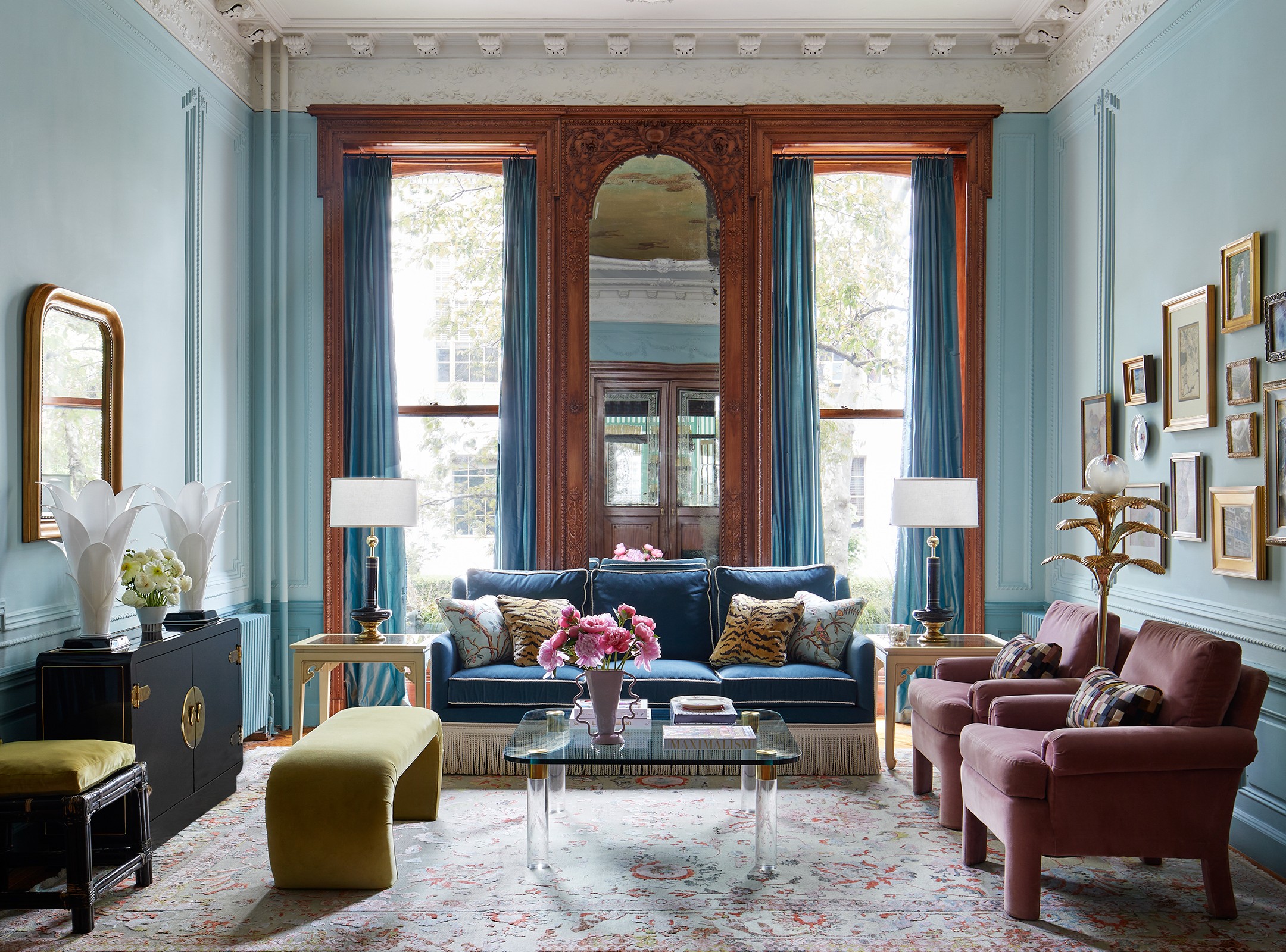
Photography by Gieves Anderson; Design by Nicholas Obeid
Denim, azure, cobalt, navy… there are countless shades of blue.
Optimistic yet calming, it’s a color we are exposed to daily thanks to the seemingly endless sky and vast oceans. But how best to use it within four internal walls?
The wonder of blue is that it’s a classic color that can be used in literally any room. While a pink kitchen can skew trendy and frivolous, Dutch blue cabinets are a timeless choice. It’s also a color to lean into to create a mood: an uplifting shade in a living room will rouse the spirits, while a tempered palette in a bedroom will help soothe you to sleep.
Here, our Experts reveal their go-to blues, from the ultimate shade for cabinetry and trims, to the ideal navy. Just be sure to test out your samples under every variation of lighting—both natural and artificial—as in a north-facing room, your favorite blue might end up looking positively gray.
For a blue with zest
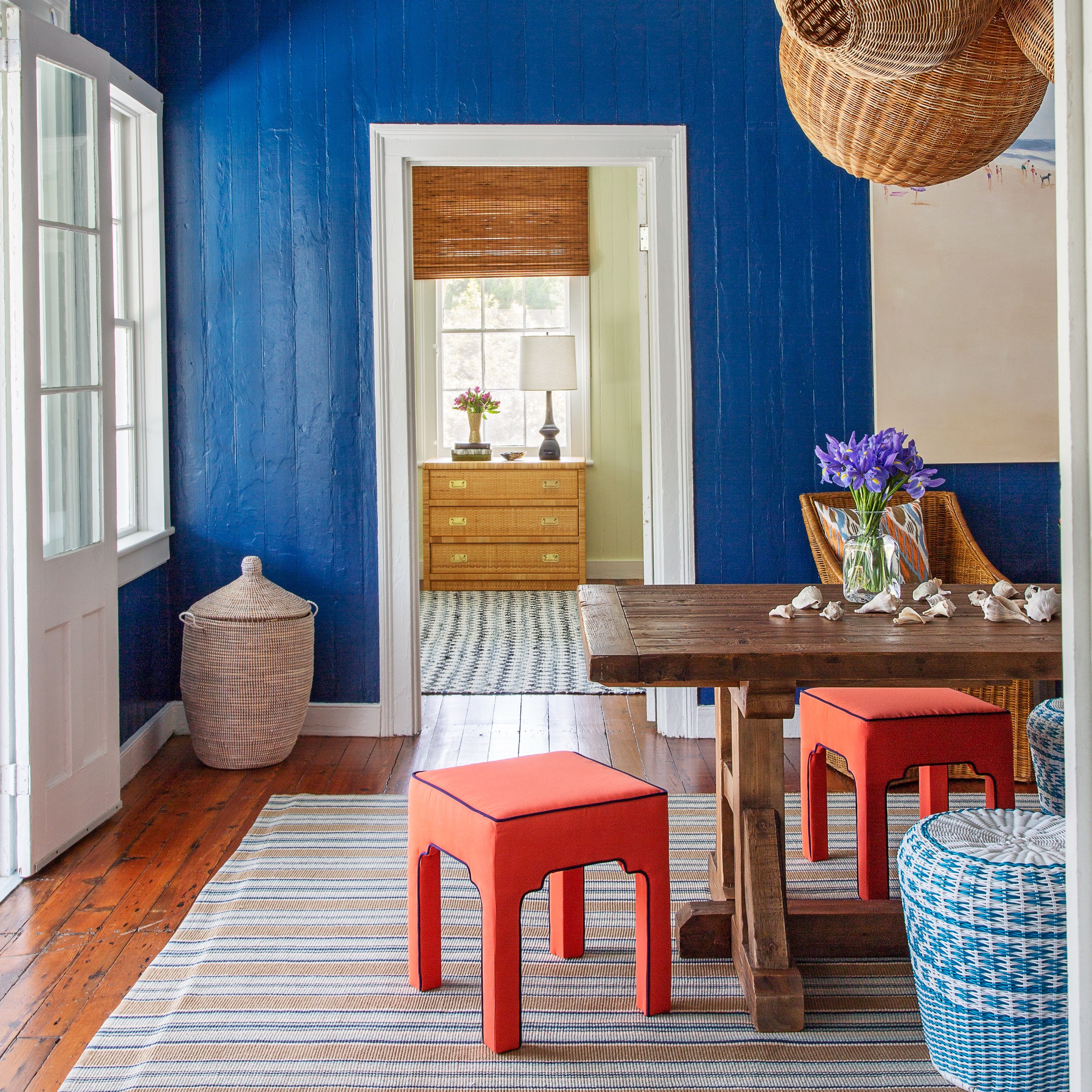
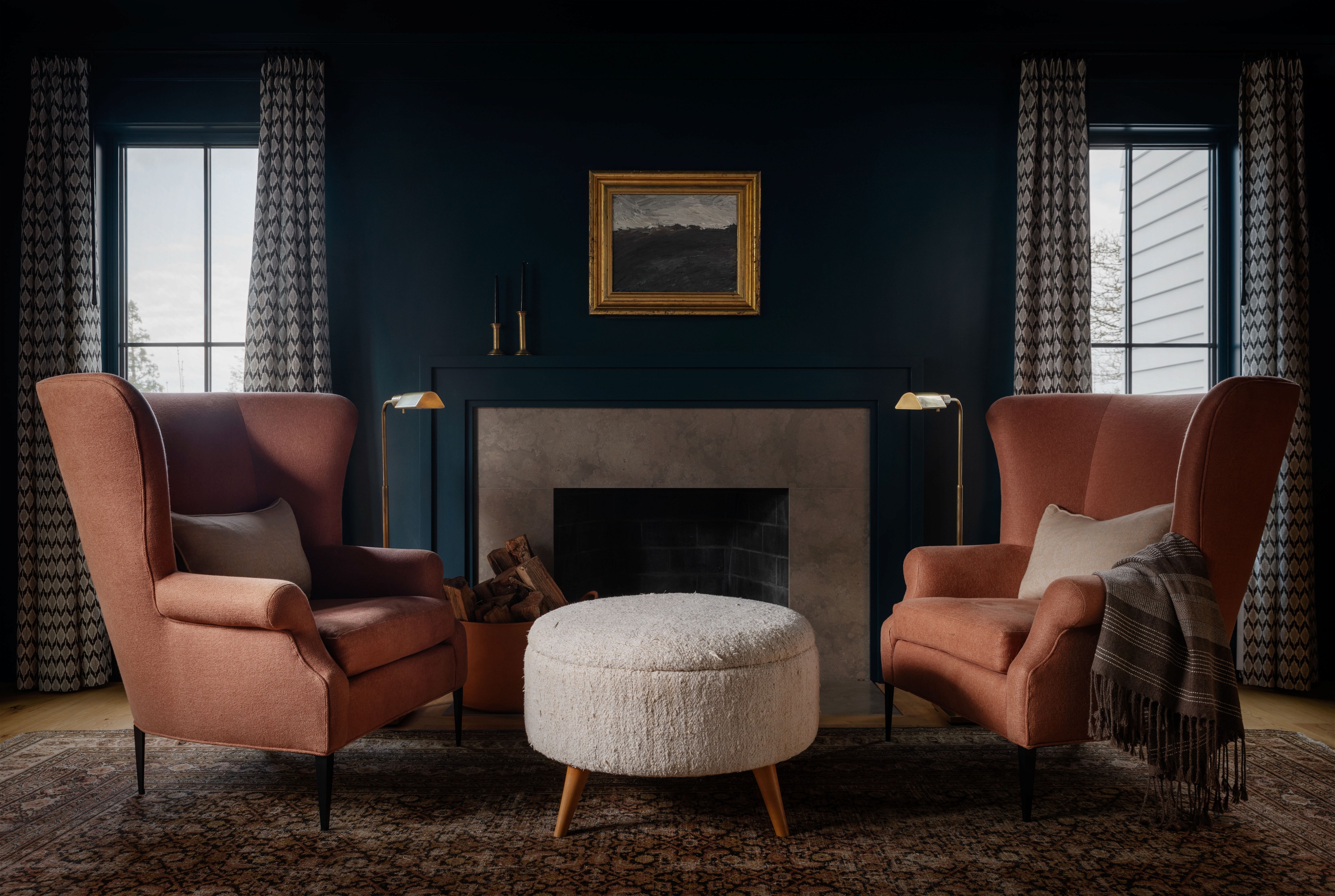
“Champion Cobalt by Benjamin Moore adds so much energy to a room. I selected this particular shade for a beach house entryway because it still reads as blue once the sun goes down, whereas most saturated blue colors, such as navy, turn black after sunset.” — Kevin Isbell

For a chalky tone
“De Nimes by Farrow & Ball is a warm, chalky blue that has enough depth to make a room feel saturated but it’s not so deep that it feels oppressive and heavy. The chalkiness also brings a level of casualness.” — Zoe Feldman
For a reliable navy
“Hale Navy by Benjamin Moore is my much-loved default when clients ask for a navy paint color. It’s always great in a kids’ bedroom or on cabinetry.” — Lisa Staton

Photography by Aaron Leitz; Design by Lisa Staton Design
For a graceful blue
“I recently paired Light Blue 22 by Farrow & Ball with silk grasscloth in a bedroom and the effect was ethereal.” — Nicholas Obeid
For the fifth wall
“Lulworth Blue by Farrow & Ball is my go-to blue when I want to add a little drama on the ceiling. It works well at the beach or in the city and really pops when offset with a crisp white trim.” — Kevin Isbell
For an elegant emphasis
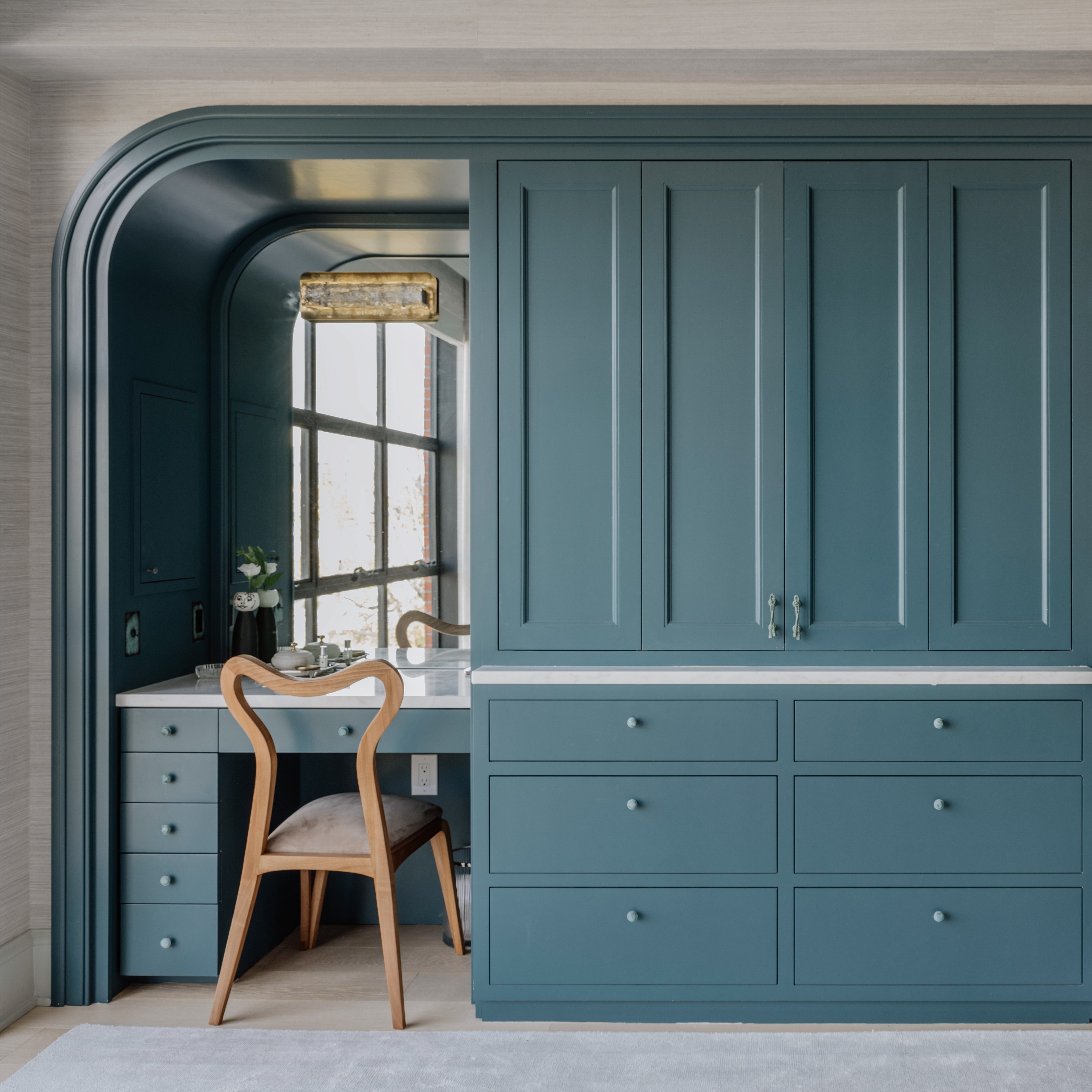
“Benjamin Moore’s Van Deusen Blue is crisp and classic. This is a go-to blue for mudroom cabinetry and custom millwork features throughout a house.” — Lisa Staton

Photography by Max Burkhalter; Design by Zoë Feldman Design
Photography by Stacy Zarin Goldberg; Design by Zoë Feldman Design
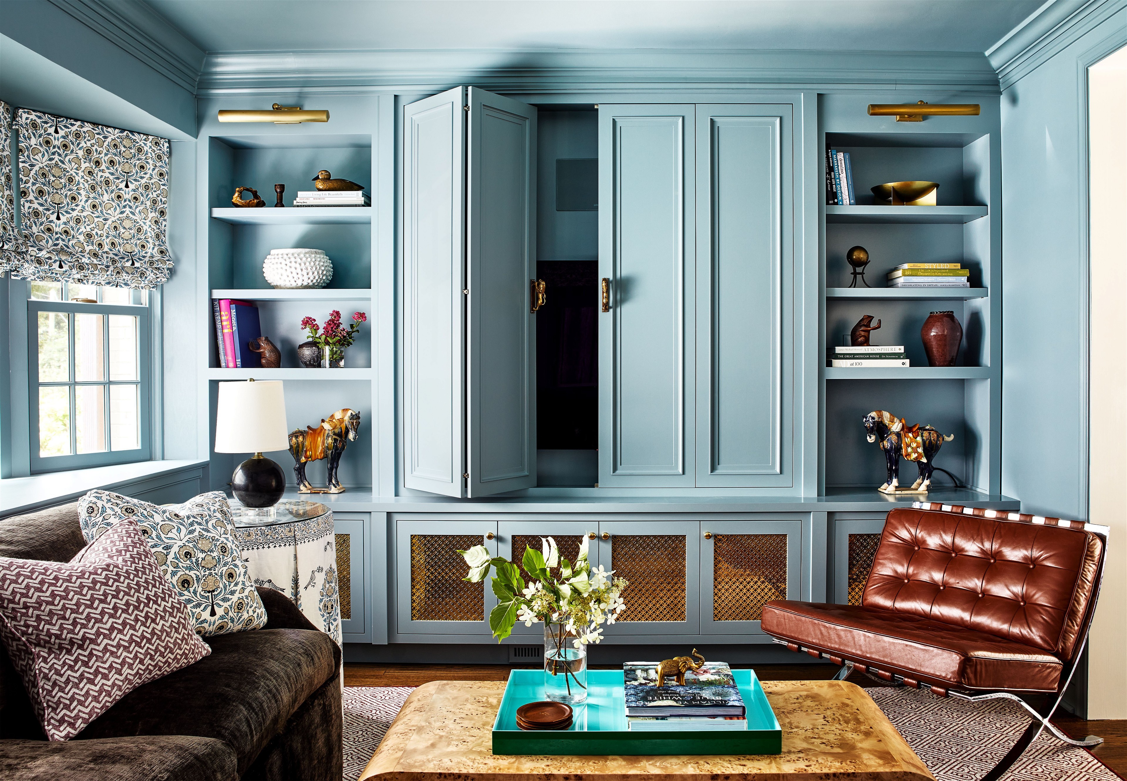
For a commanding accent
“Stone Blue by Farrow & Ball looks beautiful painted on furniture, walls, and millwork. It really commands the room so I enjoy mixing with neutrals, russets, and ochres.” — Zoe Feldman
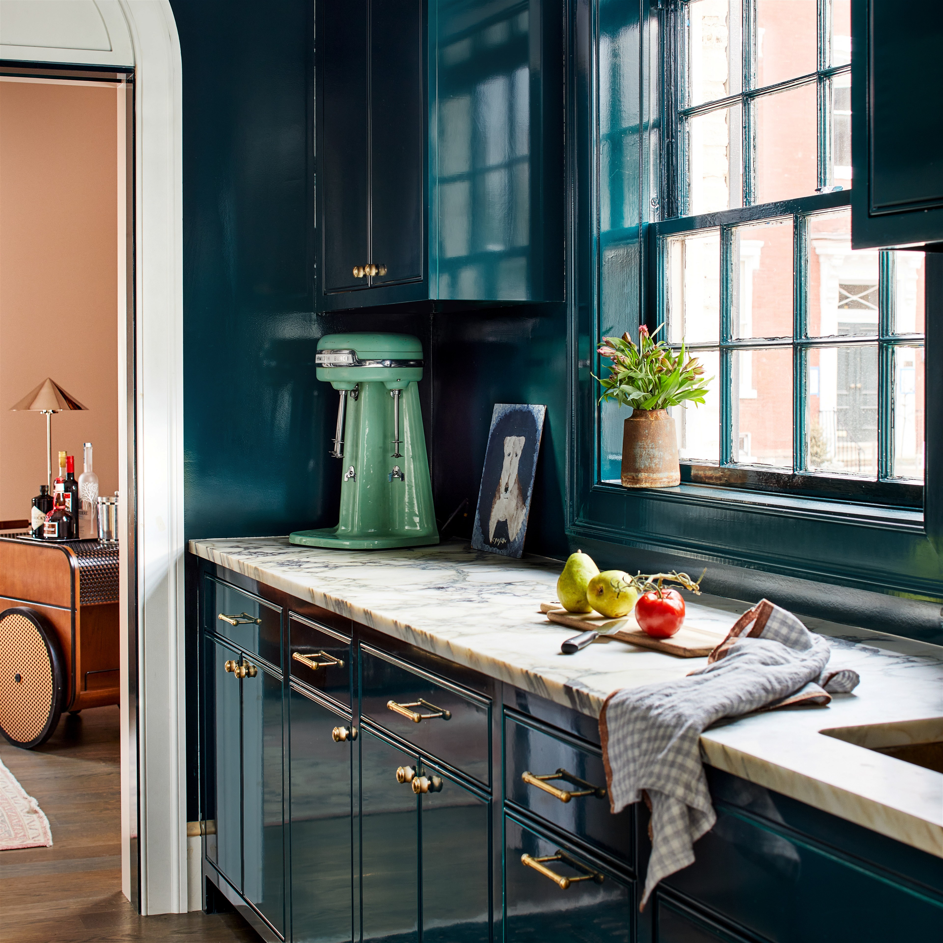
For a touch of opulence
“Venezuelan Sea" by Benjamin Moore is a deeply saturated blue that rides a fine line between aqua and peacock depending on the light. Not for the faint of heart, this intense shade is best reserved for transitional spaces such as vestibules or wet bars.” — Kevin Isbell

For refined millwork
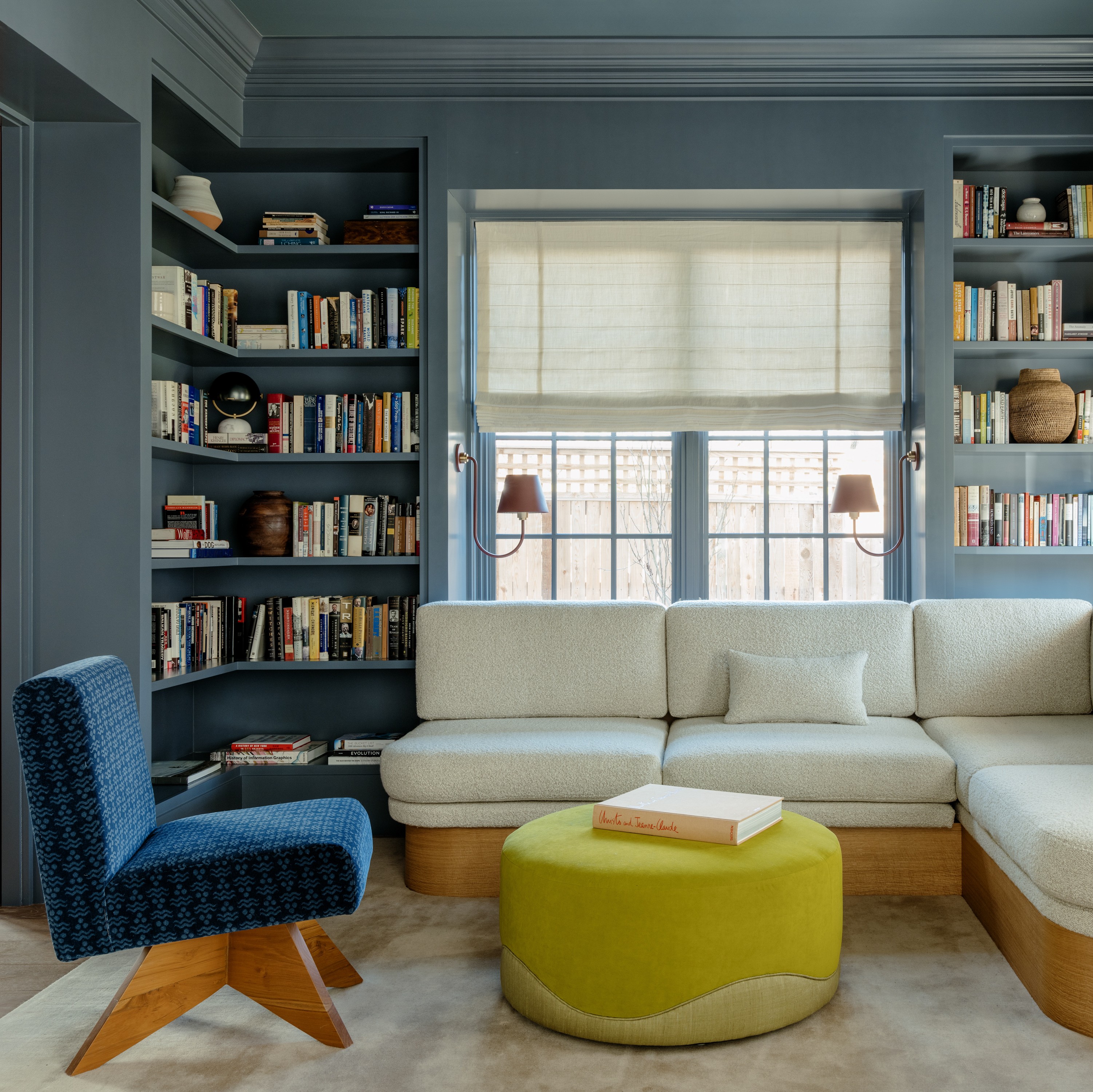
“Farrow and Ball’s Hague Blue is deep, rich, and enveloping. This shade is great in a library or on kitchen cabinetry. I love its depth and its soothing quality.” — Lisa Staton

Photography by Stacy Zarin Goldberg; Design by Zoë Feldman Design