Our Experts’ Go-To Brown Paint Color (Plus 12 More Hues They Love)
Words by Kate McGregor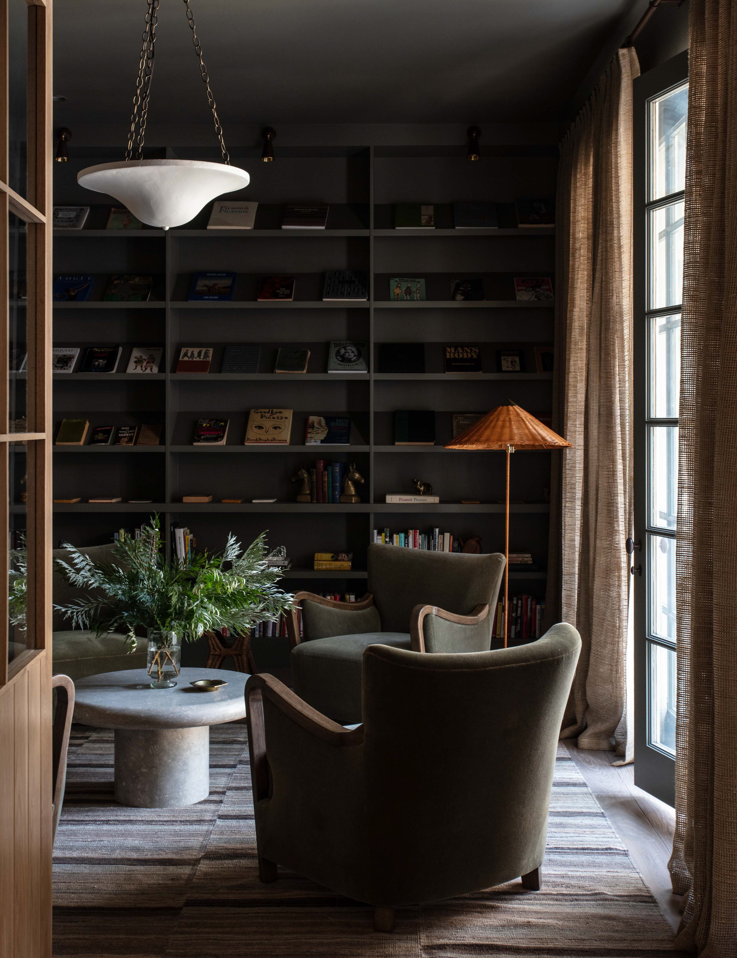
Photography by Michael Clifford; Design by Jake Arnold
Brown is anything but boring.
Flashbacks of 1990s minimalist beige or the mid-aughts’ rich chocolate era may come to mind, but the designer-favorite shade is having a renaissance—just ask Vogue—and it goes deeper than khaki or tan.
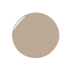
Take Tanner’s Brown by Farrow and Ball which repeatedly came up when we polled our database of Experts. A softer alternative to other dark hues, Becca Casey of Becca Interiors says, “it’s great when you don’t want to commit all the way to black.”
It doesn’t have to be all dark and dramatic, though. When used correctly, brunette hues pale caramel to rich mahogany can infuse any room with warmth and depth—and these Experts have you covered with the best brown paint colors to consider for your next project.
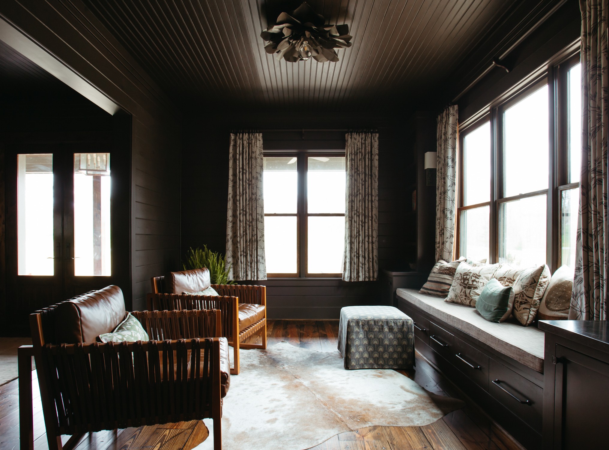
Photography by Kristin Karch; Design by The Misfit House
For Setting the Mood
“Full of depth, Benjamin Moore’s Midsummer Night has a chameleon nature that allows it to shift according to its surrounding textiles and exterior views. It’s a great choice for creating a moody room, as long as it gets plenty of natural light.” —Monica Stewart, The Misfit House

For A Hand-Painted Look
“Fairview Lime Wash from Portola Wash is a subdued truffle shade that has an earthy, textured finish.”—Becca Casey, Becca Interiors
Photography courtesy of Alice Grace
For Added Intensity
“Salon Drab by Farrow & Ball is a gorgeous rich shade. I love the clash of browns with reds so in one project, I paired it with a patterned red and white wallpaper to add depth and contrast. The stronger tone served to intensify that effect.” —Alice Grace, Alice Grace Interiors

For Keeping it Cool
“Sherwin Williams’s Urbane Bronze makes for a wonderful exterior accent color, pairing perfectly with darkened copper and slate. We also love to use the color indoors on cabinetry when something a little warmer and softer than black is desired.” —Monica Stewart, The Misfit House

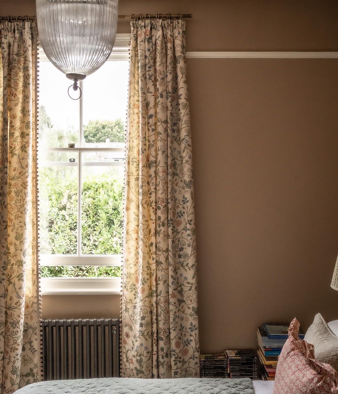
Photography courtesy of West of Main
For the Dark but Never Dim
“In some spaces, Tanner’s Brown from Farrow & Ball can come off as a warm black because of its depth and richness. We love this color on millwork or woodwork in a historic home. A small powder room would be amazing too, creating a super moody vibe.” —Sascha Lafleur, West of Main

For a Hint of Pink
“We used Farrow & Ball’s Smoked Trout in a west facing bedroom to create a cozy and warm space that exudes a feeling of calm. Our client wanted something that embraced her at the end of a busy day. It pairs beautifully with warm pinks too.” —Alice Grace, Alice Grace Interiors
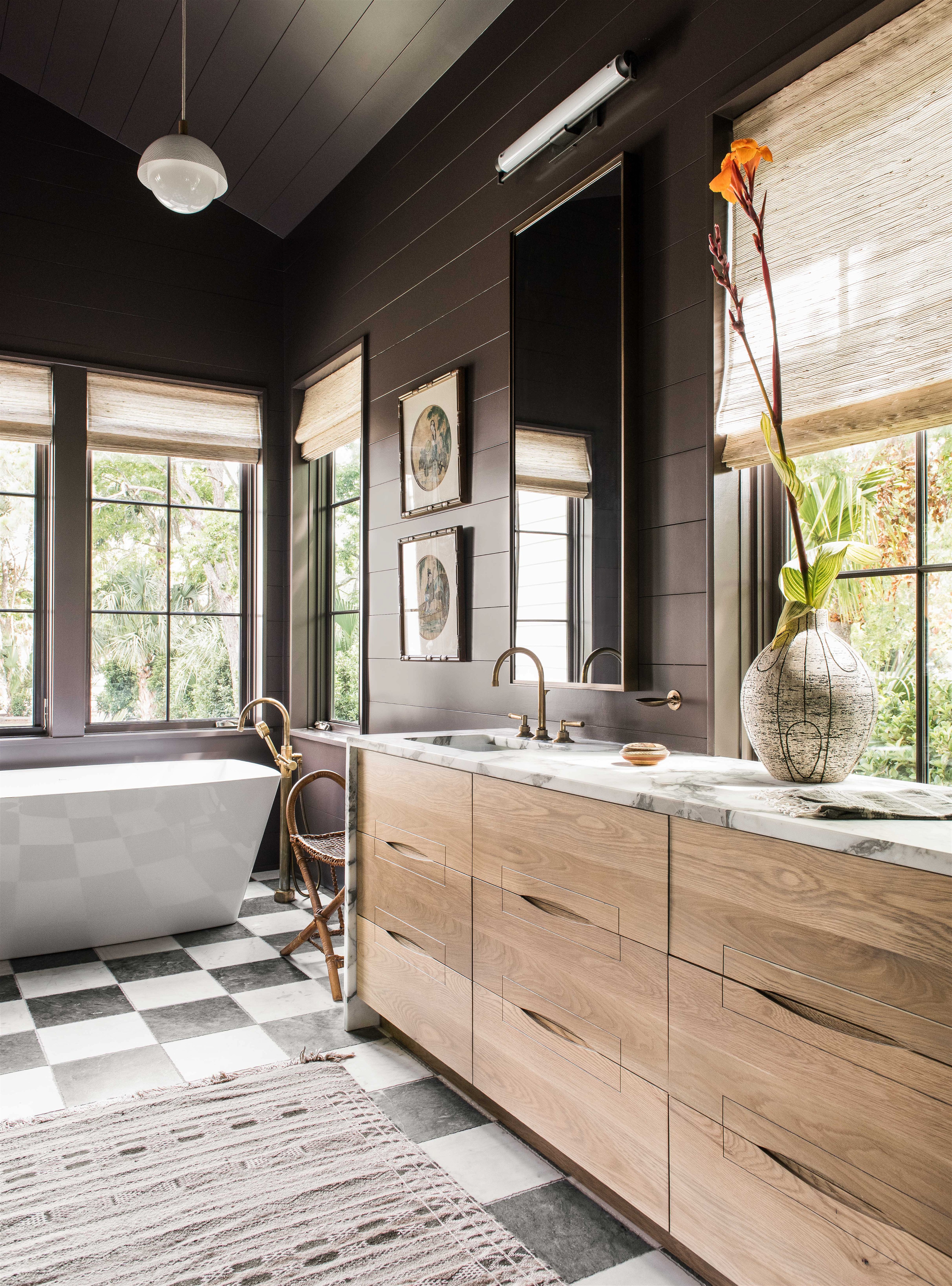
Photography by Katie Charlotte; Design by Cortney Bishop Design
For Vibrant Woodwork
“A deep bronze that looks killer on interior doors and cabinets is Kelly Wearstler’s Tar for Farrow & Ball.” —Courtney Bishop, Courtney Bishop Design

For Adding Some Warmth
“A medium caramel brown, like Coriander Seed from Benjamin Moore, exudes warmth and plays well with other earthy colors and wood tones. It’s perfect in a kitchen because it looks delicious and feels inviting, encouraging those to savor a meal and linger.” —Monica Stewart, The Misfit House
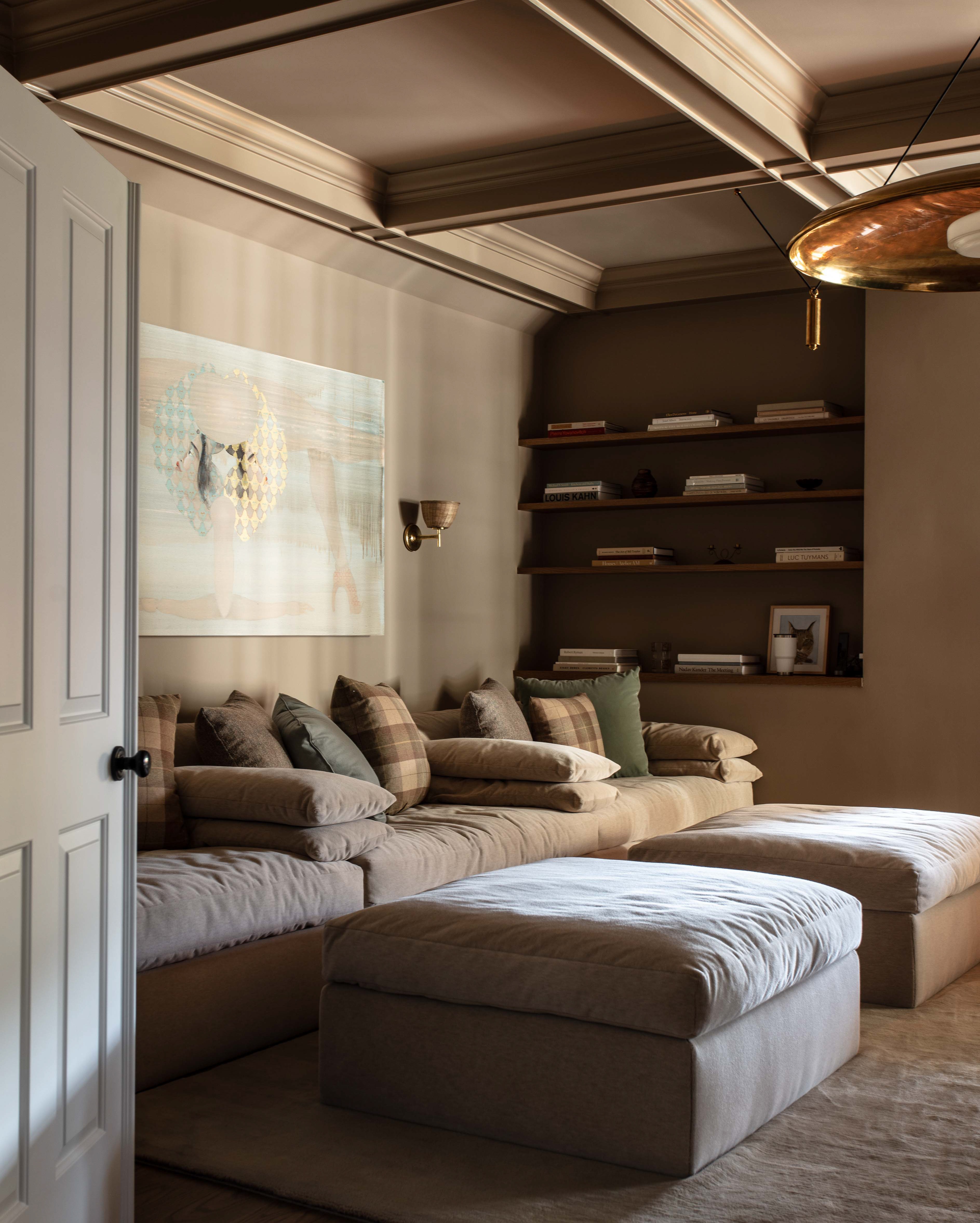
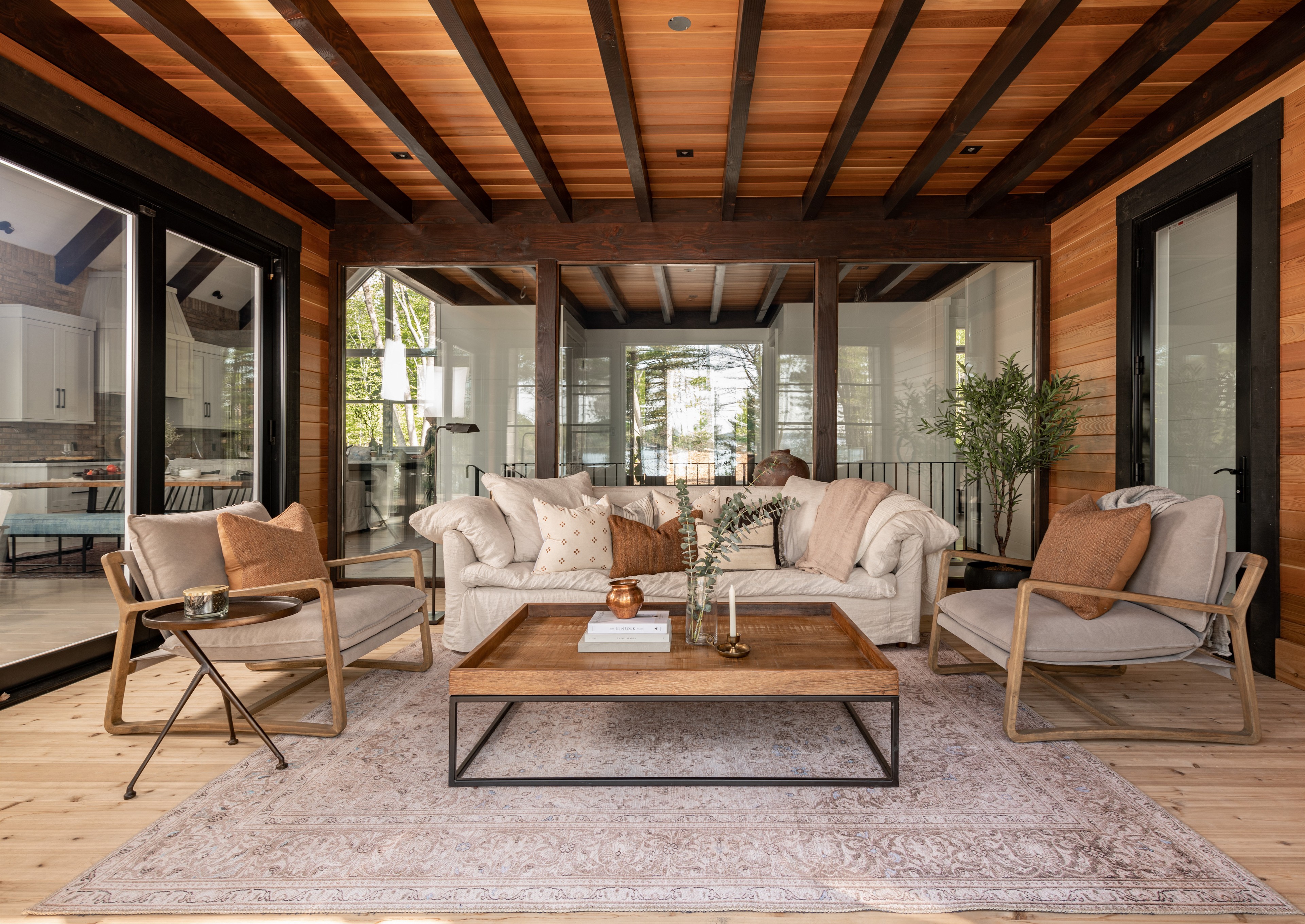
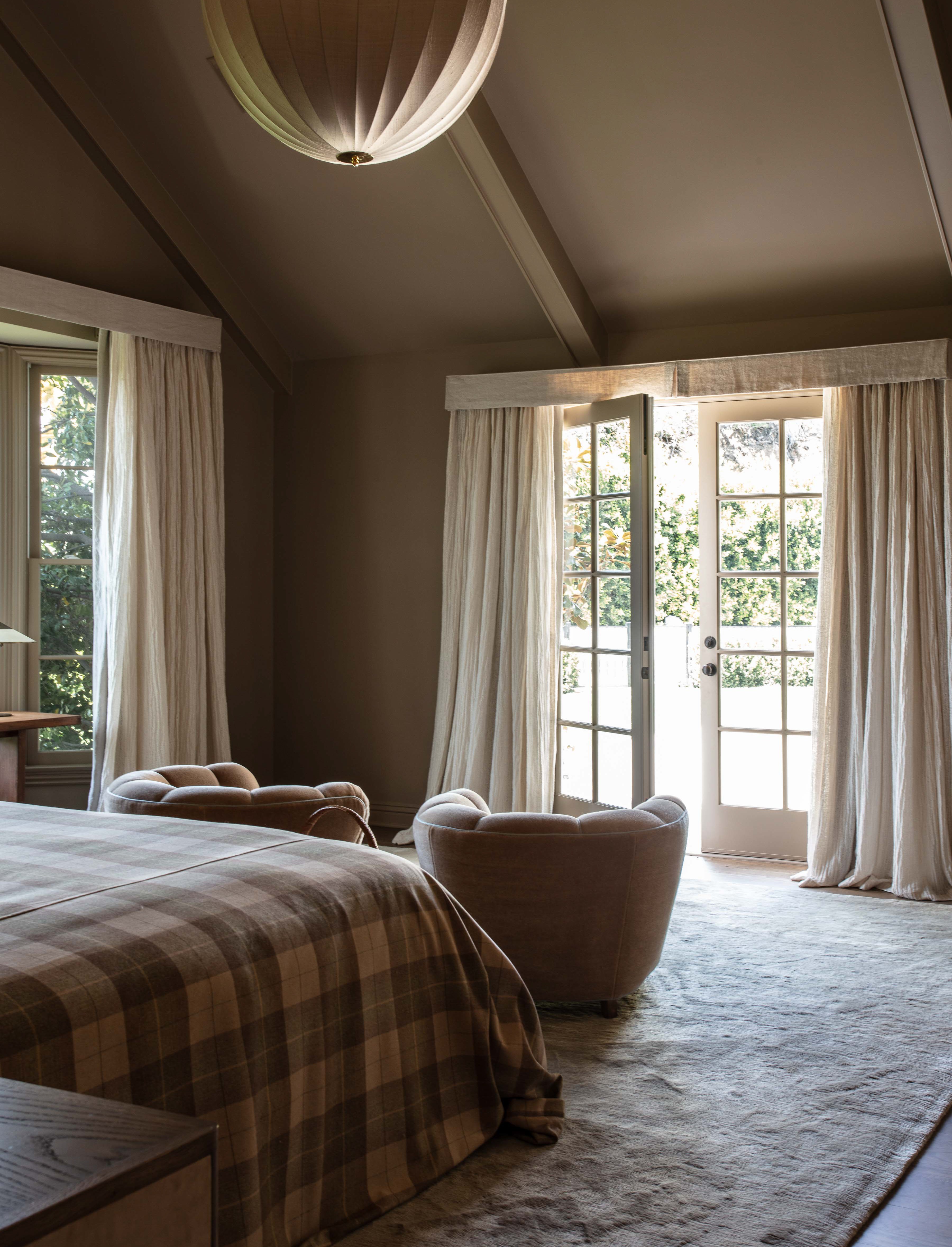
Photography by Michael Clifford; Design by Jake Arnold
For a Subtle Shift
“My motto is always brown, never gray. Shades of brown bring about warmth, earthiness, and calm, which feels timeless and grounding. Farrow & Ball London Stone is a perfect example of that.”—Jake Arnold
For Going All In
“We love the idea of Tarpley Brown by Benjamin Moore in a den, home office, or bedroom where you can apply it on the walls, trim, and ceiling to be enveloped in its richness. Paired with a natural white oak floor, flax-colored linens, reclaimed woods, and gilded accents would be so rich!” —Sascha Lafleur, West of Main

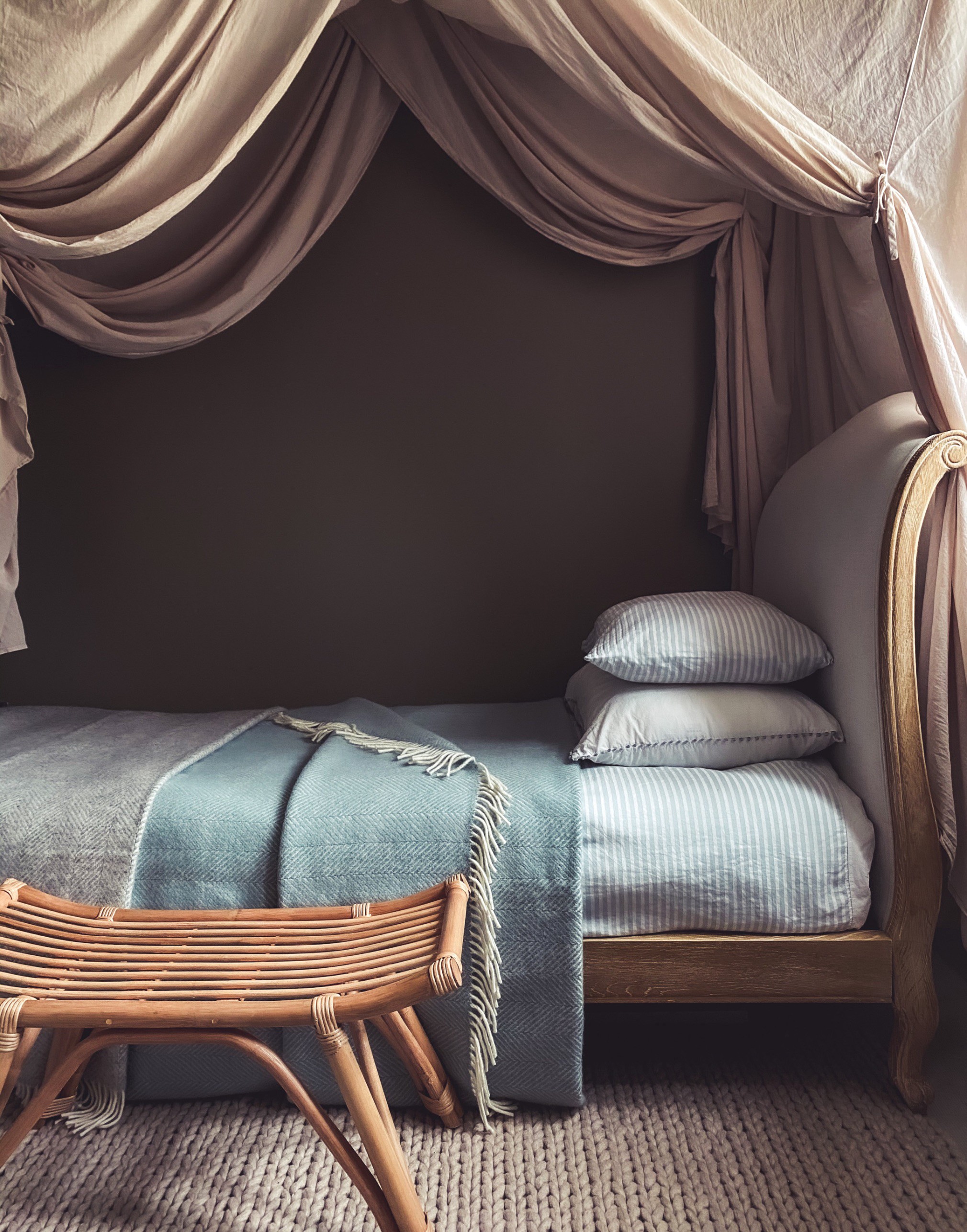
Photography courtesy of Alice Grace
For Quiet Corners
“We used Mouse’s Back by Farrow & Ball in an underlit alcove to provide a lovely traditional and muted accent color to compliment the earthy tones of adjoining spaces. The hue is the perfect choice for a darker alcove which doesn’t want to feel cold.” —Alice Grace, Alice Grace Interiors
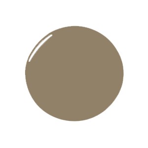
For A Strong Foundation
“Farrow & Ball’s Broccoli Brown is the perfect color for those who fall somewhere in the middle of both warm minimalist and maximalist styles. It provides a lovely complement and base for other pops of color in a space.” —Jake Arnold

Photography by Michael Clifford; Design by Jake Arnold