Know Your Greens: Our Experts Handpick the 18 Best Paint Colors
Words by Olivia Lidbury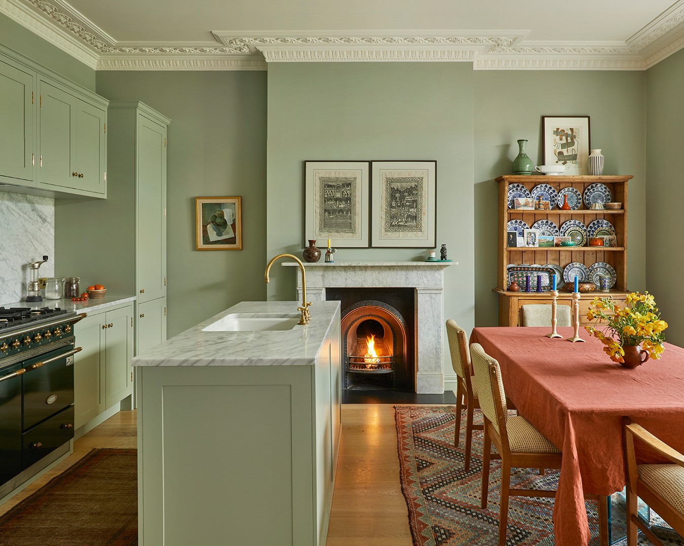
Photography courtesy of Brandon Schubert
Not all green paints are made equal.
Just like the lush palette found in nature, the spectrum ranges from deep forest shades to grassy hues with yellow bases. And then, determined by the light, there’s also those that come with hints of gray or brown.
With so many options, we canvassed our Experts to whittle down the greens they have a soft spot for (spinach excluded). The feedback was as generous as an allotment in spring: “Green is my favorite and I could name so many for a million different reasons,” enthuses Monica Stewart of The Misfit House.
Two brands dominate this list, with Benjamin Moore and Farrow & Ball producing the most desired colors. “I love Farrow & Ball paint because of the beautiful undertones to each color and how the depth can be so rich in different spaces,” explains Tiffany Thompson of Duett Interiors.
Keen to up your greens? Keep reading for the shades to know now.
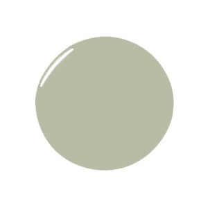
The Most Versatile Greens
Photography by Kristin Karch; Design by The Misfit House
For Multipurpose Appeal
“Bancha by Farrow & Ball has a little bit of brown in it and works really well with other colors. It’s equally suited to a more formal space—like the millwork of a bar—and a kid’s bedroom." —Nicole Salvesen, Salvesen Graham

For a Traditional Feel
“Green Smoke by Farrow & Ball is such a classic color, looks great with every other shade imaginable, and carries the perfect amount of depth and mood without overpowering its surroundings.” —Monica Stewart, The Misfit House

For Bringing the Outside In
“Benjamin Moore’s Backwoods reminds me of the outdoors, especially in Oregon. It’s warm, rich, and feels like a classic green that can go from your kitchen cabinets to an accent wall.” —Tiffany Thompson, Duett Interiors

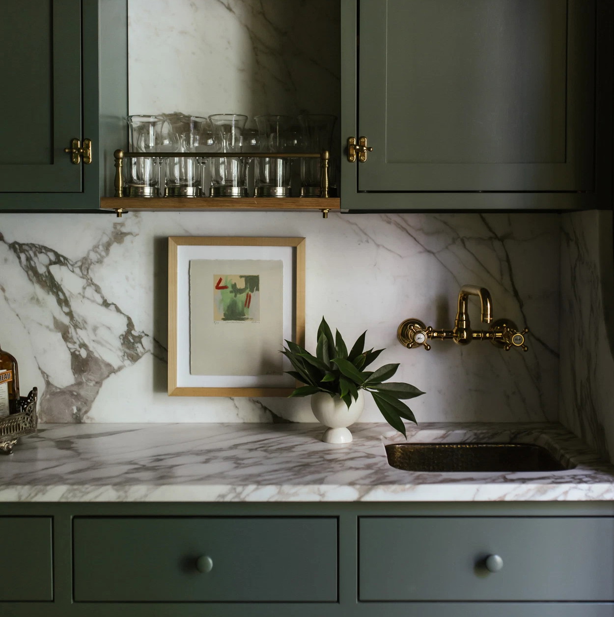
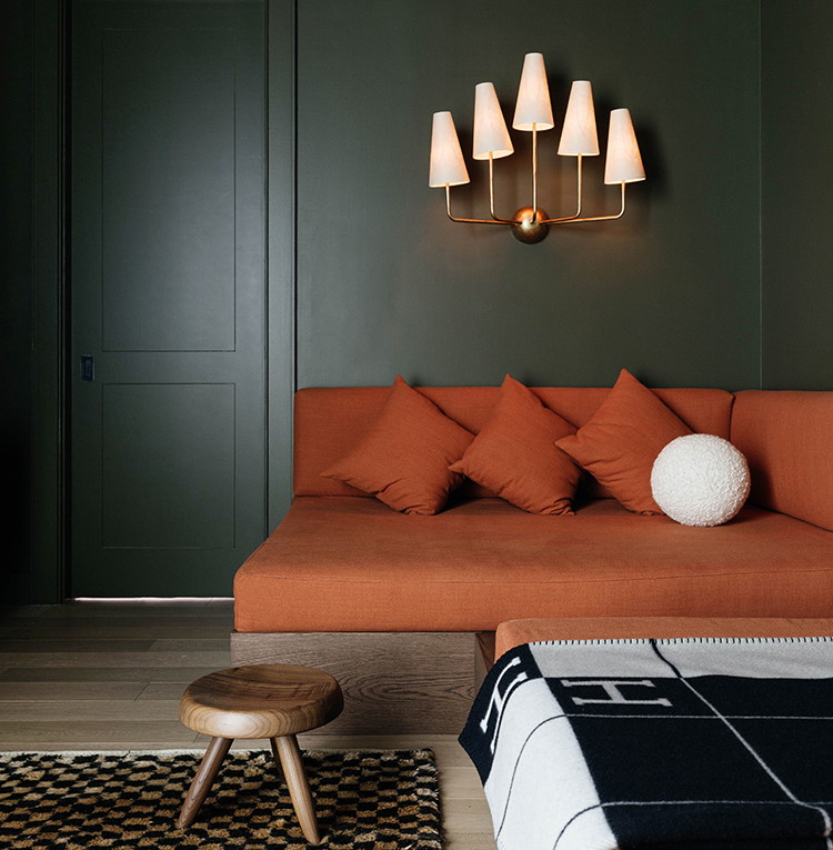
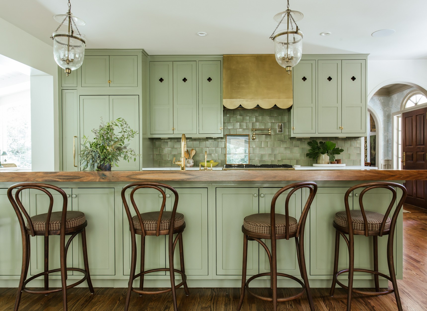
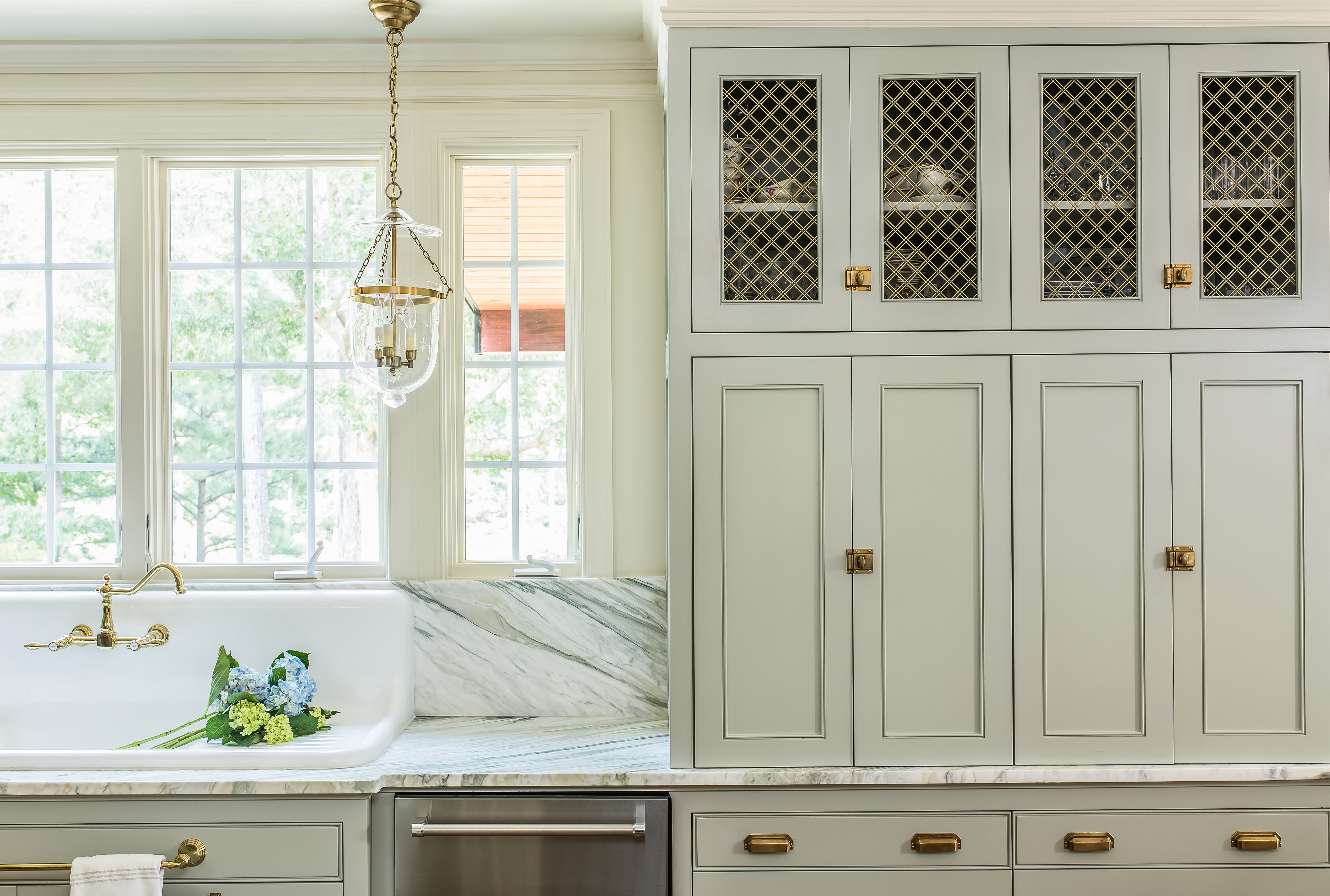
The Most Statement Greens
Photography courtesy of Brandon Schubert
For a Dazzling Kitchen
“Herb Garden by Benjamin Moore is perfectly saturated with enough yellow undertones that it carries a freshness. I like its versatility too: the color is fantastic on walls but I also absolutely love it on cabinetry. I once painted an entire pantry Herb Garden in a very glossy finish, and it felt like being inside of a grassy jewel.” —Noz Nozawa

For That Spirited Touch
“I love Breakfast Room Green by Farrow & Ball. It's super vibrant and fun. I think it's great for millwork or walls. I would put it in an entry or dining room.” —Tali Roth
For a Lively Accent
“Pea Green from Little Greene is a joyful pop of color that makes me happy to use. It’s quite intense so may not be right for every space, but it works really well as a trim or accent color.” —Brandon Schubert

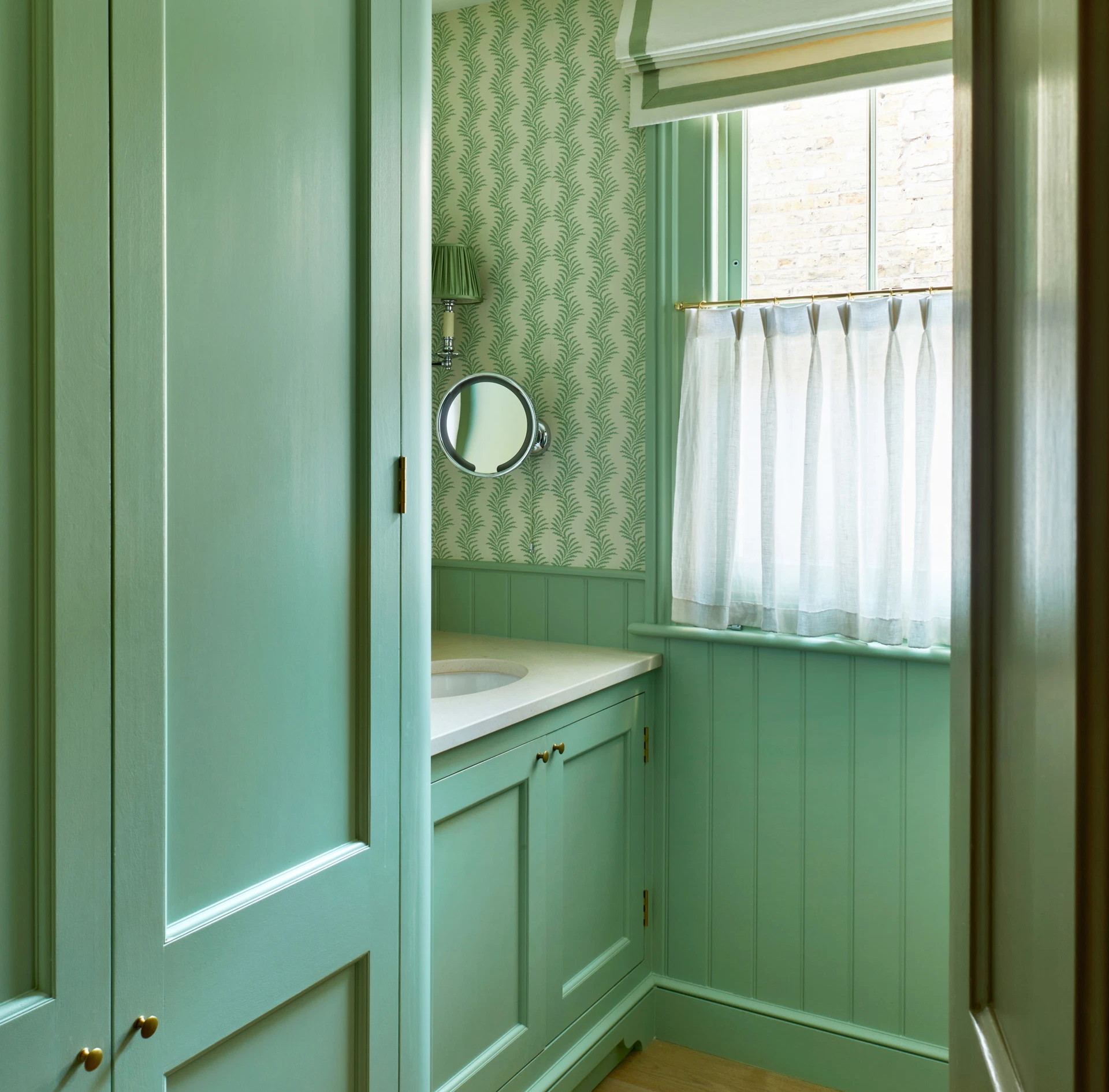
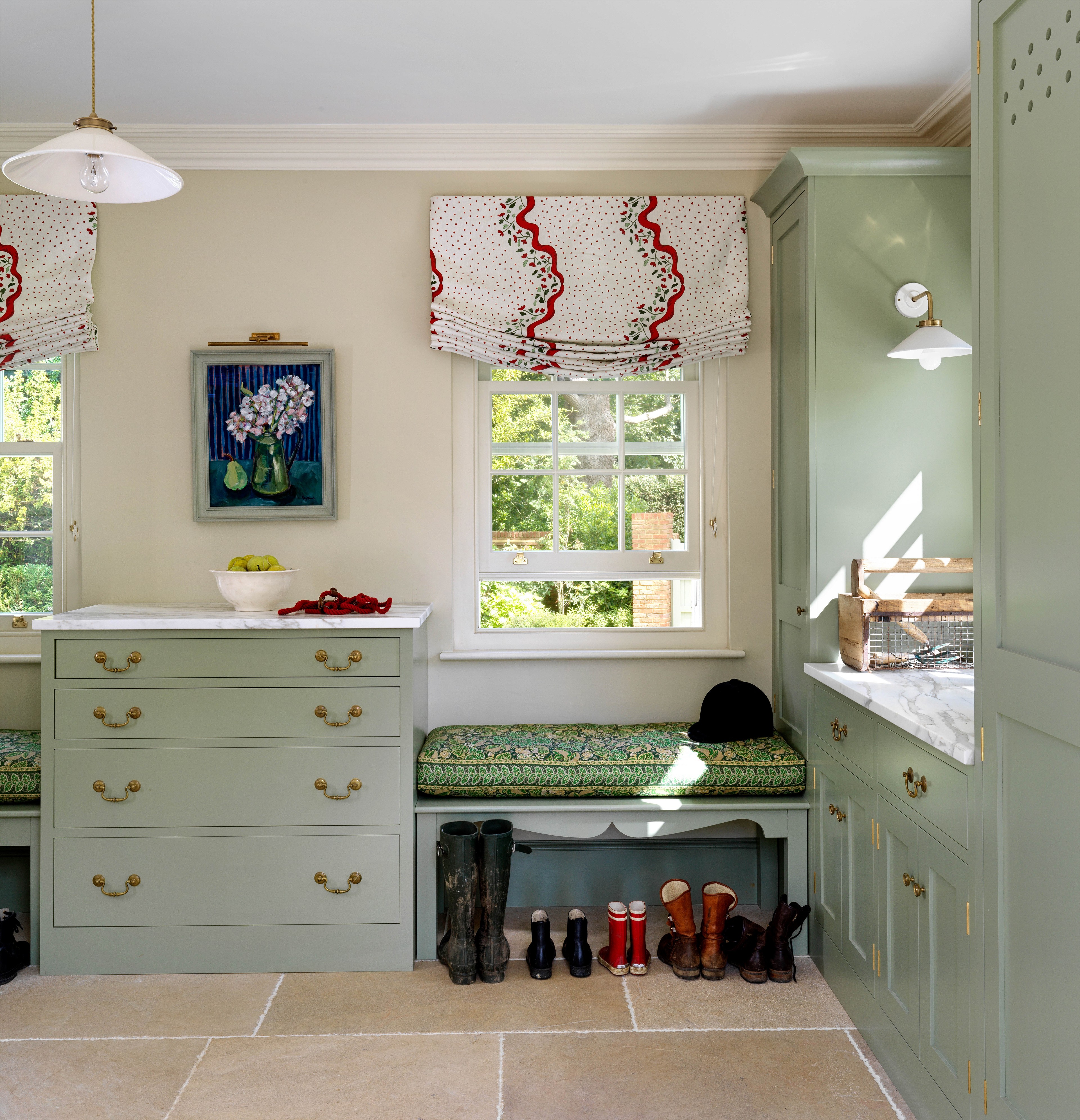
The Coziest Greens
Photography by Nick Glimenakis; Design by Tali Roth

For Snug Spaces
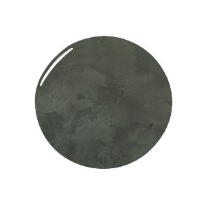
“Castle Gray is a Farrow & Ball archive color. We used it in the sitting room of our old flat in London and it was such a warm and cocooning space. It’s a dark greeny-gray that makes a wonderful background to art and brown furniture.” —Brandon Schubert
For Unrivaled Comfort
“I used Benjamin Moore’s Van Alen Green in a guest room in my old house in East Hampton. It’s so fresh, surprisingly cozy, and great for the country. Everyone always loved staying in this room.” —Patrick McGrath

The Most Intense Greens
Photography by Kristin Karch; Design by The Misfit House
For a Little Opulence
“Nitty Gritty by Portola Paints is a deep, smoky rich green which is great if you want to create a moody space. Consider this for a small powder room or a bar area and if you are bold enough, use this color in a bright bedroom to juxtapose the light. It can make a huge impact in unexpected areas.” —Tiffany Thompson, Duett Interiors
For Chameleon Spaces
“Calke Green from Farrow & Ball is one of the rare colors that can be both dark and happy at the same time. When I was young, my favorite Crayola color was called Forest Green, and this is the paint color that gets closest to it!” —Brandon Schubert

For Delicious Kitchens
“Benjamin Moore’s Forest Green is a really durable, earthy color. In my old Hamptons kitchen, we used it for the island as a contrast, and to nod to the antique faience pieces that also lived in the room.” —Patrick McGrath

The Most Calming Greens
Photography by Rachael Levasseur; Design by The Misfit House
For Sweet Dreams
“My latest obsession has been Farrow & Ball’s Mizzle. It’s a soft green that works nicely in a nursery or a bedroom because of the color’s inherent calmness. It feels like a beautiful balance color while still being neutral.” —Tiffany Thompson, Duett Interiors

For a Serene Vibe
“Ball Green by Farrow & Ball is a restful green for woodwork that wants to be interesting but not overly impactful." —Nicole Salvesen, Salvesen Graham

For Relaxed Vibes
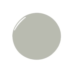
“Barely green, Gray Horse by Benjamin Moore works like a charm every time. Even though it’s very light, it’s never pastel or nursery feeling. It’s as lovely in a formal dining room as it is on bathroom cabinetry.” —Monica Stewart, The Misfit House
The Only-Just Greens
Photography by Simon Brown; Design by Salvesen Graham
For Vintage Glamour
“There's something both very vintage and very now about Benjamin Moore’s Webster Green. This hue leans slightly blue, which feels nostalgic, partly because it pairs very nicely with rich, warm woods that I associate with Art Nouveau and late '70s interiors.” —Noz Nozawa

For Blissful Bedrooms
“Blue Gray by Farrow & Ball might have blue in the name, but I definitely find it to be green at heart. It’s the perfect shade of celadon and you can use it in the same way you would an off-white. It has just the right amount of richness to warm up a room and it changes beautifully between sunrise and sunset.” —Brandon Schubert

For a Warm Welcome
“We matched a Voutsa wallpaper with Farrow & Ball’s Farrow & Ball Vert de Terre for the entrance of a project in New York City. It turned out so beautifully—I love how it’s sort of natural-looking and changes color throughout the day.” —Patrick McGrath