From Mustard to Mellow: Experts Dish on the Best Shades of Yellow
Words by Olivia Lidbury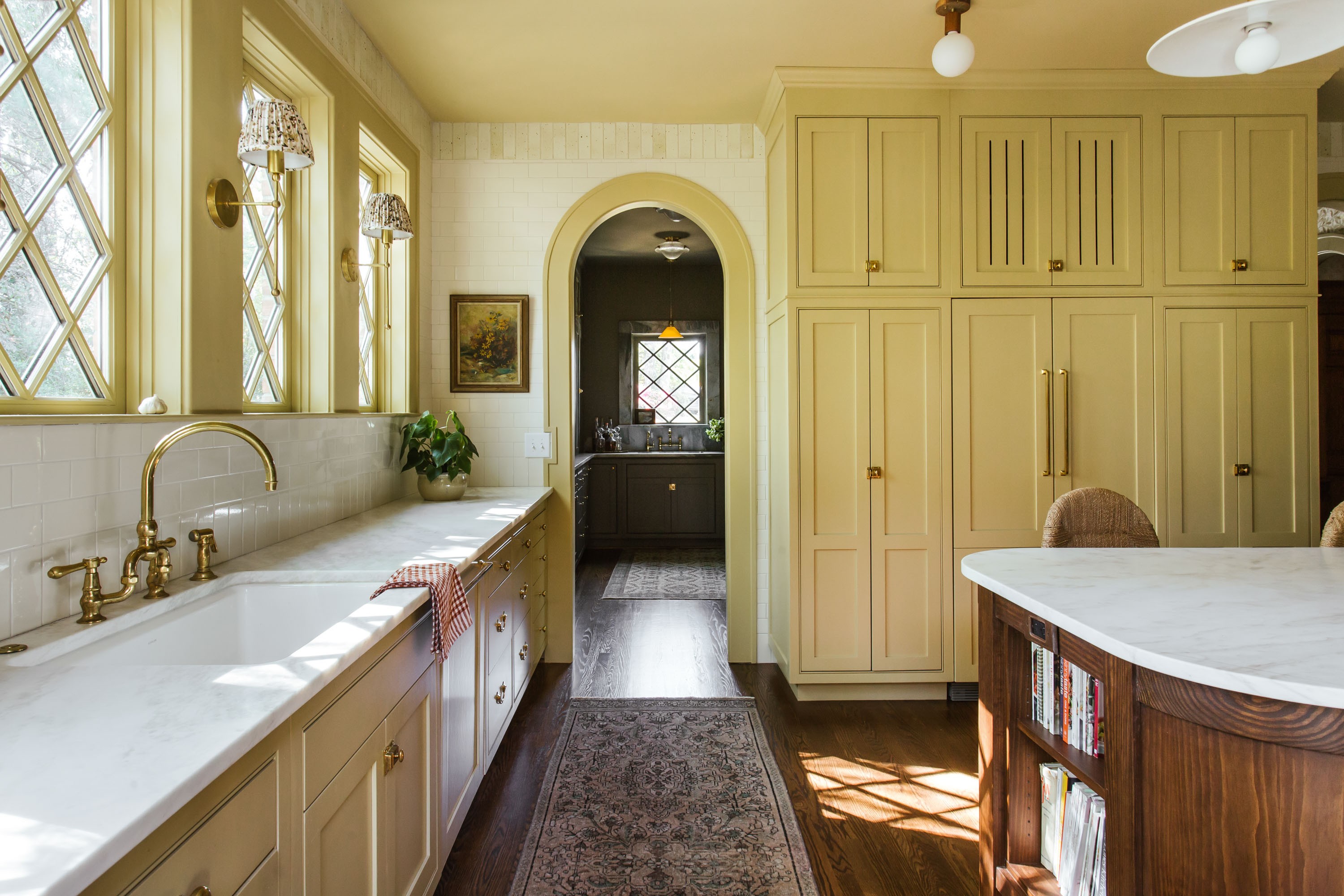
Photo courtesy of The Misfit House
Everyone has a soft spot for yellow.
“The legendary, late interior designer Albert Hadley once said that every room needs a little yellow, and I couldn’t agree more,” says Expert Whitney McGregor. “It's the happiest color—like a warm hug!”
The trick is finding the perfect shade: not too brash, not too kindergarten, and just the right side of sunny. Hit the palette jackpot and you’ll be rewarded with not just an uplifting space, but an enduring one. “Yellow is extremely timeless, most historic houses I’ve toured have the most beautiful golden trim,” says Monica Stewart of The Misfit House.
There’s a yellow for every setting. Here, our Experts dish on the best yellow paint colors, including the perfect one to pair with brass, and the ultimate bright sunshine hue.
The Mellowest of Yellows
For a Serene Sanctuary
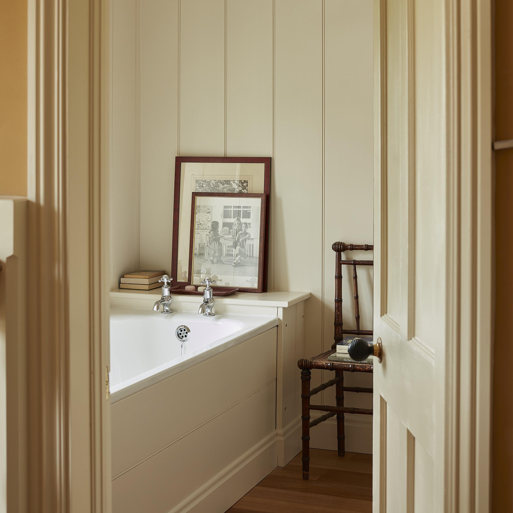
“In this bathroom, Weston Flax by Benjamin Moore was almost an exact match for the yellow shower tile we used and it came out beautifully.” —Ashley Montgomery

For Elegant Millwork
“Late Wheat by Benjamin Moore is the softest of yellows: perfectly neutral, cheerful, enveloping but not overpowering. I would use it on cabinetry and trim.” —Monica Stewart, The Misfit House

For the Joyful Everyday
“Farrow’s Cream by Farrow & Ball is just saturated enough to give you the warmth and joyfulness that a yellow brings to a space without overpowering it. You can almost treat it as a neutral in your palette. We used this for a kitchen and it’s sublime, it truly does make you feel happy.” —Ashley Montgomery

The Most Ambient Yellows
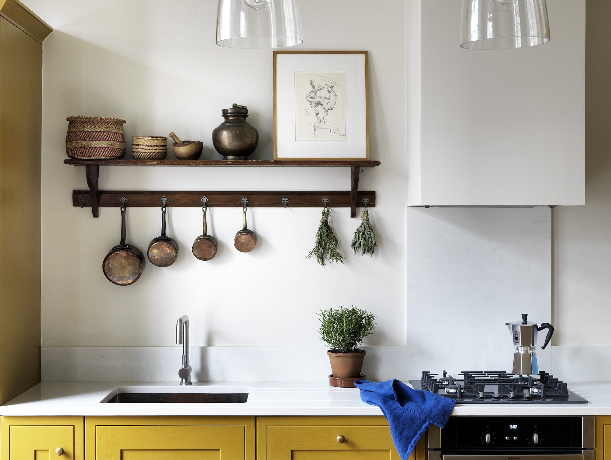
Photo by Simon Brown; Design by Lonika Chande
For A Dash of the Unexpected
“Muga by Paint & Paper Library is quite an unexpected color for a kitchen cabinet—which is perhaps why I like it! It works well in an open-plan living space. I love the warmth that it brings against the more neutral backdrop.” —Lonika Chande

For a Warm Welcome
“I was after an old-fashioned tobacco shade and Trumpington by Edward Bulmer is a color which was mixed especially for a project. It has since been added to the collection and I’ve used it several more times, including in the hall and staircase at my farm in the north of England.” —Rita Konig
Martin Brudnizki has also picked Trumpington for the walls of & Objects, his new product and design studio in London: “It has a lovely earthy quality to it which adds a level of intrigue whilst feeling neutral enough.”

For Versatility
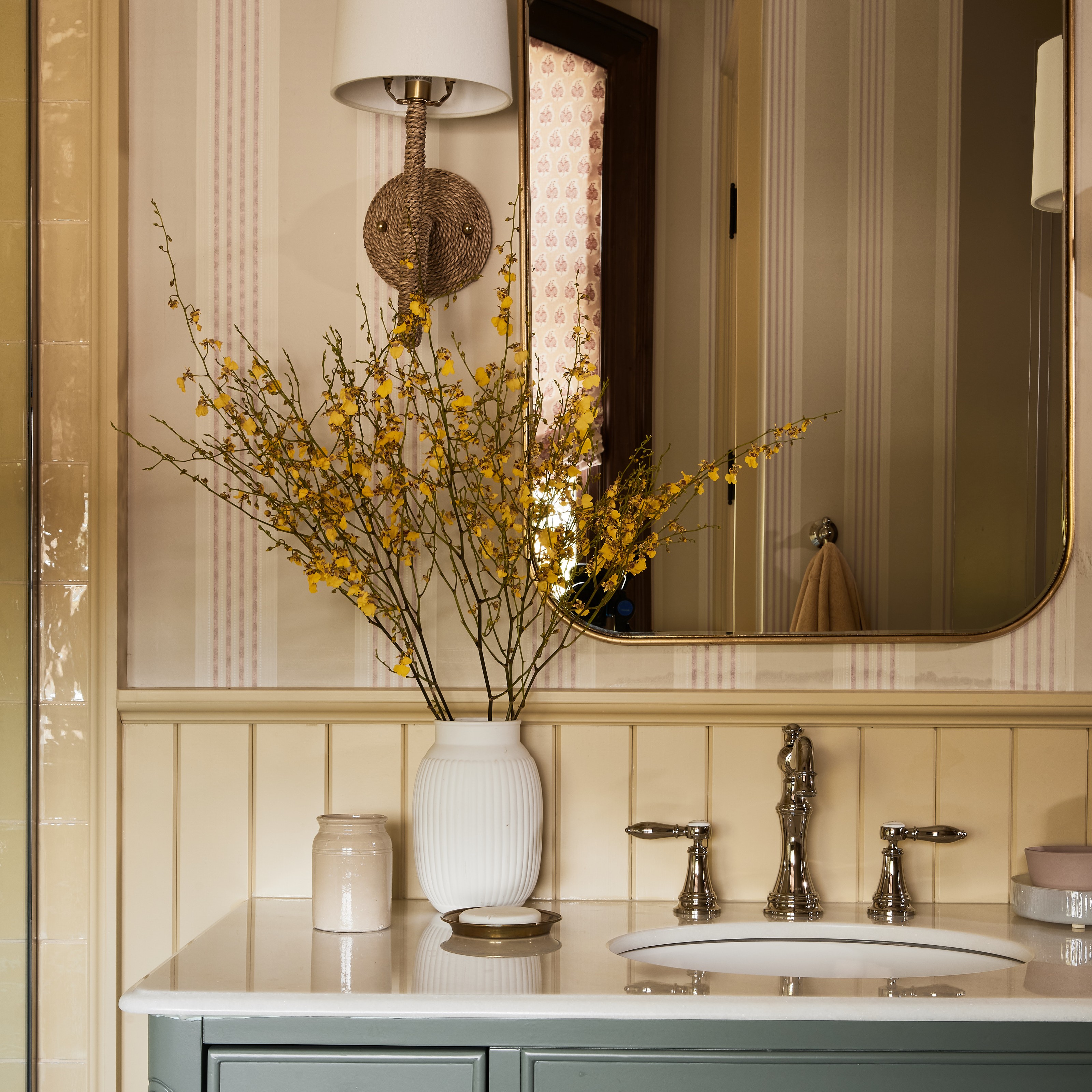
“Sudbury Yellow by Farrow & Ball is a light, traditional yellow. It works well anywhere that is bright—from kitchens to breakfast rooms, and also children's bedrooms. One thing I love about this color is that due to its lighter tone, it works really well with brass finishes, whereas many yellows upstage brass when they are too saturated.” —Cameron Ruppert

For Outside Pursuits
“Sherwin-Williams’ Harmonic Tan has hints of green, it’s a bit of a chameleon and looks so cozy. It’s beautiful on a home’s exterior, especially on window sashes.” —Monica Stewart, The Misfit House

The Perfect Mustard Yellow
Photo by Lauren Miller; Design by Ashley Montgomery Design
There is a shade unanimously revered by our Experts when it comes to mastering a mustard: India Yellow by Farrow & Ball.

For a Touch of Drama
“This paint is a true classic. Deep and rich with a historic gold tone, it complements browns and purples and can really hold its own in a space. It’s a bit more dramatic than other yellows, perfect for trim and ceilings to add a pop of color to space.” —Ashley Montgomery
For a Power Pantry
“I have found this color to be incredibly versatile across very different projects. I've used it in a mid-century modern house in Palo Alto, CA, where it worked beautifully with the original walnut wood, and also used it at a Georgetown row house where it complemented many of the deeper jewel tones in the home. It's a deep mustard and better for smaller, darker spaces such as pantries and bars.” —Cameron Ruppert
The Most Uplifting Yellows
Photo by James Merrell; Design by Rita Konig
For a Sophisticated Spin
“Yellow can get quite scary if it’s too bright. Gamboge from Paint & Paper Library is a bright and cheerful yellow with enough black in it to prevent a room painted in it from looking like a hazardous area.” —Rita Konig

For Summer Nostalgia
“Babouche by Farrow & Ball is a bright and full bodied French mustard yellow that is deep and happy and complex all at once. I love it in a summer house or on trim with wallpaper—it really pops.” —Katie Rosenfeld

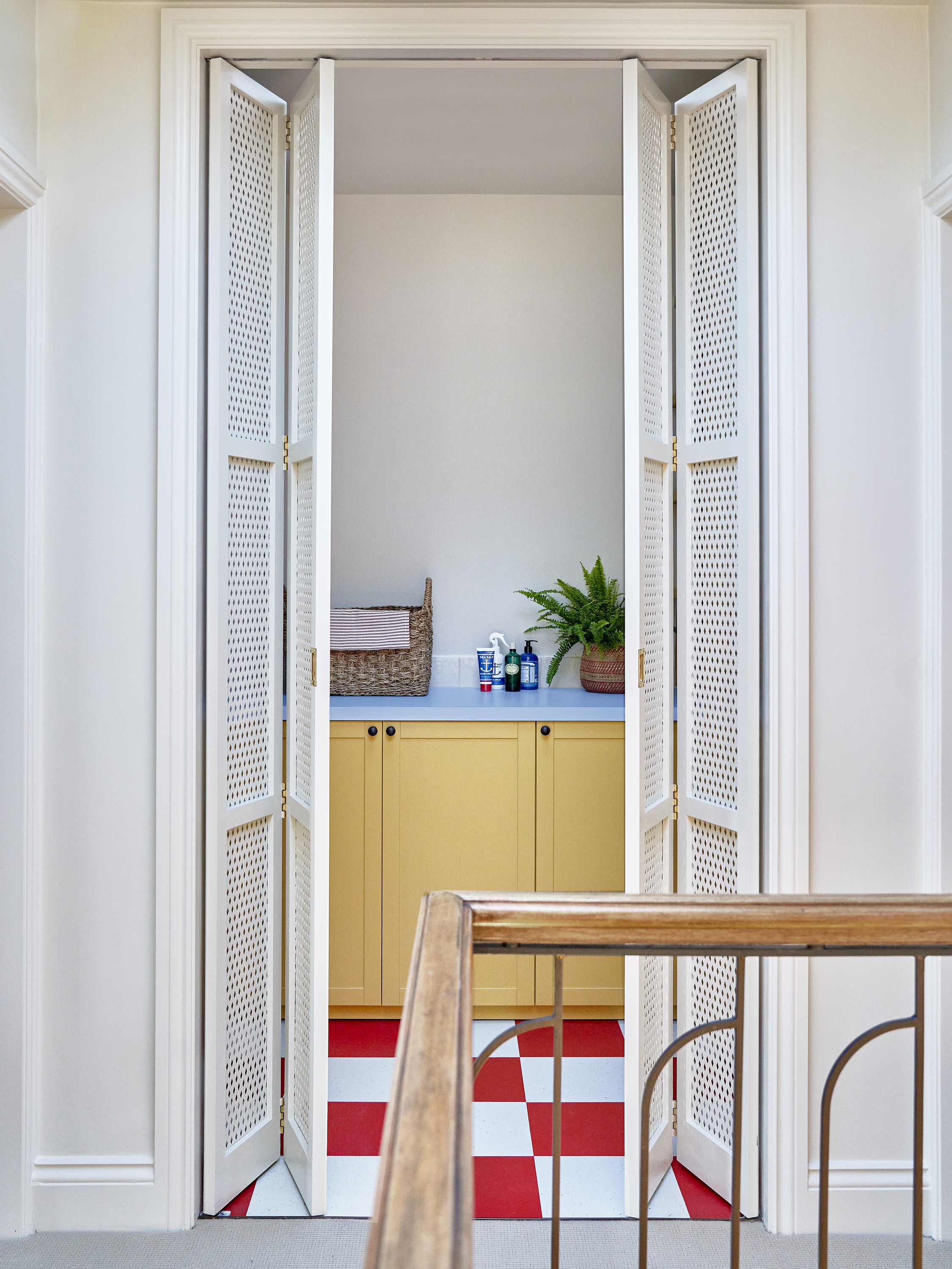
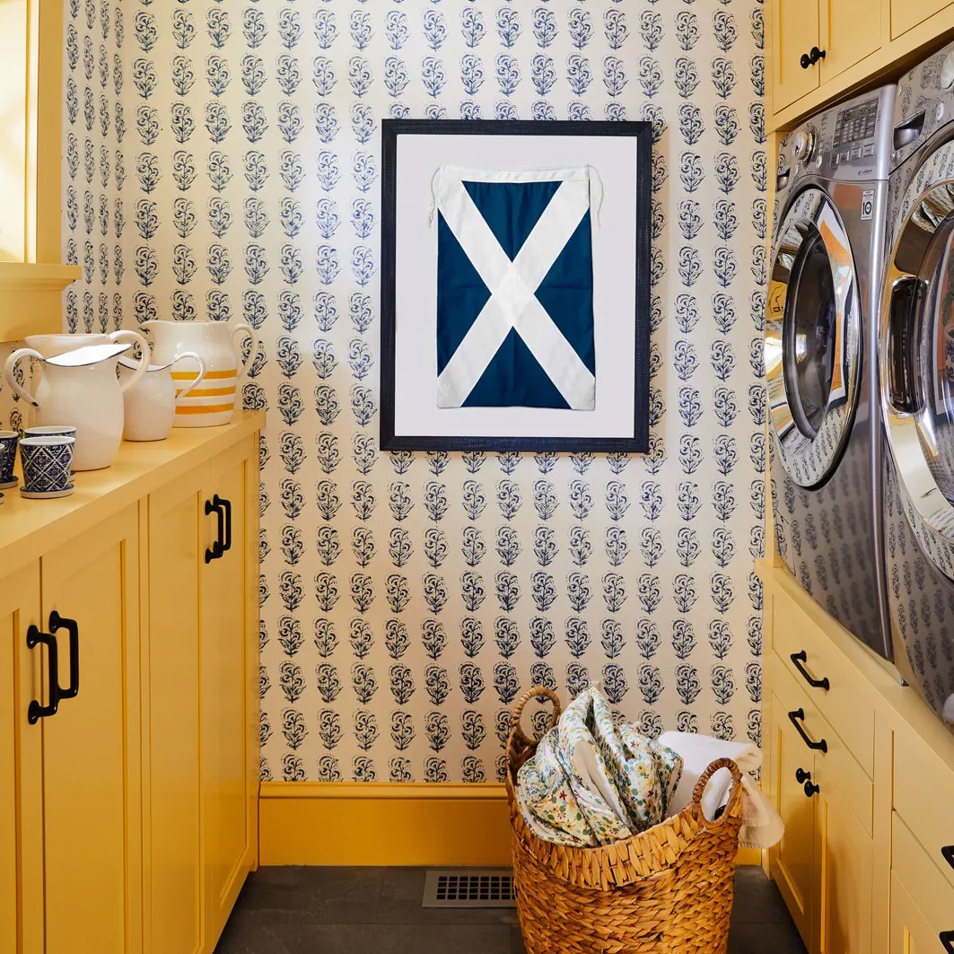
Photo by Milo Brown; Design by Lonika Chande
For A Color Pop
“The cabinets in this utility room on a top-floor landing are painted in Yellow Pink by Little Greene. I love how the ice blue Formica worktop and Marmoleum floor tiles pop against the cabinet color.” —Lonika Chande

For Sweet Dreams
“I’m currently using Farrow & Ball’s Dayroom Yellow on the walls of a dormered attic guest room to make the room feel bright and warm.” —Whitney McGregor
For a Cozy Retreat
“I have used Mister David by Little Greene to create a cheerful eaves bedroom in a London home. Painting the ceiling the same color as the walls gives a lovely cocooning and cozy feel, and avoids the eye being drawn to any awkward corners.” —Lonika Chande

The Most Regal Shades of Yellow
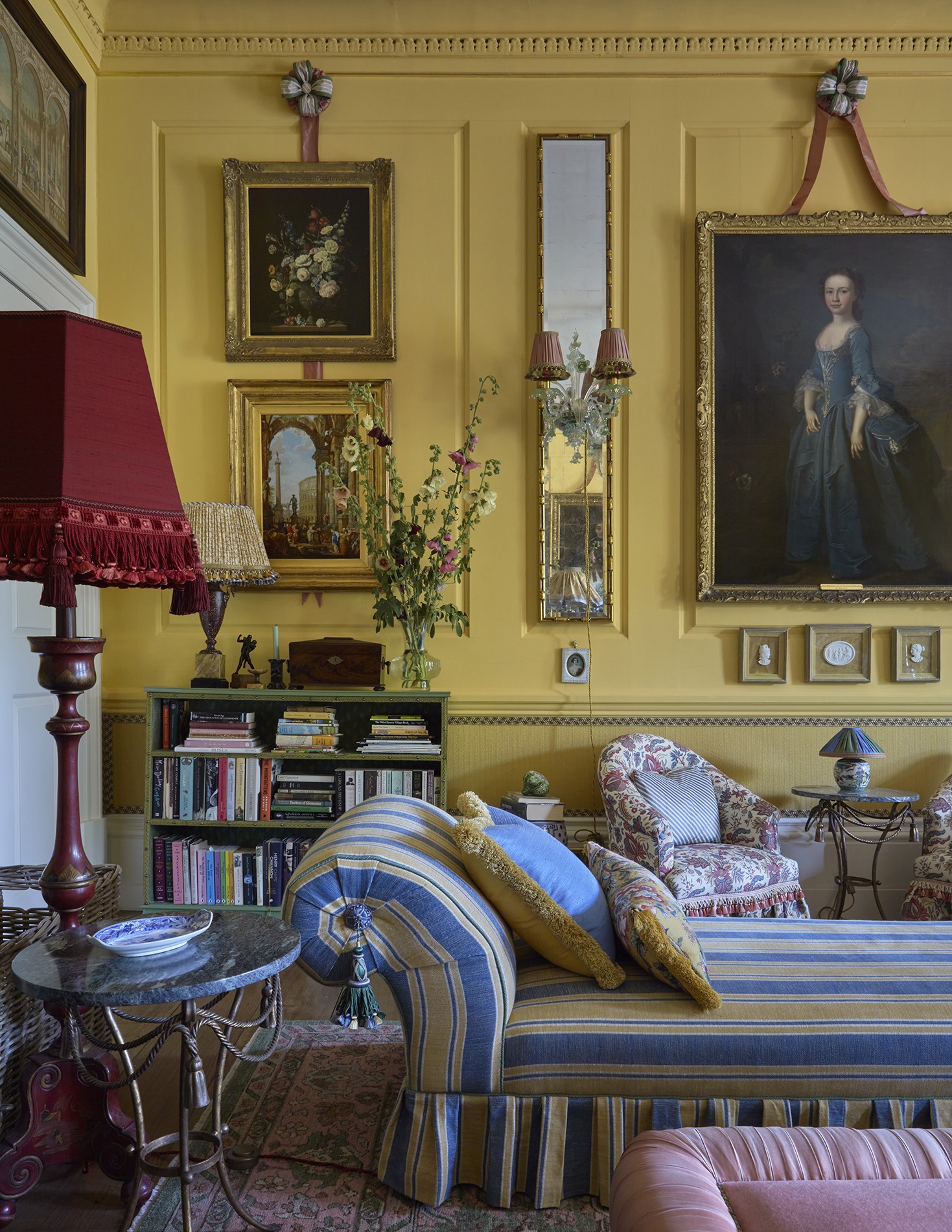
Photo courtesy of Martin Brudnizki Design Studio
For a Drawing Room
“From John Soane to Nancy Lancaster, there is a rich history of yellow for drawing rooms, so it made perfect sense for my own home. I used Edward Bulmer's Naples Yellow, and I love the way it changes throughout the day from a deep buttery yellow to a wonderfully vibrant one which provides an extra element of fascination.” —Martin Brudnizki

For Period Features
“Benjamin Moore’s Tapestry Gold packs a punch. It’s sophisticated but fun, and a great choice for vanities and fireplace mantles.” —Monica Stewart, The Misfit House

For That Magic Accent
“I’m itching to use Benjamin Moore’s Damask Yellow as a trim with wallpaper or even a simple white wall. This summer we stayed at a historic house in Newport, RI and the dining room had this on trim and built-ins and I haven’t stopped thinking about it!” —Whitney McGregor

The Best Lemon Yellows
For a Fresh Touch
“Yellow Ground by Farrow & Ball is the closest to a classic light lemon yellow—not too sweet and not too cute, but with enough depth to hold a room. I see it as really traditional but also very fresh. It would look great with brown, pink, and light blues. I would love to do a whole kitchen in this color.” —Katie Rosenfeld

For the Fifth Wall
“I love the thought of Lemon Chiffon by Sherwin-Williams on the ceiling in an otherwise restrained white room.” —Whitney McGregor
