15 Paint Colors That Will Define 2023, According to Experts
Words by Kate McGregor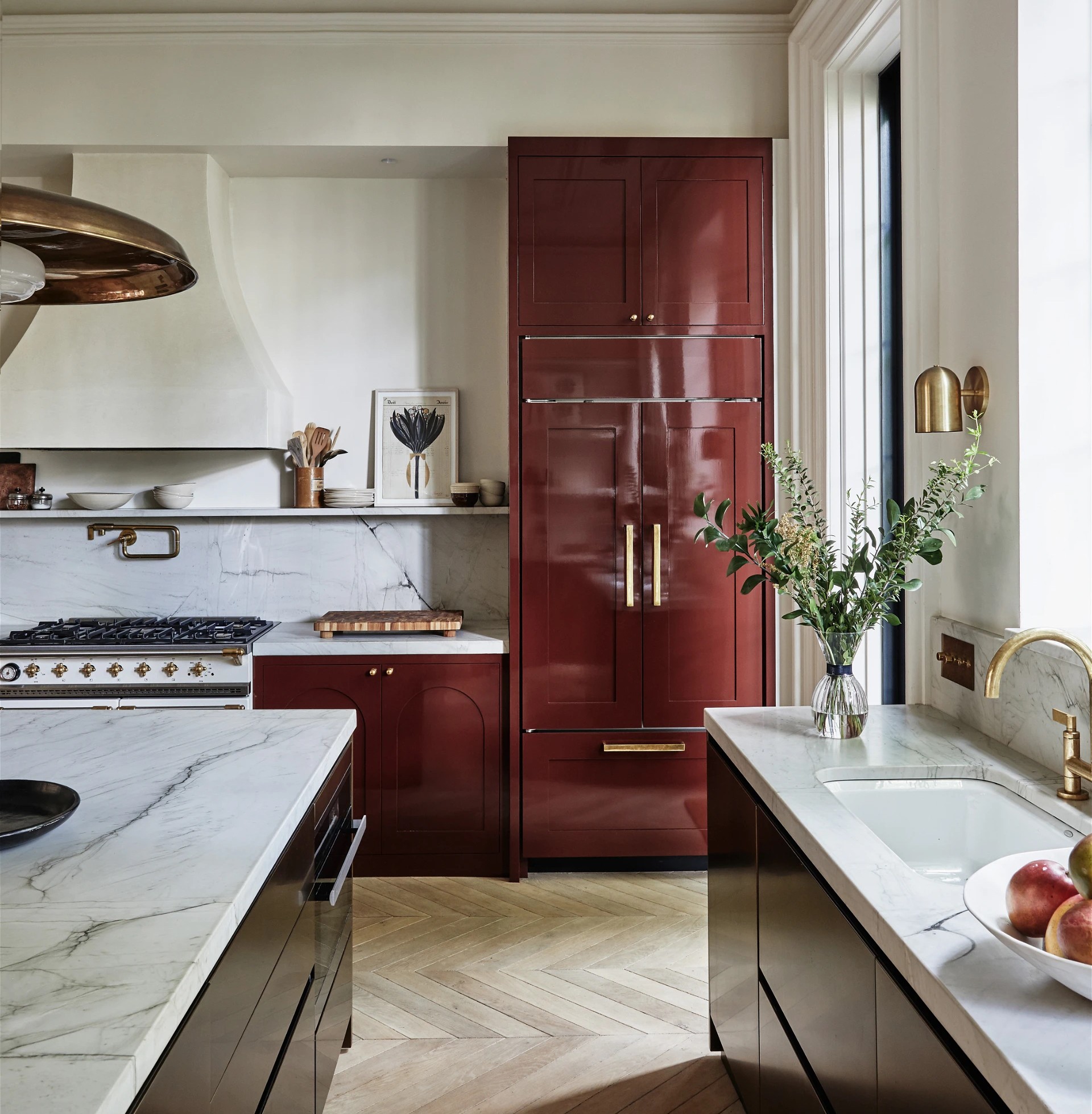
Photography by Jeff Holt; Design by Chused & Co.
While the days of the pandemic were defined by soft beiges and soothing neutrals, the design world has a bolder palette in mind for 2023.
According to our Experts, bright hues are back and color is ruling their projects for 2023. “This year, we’re excited about shades of red and saturated hues,” says Britt Zunino of Studio DB.
From deep mahogany browns inspired by vintage furniture to rich brick reds perfectly formulated for kitchen cabinets, these moody shades will inspire you to showcase your personality at home and abandon the all-white aesthetic. Get your walls ready for a change-up, because these are the 15 shades our Experts predict will take 2023 by storm.
The Best Earth Tones
Photography by Matthew Williams; Design by Studio DB
For a Desert Moment
“My guess is we are going to start to see more use of colors in general: muted yellows, oranges and reds like Joshua Tree by Portola Paints. Personally, I am excited to incorporate bolder hues into my designs. For a long time there was a lot of client push back on color, but I am seeing more openness to making more daring choices.” —Joyce Downing Pickens, JDP Interiors

For a Burnt Effect
“Baked Cumin by Benjamin Moore has a playful and lived-in quality. Its spicy toasted and organic hues give the allure of old age, but it can also surprise you in contemporary spaces. This color was meant for accents like built-ins nooks.” —Molly Kidd, Light and Dwell

For a Sunny Disposition
“I am excited for yellow to shine! In a kitchen, bath, or office, this color is joyful and inspiring. I painted my studio in Farrow & Ball’s India Yellow to get my creative juices flowing.” —Dee Murphy

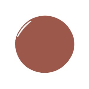
The Best Reds
Photography courtesy of JDP Interiors
For a Daring Statement
“Reds (especially deep, earthy, brick reds) are going to have a moment in 2023. It’s daring and it’s just what we need to make a fearless statement after hiding behind the safety of neutrality for the past few years. I’d use Bamboozle by Farrow & Ball on built-ins for a safer statement or go big on kitchen cabinets. I am giddy just thinking about the art and accessory combos with this type of warmth as a backdrop!” —Dee Murphy
For a Hint of Tradition
“Deep Reddish Brown by Farrow & Ball is an unexpected twist on tradition. It’s deep, warm and inviting. This shade was meant for country homes and cottages to add bold richness.” —Molly Kidd, Light and Dwell

For a Textured Feel
“I’m excited to see some applications of Meritage by Portola. Eggplant shades had a resurgence last year and they’re here to stay. It feels daring but equally versatile, which is important for virgin risk takers. This hue was found in a few popular kitchens in 2022, but I’d love to see it in a moody, cocoon-like bedroom.” —Dee Murphy
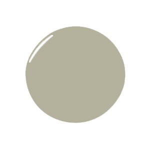
The Best Greens
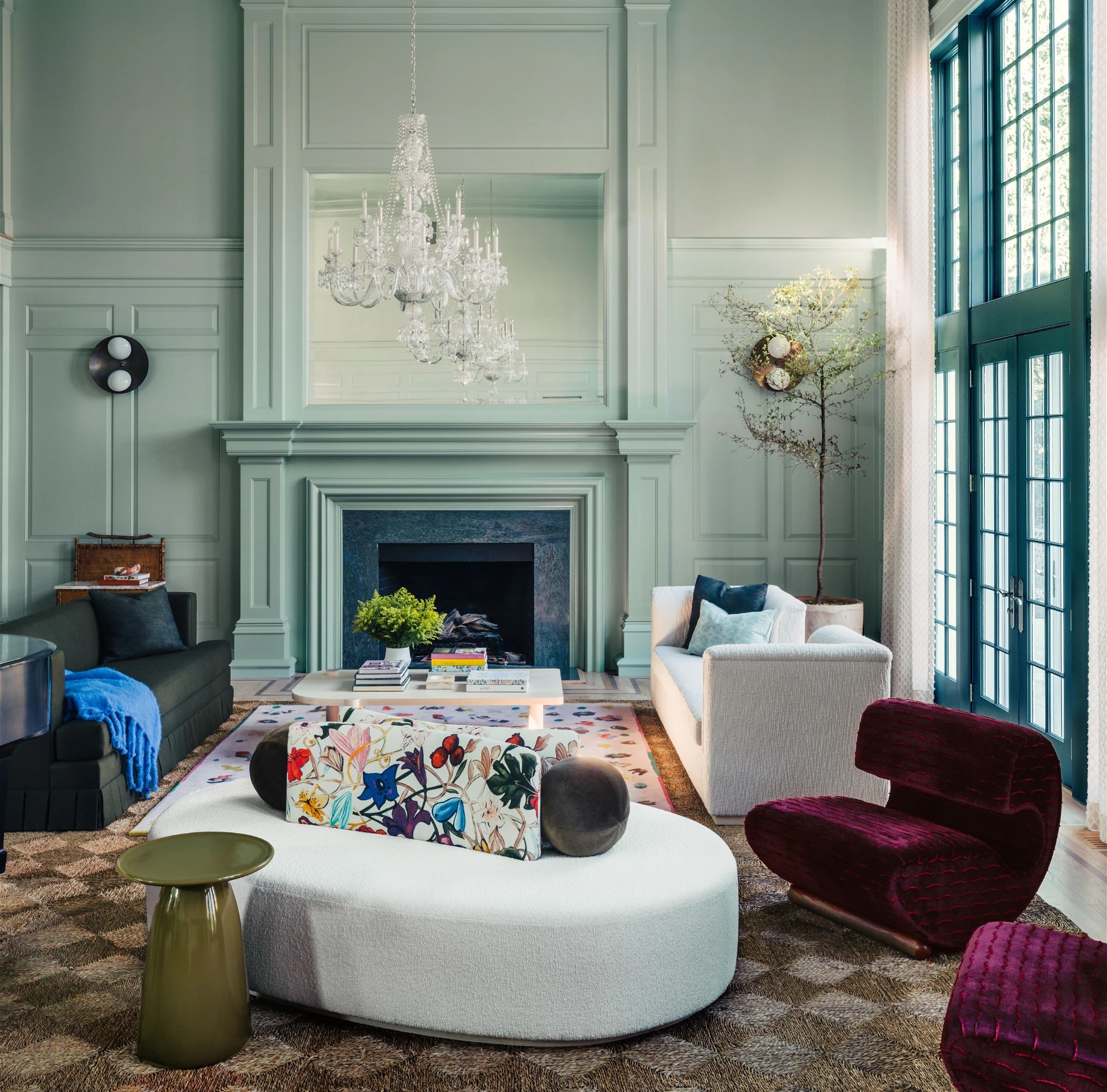
Photography by Ian Baguskas; courtesy of Studio DB
For the Color Averse
“French Gray by Farrow & Ball is an updated neutral with pretty green undertones. It’s a departure from the grays of the past that we are all accustomed to, and it plays really well with the warmer tones we are all gravitating towards right now. The best part… it’s a non-committal neutral that can go a million different directions and doesn’t take a lot of courage to pull off but still looks current and very polished.” —Ashley Gilbreath
For a Cocoon Effect
“Sherwin Williams’ Roycroft Bronze Green brings so much depth to a space. In a bedroom, it provides a sense of comfort and security that really just embraces you. It also plays nicely with hard finishes and wood tones and contrasts beautifully with a lighter ceiling.” —Ashley Gilbreath

For a Soothing Vibe
“Shades of green continue to inspire. In our Greenwich, Connecticut project, we used Bali by Benjamin Moore, a dusty shade of mint, to create a sophisticated backdrop. The ceiling and crown were painted two shades darker to create depth and anchor the double height space. We love pairing soft greens with deep aubergine and dark olive.” —Britt Zunino, Studio DB
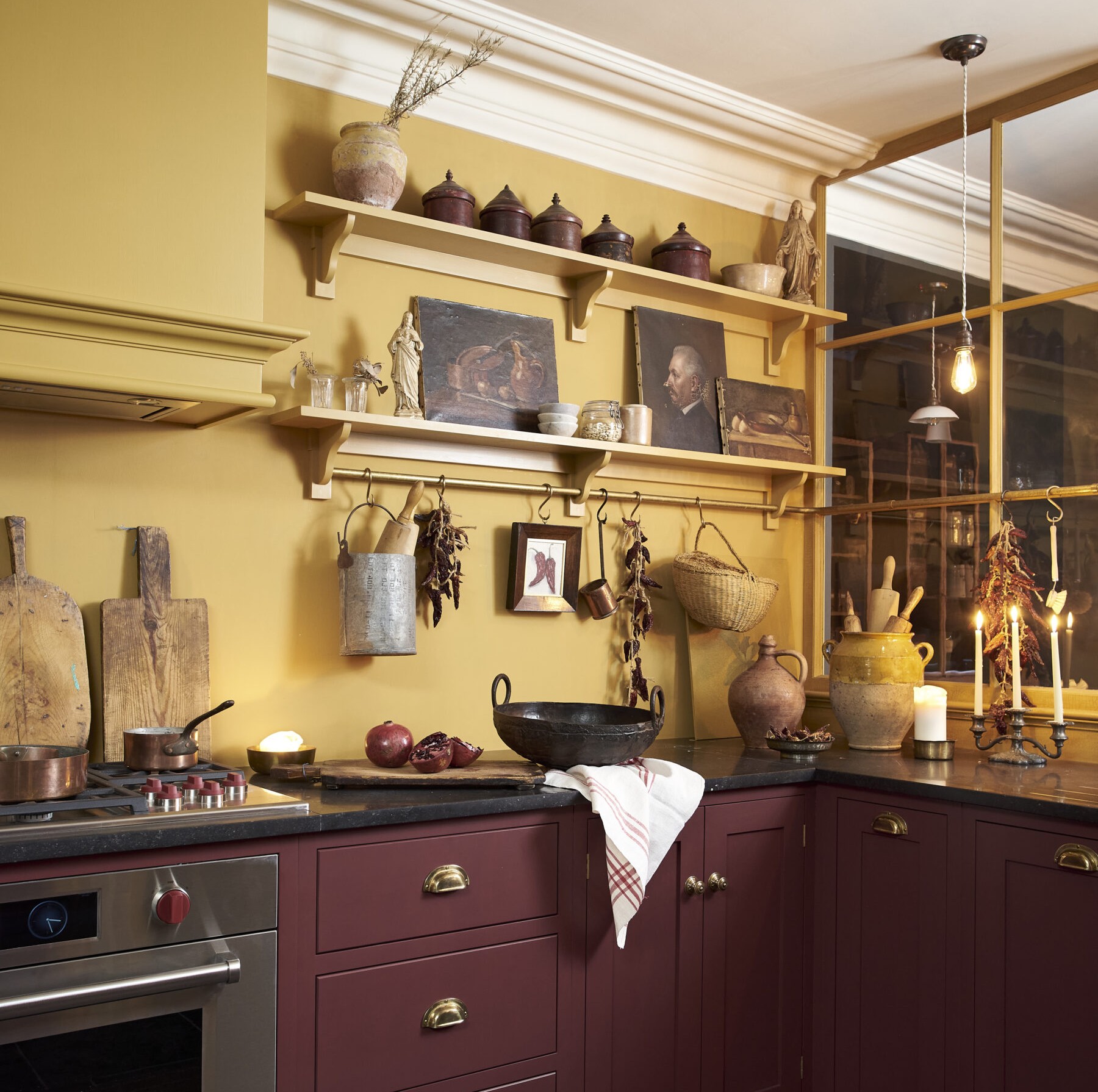
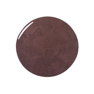
The Best Browns
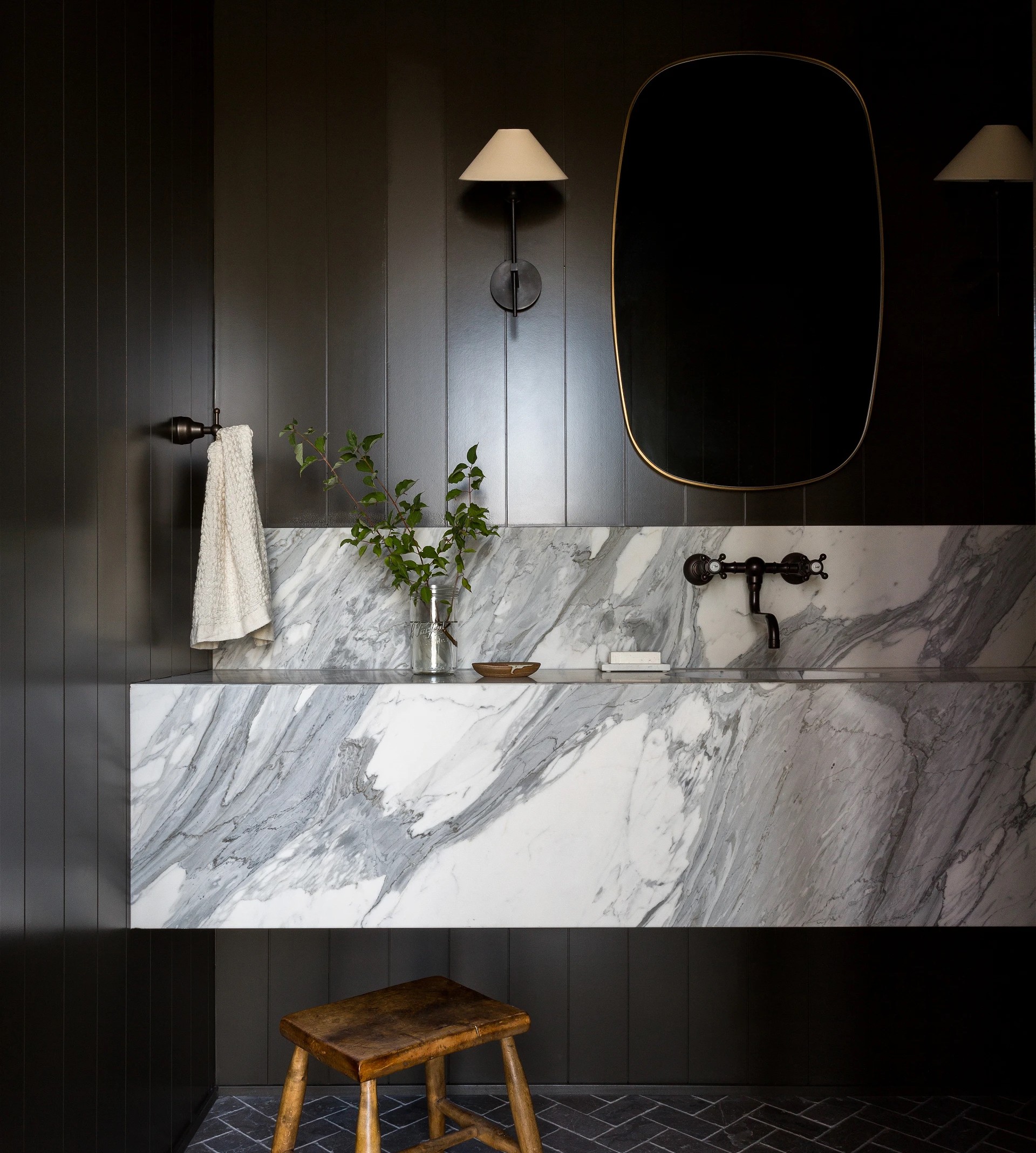
Photography by Amy Bartlam; Design by Light and Dwell
For a Warming Feel
“We're seeing earthy tones in almost every room of the house. Colors are becoming warmer and richer, creating a more lived-in, old-age look. Cacao and brown are booming as relaxed neutrals with leisurely notes of boldness. Broccoli Brown by Farrow & Ball is an effortlessly moody neutral best used in intimate spaces like studies or powder rooms. We’ve also seen hues influenced by nature, European architecture, and ‘vintage-inspired’ spaces: Think ‘baked’ colors like cumin, dark forest greens, and reds that look like aged wine. —Molly Kidd, Light and Dwell

For a Soft Backdrop
“Mouse's Back by Farrow & Ball is the perfect muted statement and serves as a classic and soft backdrop. The color reminds us of nature and is the perfect accent on furniture or floors when combined with more traditional whites.” —Molly Kidd, Light and Dwell
For a Moody Moment
“Dark and moody, but still a bit unexpected, Tanner’s Brown by Farrow & Ball makes a great backdrop for a pop of color. It also lends a lot of drama and warmth to soft white upholstery.” —Christina Samatas, Park & Oak

The Best Neutrals
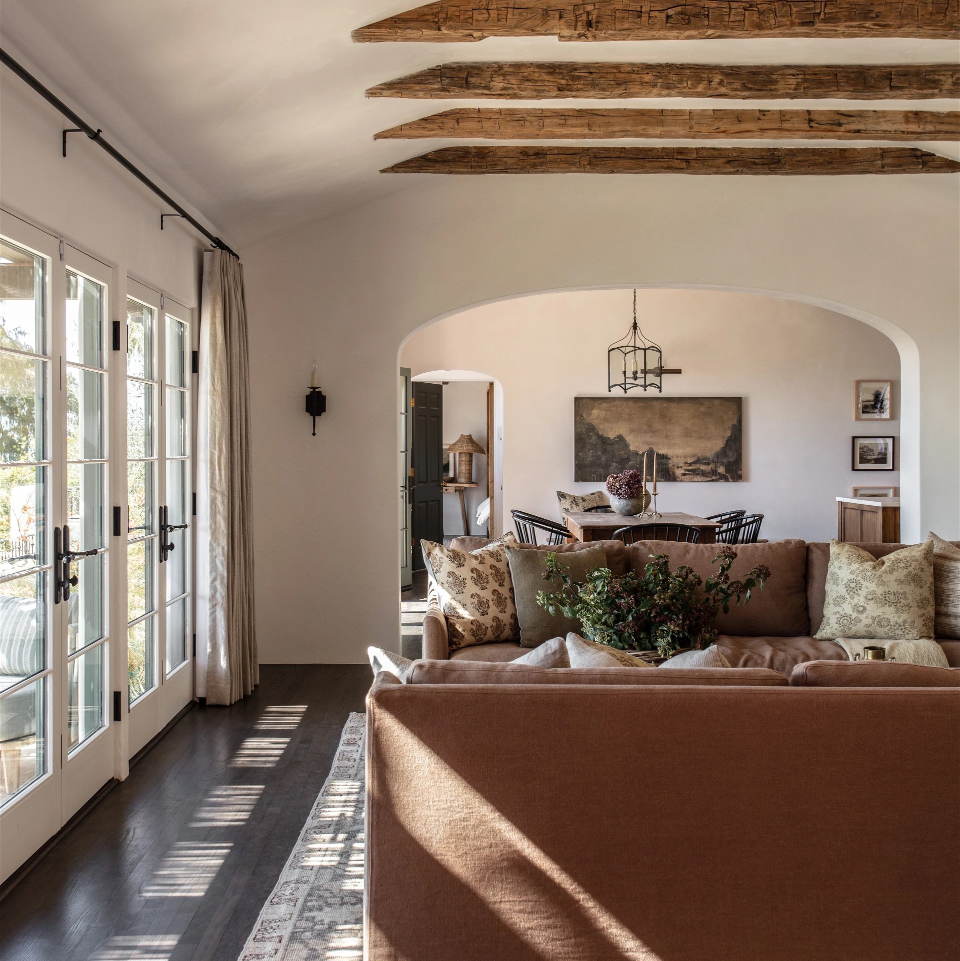
Photography by Michael Clifford; Design by JDP Interiors
For a Good White Alternative
“Pale Oak by Benjamin Moore is the new white! We try to steer white-loving clients toward this softer option. White can be so stark depending on the light in the room, whereas Pale Oak provides the same neutral backdrop but with tons of warmth. We love it so much we painted our new store in this color!” —Christina Samatas, Park & Oak

For a Neutral With Depth
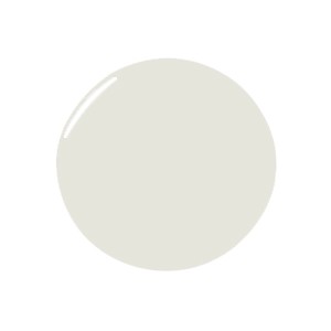
“My favorite go-to neutral off-white neutral is Neige by Ressource. It’s the perfect way to backdrop walls with great architectural details against more substantial furnishings.” —Jenna Chused, Chused & Co
For a Hint of Pink
“The pink and brown undertones in Farrow & Ball’s Dead Salmon play so nicely with some of our favorite textures like leather, rich woods, and rattan. For those wanting a cozy feel without going too dark, this is a go-to.” —Christina Samatas, Park & Oak